# 📝 Overview of Core Framework
Core Framework is a free, versatile and user-friendly tool designed for visual management of CSS development, whether you make websites from scratch, or use any platform, it is a good fit for all.
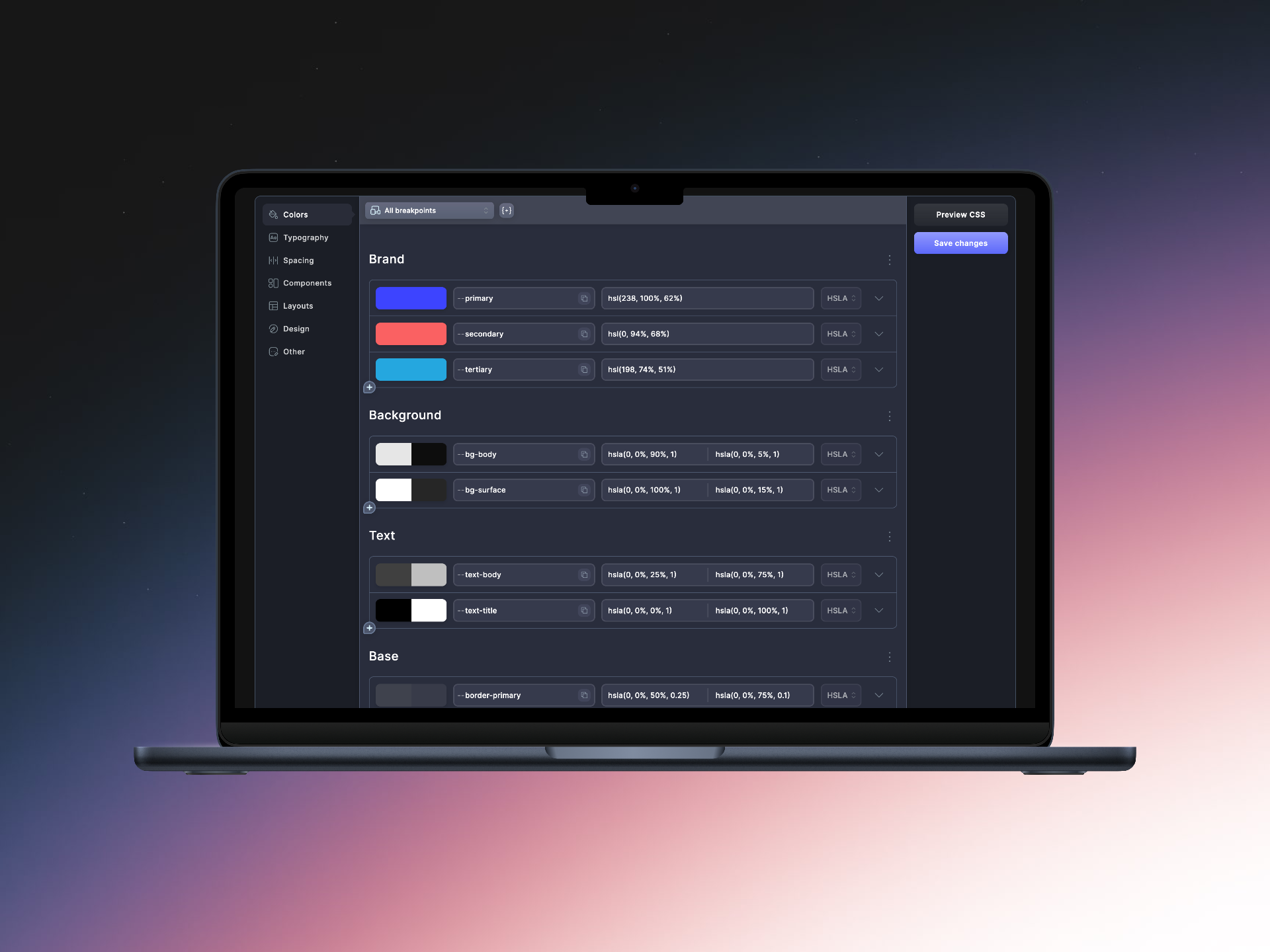
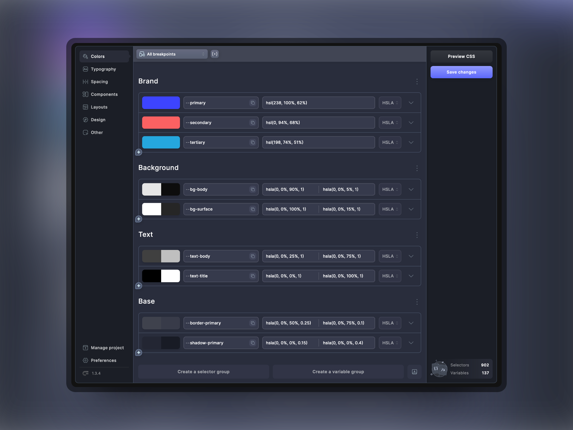
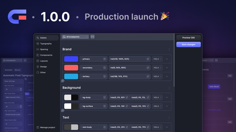
Core Framework's baseline setup.
## What is Core Framework?
Core Framework is a visual CSS toolkit which makes the development of your websites rapid and uniform. The toolkit allows you to manage, organize and reuse your custom-made stylesheets across all of your projects. Control every aspect of your projects through our gorgeous and unique visual GUI, ranging from:
* Management of CSS variables and classes
* Smart color system
* Automatic and responsive sizing and spacing
* Automatic creation of transparent, lighter and darker shades of colors
* Component editor for instant visual feedback on selected HTML elements
### At First Glance
We pride ourselves on the clean UI of Core Framework. Not only does it look great, but it also offers a lot of useful UX features, making duplicating effortless, moving groups of items around seamless, and adding and removing single items or groups of items is made very simple.
{% hint style="success" %}
[We go over all of the UI categories here](https://docs.coreframework.com/navigating-the-ui/color-system) ✅
{% endhint %}
### As a Web App
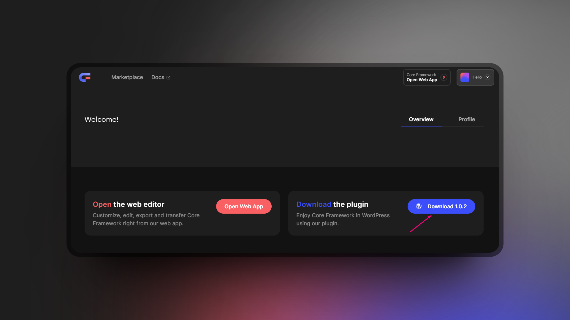
Core Framework is available as a free web app, which can be accessed once you have registered an account on our website. From your dashboard, you can set up projects and have completely free access to the Core Framework builder.
### As a WordPress Plugin
Core Framework is also available to WordPress developers for free. We have created Core Framework as a plugin and have it approved on the [WordPress repository](https://wordpress.org/plugins/core-framework/).
With our additional addons available on our own [marketplace](https://coreframework.com/marketplace), developing in popular builders like Oxygen Builder, Bricks Builder, and Gutenberg, Core Framework simplifies the process of web design customization, making it quicker and accessible to users of various skill levels.
## Core Framework Background
Core Framework is brought to you by the same developers of OxyNinja; a plugin which is renowned in the WordPress community for being the first CSS framework for Oxygen Builder. This inspired other CSS framework plugins and developers to come forward and compete with OxyNinja.
Later, we decided that users of other builders could not benefit from the amazing features offered in OxyNinja, since it was primarily tied to Oxygen Builder only. This is why we made Core Framework.
# 💁🏼♂️ Target Audience
Core Framework is designed for a diverse range of users in the web development industries. People of all skill levels can and should use Core Framework!
Its primary audience includes both web developers and web designers of all proficiency levels who seek an efficient tool to enhance website aesthetics and functionality. With its sleek UI and easy-to-use features, Core Framework is not at all overwhelming and easy to use.
At the same time, Core Framework has zero limits; you can add any CSS properties as you wish, meaning it is also appropriate for more advanced developers.
### Users Building Websites from Scratch
Core Framework takes in all of your preferences regarding colors, sizes, spacing, plus more, and outputs the CSS for you. Since this CSS can be downloaded (minified versions are also available), then Core Framework means it is suitable for people building websites on ***any*** platform!
### WordPress Users
It is also ideal for WordPress users as Core Framework is available as a plugin on the [WordPress repository](https://wordpress.org/plugins/core-framework/), particularly those utilizing builders such as Oxygen Builder, Bricks Builder, and Gutenberg, who need a robust solution for managing CSS with ease.
Additionally, freelancers and agencies that require a scalable, user-friendly platform to deliver customized websites will find Core Framework particularly useful.
# 🔍 Navigation of the Documentation
We are constantly trying to improve our documentation and our aim is to make it easy to follow, we hope that you have no issues with the navigation.
Our documentation is structured to help you quickly find the information you need. It is divided into several sections, including Getting Started, Core Features, Integration Guides, and Troubleshooting.
Each section is further subdivided into detailed topics that cover everything from basic setup to advanced customization options.
Use the search function for direct queries, or navigate through the table of contents for a broader exploration.
Links to video tutorials and downloadable resources are also available throughout, to enhance your learning experience.
{% hint style="info" %}
Have any advice or feedback on our documentation? Please let us know!
{% endhint %}
# Getting Started with Web App and WordPress
Using Core Framework is extremely easy for both the web app version and the WordPress plugin. Please follow the simple steps below to get started right away.
## **Web App:**
{% hint style="info" %}
If you don't have an account yet, [create a free one here](https://coreframework.com/auth/sign-up).
{% endhint %}
After you sign up either with your email or via Google, you will get immediate access to the dashboard where you can readily access the standalone web app, and/or download the plugin for WordPress.
1. **Sign Up:** Begin by signing up for an account on the [Core Framework website](https://coreframework.com) to access the web app.
2. **Open Web App:** Once logged in, you will have access to the Web App. Simply click on the 'Open Web App' button in the header.
3. **Configuration:** Follow the on-screen instructions to configure your project name, and then hit 'Create'.
## **WordPress Plugin:**
If you're using WordPress, you can either download our plugin manually at any time after you log in to your account from your dashboard, or you can install it right from your WordPress installation through the plugins page.
1. **Download/Install Plugin:** Download the [Core Framework plugin from the WordPress plugin repository](https://wordpress.org/plugins/core-framework/), or, download the plugin from your dashboard on our website.
2. **WordPress Plugins:** Alternatively, from your WordPress admin dashboard, navigate to **Plugins -> Add New Plugin** and search for Core Framework. From here, you can click on **Install Now** and then **Activate**.
3. **Configuration:** Configure the plugin settings from the WordPress menu to integrate it with your current theme and plugins.
[In the next article](/getting-started/initial-setup-and-configuration), we will explain in more detail about how to configure Core Framework.
{% hint style="success" %}
No license key required to use the plugin! 🎉
{% endhint %}
# Initial Setup and Configuration
## **For the Web App:**
1. **Account Creation:** After creating your account outlined on the previous page, click on the [Open Web App](https://coreframework.com/app) at the top right to access to the web app.
2. **Create a new project:** Next, you will have the option to create a new project. Start by entering a name for your project and then click 'Create'.
3. **Core Framework:** Once you have created your project, you will now be directed to the main interface of Core Framework. All projects will be set up with the standard, baseline setup. You can now navigate the sections of Core Framework and have a look around to familiarize yourself with the different sections such as Colors, Typography, Spacing, etc.
4. **Preferences:** We recommend navigating to the [⚙️ preferences section](/navigating-the-ui/preferences) to familiarize yourself with the options available in this tab to help you set up your main configuration. This section contains some important values that will dictate both the way your website will look and how Core Framework will function.
5. **Exporting CSS:** Once you have the desired setup in Core Framework, you can click on the Preview CSS button and then download your generated CSS from here. Alternatively, you can copy the full CSS or the minified version to use on your websites.
## **For the WordPress Plugin:**
1. **Plugin Installation:** After downloading and activating the Core Framework plugin, you can now access Core Framework right from your WordPress dashboard.
2. **Plugin Setup:** Configure the plugin settings to align with your site’s design needs from the preferences section. Please see the [⚙️ preferences section](/navigating-the-ui/preferences) below for more information on the preferences fields.
3. **Testing:** Ensure everything is functioning correctly by previewing changes on your site's front end.
4. **Builder:** If you are using a page builder such as Oxygen Builder or Bricks Builder, then you will find our section on [Builder Integrations](/builder-integrations/overview) useful.
## Onboarding
When opening Core Framework for the first time, you will be presented with our simple onboarding screen. There are 2 steps for the web app, and 3 steps for the WordPress plugin (this includes an option for enabling addons).
### Step 1
Here is the onboarding screen which you will be presented with when first opening Core Framework.
#### Core Framework: Full experience
This option will import everything you need regarding colors, typography and spacing, and will generate both utility classes as well as variables.
{% hint style="info" %}
This option is recommended when using Core Framework UI kits!
{% endhint %}
#### Variables Only: Minimalistic
This option will streamline the outputted CSS as it will generate variables only for the default Core Framework setup. This includes colors, typography and spacing and radii.
#### Empty: Create your own
This option will give you an empty setup but will still import a default typography and spacing setup which includes both utility classes and variables.
### Step 2
This second step is available on the plugin version of Core Framework
On the second step, you will be presented with the options to add license keys for any builder addons that you have purchased. Simply enter the license key in the relevant field and click the check mark!
### Step 3 (Step 2 on Web App)
Choose your basic preferences
Regardless of which option you choose in step one, the final step will offer 2 more options for your basic preferences:
#### Root font size
This allows you to choose your root font size (options of 100% and 62.5%).
#### Dark mode
With dark mode toggled on, this will set up Core Framework with the necessary color options so that you can choose both your light and dark mode colors where necessary.
# Video tutorial: First-time setup walkthrough
{% hint style="info" %}
This part of the documentation will be updated very soon.
{% endhint %}
# OxyNinja Users
This page contains some important information for our OxyNinja users. Please read it carefully, so that you can benefit from being an original customer, but also not to make a mistake of migrating.
## Our Generous Offer
We made a promise to our OxyNinja users that we would give you the following for free:
* [Oxygen Integration addon](https://coreframework.com/marketplace/oxygen-builder-addon).
* [CoreKit - Design Set](https://coreframework.com/marketplace/corekit) (for Oxygen).
* [WooCore - Design Set](https://coreframework.com/marketplace/woocore) (for Oxygen).
Please follow the steps below to get these freebies:
### Step 1
To get these very generous offers, you will need to have an OxyNinja license. Kindly visit the [OxyNinja website here](https://oxyninja.com/) and log in to your account. Once logged in, navigate to your Purchase History ([or click here](https://oxyninja.com/checkout/purchase-history/)) -> View Licenses -> Manage Sites.
On this page, you will be able to access your OxyNinja license key.
Your OxyNinja Purchase History Displaying the License Key
### Step 2
Now, kindly login to your account on the [Core Framework website](https://coreframework.com). Once you have logged in, you can now visit the redeem page at: - here, you can enter your OxyNinja license and email used for purchase. You will automatically receive the Oxygen add-on, CoreKit and WooCore (if purchased previously).
The page presented after successfully redeeming your OxyNinja license.
## Do Not Attempt to Convert OxyNinja to Core Framework.
{% hint style="danger" %}
Please, do not attempt to convert an OxyNinja site to Core Framework. Please read below for more information.
{% endhint %}
OxyNinja is our original CSS framework which we introduced to the WordPress eco-system. While OxyNinja still works great, we do not recommend converting your websites utilizing OxyNinja to Core Framework. Here's why:
1. OxyNinja and Core Framework use different utility classes and variables.
2. Attempting to use a Core Framework Design Kit with OxyNinja will not work.
3. Attempting to use an original OxyNinja Design Set with Core Framework will not work.
4. Manually attempting to change all classes and variables from OxyNinja to Core Framework is not recommended, and we will not provide support in this case.
We have already spent a lot of time recreating the OxyNinja design sets to work with Core Framework, so that you don't have to. We therefore only recommend using **Core Framework Design Kits** with **Core Framework**, and **OxyNinja Design Sets** with **Oxyninja**. Please, do not attempt to mix them together.
{% hint style="success" %}
If your site is using OxyNinja, it is OK to leave it as it is. We still provide OxyNinja support to our customers.
{% endhint %}
### So, what if I want to use Core Framework?
We would recommend starting all fresh websites with Core Framework. There is no need to change existing sites from OxyNinja to Core Framework. We still provide support for OxyNinja users, and everything should still continue to work just fine.
If you are really wanting to change from an OxyNinja build to a Core Framework build, then we would recommend starting the website from anew and use Core Framework along with Core Framework kits. These kits will be free to you if you were previously an OxyNinja user. [Please read above ](#our-generous-offer)to see how you can get the kits and the Oxygen Integration Addon for free.
# Overview
At Core Framework, we offer integration addons for specific builders to make developing much more efficient. Click the cards below to learn more about the individual addons we offer.
The integration addons add extra features to the respective builders to make developing quicker. For example, the builders will import all colors, classes and variables directly from Core Framework so that they are constantly synchronized.
You will no longer need to type out the full class names or variable names, as the integration addons also allow not only for auto-suggestions, but also a unique variable UI.
Bricks Builder
Learn how to set up the Bricks Builder Integration addon as well as configure styles.
### Features
* Variable UI - Select variables from the visual UI that can be accessed by right-clicking on the input.
* Variable auto-suggestion - Custom variables are automatically suggested in custom auto-suggestion dropdowns. Sorted by relevance.
* Sync classes with Oxygen Builder and Bricks Builder native auto-suggest fields.
* Preview classes and variables by hovering over them.
* Preview dark mode by toggling the switch.
# Oxygen Builder
This page will help you get started with Core Framework's Addon for Oxygen Builder, as well as the setup required for Oxygen Builder's Global Options.
## Oxygen Builder Integration Addon
The Oxygen Builder integration addon is dedicated solely to Oxygen Builder and provides many benefits such as the synchronization of classes, colors and variables.
This addon acts as a pivotal extension to the Core Framework, refining your development workflow within Oxygen Builder to be more fluid and productive. It enriches your design process, not only by rendering visible all styles applied to your elements within Oxygen Builder but also by introducing additional features designed to streamline operations.
### Video Showcase
{% embed url="" %}
Oxygen Builder Addon Showcase
{% endembed %}
### All Features
* **Variable UI** - Select variables from the visual UI that can be accessed by right-clicking on the input.
* **Variable User Interface**: Effortlessly select variables via a visual interface, accessible through right-clicking on input fields.
* **Variable Auto-Suggestion**: Experience the convenience of custom variables being automatically suggested within a bespoke auto-suggestion dropdown, organized by relevance for ease of access.
* **Synchronization with Core Framework Classes**: Automatic alignment of Core Framework classes with Oxygen Builder's native auto-suggest feature, ensuring a seamless design experience.
* **Instantaneous Preview of Class and Variable Styles**: Preview the impact of class and variable styles on your elements with a simple hover, facilitating immediate visual feedback.
* **Theme Mode Toggle**: Effortlessly switch between dark and light themes using the toggle provided in the top bar, enabling diverse visual explorations.
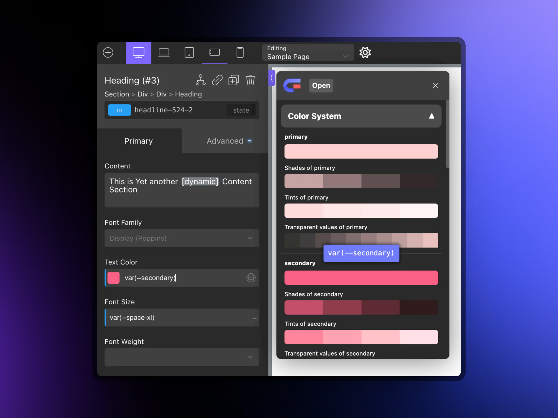
The Variable UI Showing the Core Framework Color System in Oxygen Builder
### Installation
You will need to have purchased the [Oxygen Builder Integration addon](https://coreframework.com/marketplace/oxygen-builder-addon) in order to make use of it in Core Framework.
With Core Framework installed on your WordPress installation, kindly navigate to **Core Framework → Addons** and enter your license key for the Oxygen addon. Don't forget to click '**Save Changes**'.
Your license key is located on [your dashboard](https://coreframework.com/dashboard) and you will need to click 'View' next to the **Oxygen Builder Integration** addon.
### **Is the Oxygen Builder Integration Essential?**
While the integration addon is not mandatory, its adoption is strongly advised to enrich your development experience. The benefits of utilizing this addon include:
* Elimination of the need to refresh the front-end to observe style changes, as all modifications are visible within Oxygen Builder.
* Real-time updates to elements upon hovering over auto-suggestions, allowing for a visual pre-assessment before final application.
* Simplification of the process to apply classes and variables, reducing it to as few as two clicks.
* Direct toggling of dark/light themes from within the Oxygen Builder, as opposed to navigating through the Core Framework interface.
In summary, the Oxygen Builder Integration addon is a highly recommended tool that not only enhances your workflow but also significantly accelerates the development process by providing a more intuitive and efficient design environment.
This addon is available at
## Oxygen Builder Styles Setup
### Option #1: Import Our Blueprint
Oxygen offers an import feature where you can import your global styles. Simply use our JSON provided below to quickly set up your global styles for Oxygen. Kindly navigate to Oxygen -> Export & Import -> and paste the JSON into the **Import Global Settings** box.
{% hint style="warning" %}
Please right click on the file below, and choose 'Save Link As' to download it.
{% endhint %}
{% file src="/files/f8jP93cWSLwaZQOH0yrB" %}
This JSON will help you quickly set up your Oxygen Global Styles.
{% endfile %}
{% hint style="info" %}
You can leave the **Import Global Colors** toggle unchecked.
{% endhint %}
### Option #2: Manual Setup
#### Global Styles
Let's set up the Global Styles in Oxygen to inherit the variables of Core Framework. We will list only the necessary styles below, as the others (such as colors) will be inherited automatically.
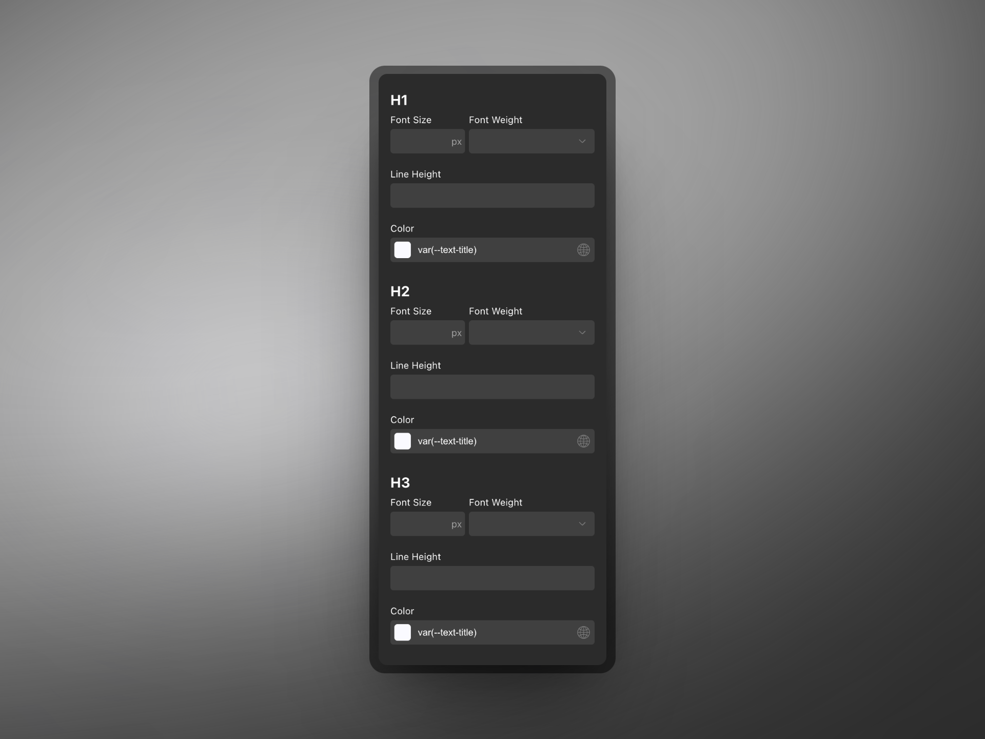
#### Headings
* **Font Size:** Please remove all instances of font-sizes, as these will be applied automatically since they're set up as `h1, h2, h3` etc. in Core Framework.
* **Font Weight:** blank
* **Color:** `var(--text-title)`
The first 3 headings setup.
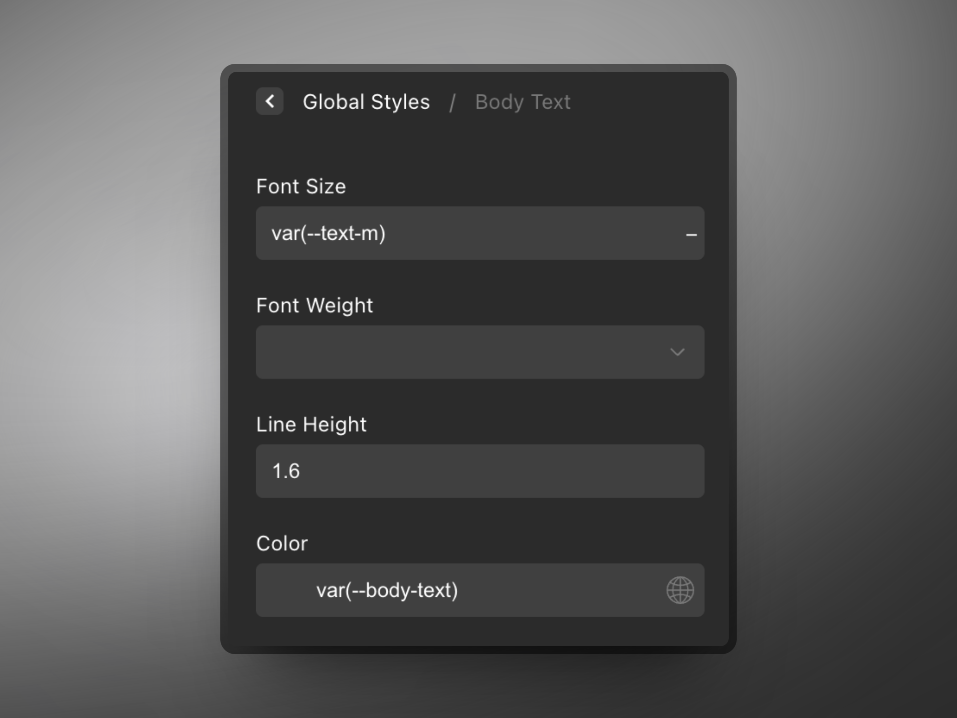
#### Body Text
* **Font Size:** `var(--text-m)`
* **Font Weight:** blank
* **Line Height:** `1.6`
* **Color:** `var(--body-text)`
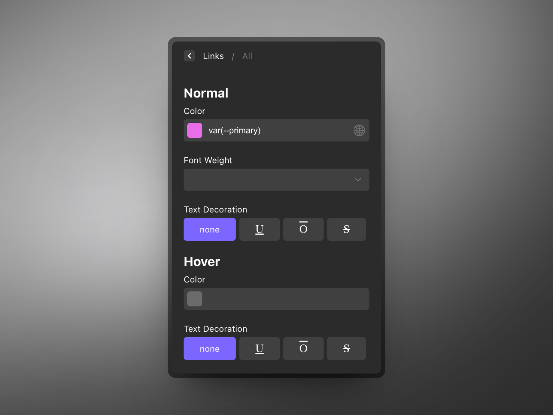
#### Links
#### All
**Color:** `var(--primary)`
#### Width & Breakpoints
{% hint style="warning" %}
When setting your breakpoints in Oxygen Builder, it is important to make some necessary changes to Core Framework's breakpoints. We will explain this below:
{% endhint %}
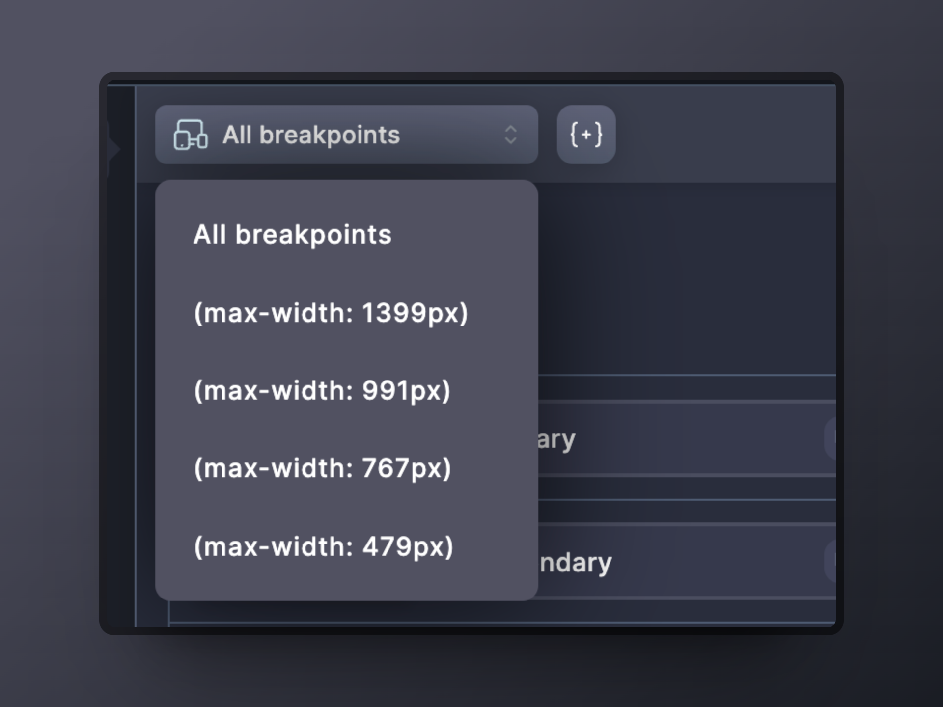
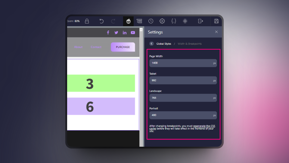
Please set your breakpoints in Core Framework relative to Oxygen Builder minus 1px. This will ensure that your elements will be displayed correctly when editing in Oxygen Builder. For example, if the page width is set to 1400px in Oxygen Builder, then please set this to 1399px in Core Framework. This is the same for every breakpoint. Please see the screenshot below which matches the settings given here:
* Page width: 1400px
* Tablet: 992px
* Landscape: 768px
* Portrait: 480px
Core Framework breakpoints to reflect the above settings:
{% hint style="info" %}
To edit the breakpoints in Core Framework, select a breakpoint first and then click on the '**Edit current media query'** button. Once you have changed the value, click on the green '**Apply**' button. Don't forget to then click '**Save changes**'.
{% endhint %}
#### Sections & Columns
* **Section Container Padding (top, right, bottom, left):** `var(--space-2xl), var(--space-s), var(--space-2xl), var(--space-s)`
* **Columns Padding:** default (you can change this if you make use of Oxygen's Columns element, but we would recommend you use the grid classes from Core Framework instead).
# Bricks Builder
Utilizing Core Framework alongside Bricks Builder? This guide delves into the specifics of the Bricks Builder Integration addon, as well as how to setup your Bricks' Theme styles.
## Bricks Builder Integration Addon
This integration represents a bridge between the comprehensive functionalities of Core Framework and the advanced capabilities of Bricks Builder, one of the premier page builders available. Our integration is engineered to be lightweight and straightforward, ensuring a perfect alignment of classes, colors, and variables between Core Framework and Bricks Builder's native functionalities. It facilitates an effortless utilization of Bricks' native auto-suggestions and color systems.
### Video Showcase
{% embed url="" %}
Bricks Integration Addon Showcase
{% endembed %}
### **All Features**
As an essential extension of Core Framework, this addon enhances your development journey within Bricks Builder, making it more fluid and intuitive. It provides visibility over all styles applied to your elements directly within Bricks Builder and introduces additional features to simplify your workflow. Highlights of its capabilities include:
* **Variable User Interface**: Easily select variables through a visual UI, accessible via right-click on the input fields.
* **Variable Auto-Suggestion**: Custom variables are conveniently suggested within a fully-customized auto-suggestion dropdown, organized for easy access based on relevance.
* **Synchronization with Core Framework Classes**: Core Framework classes are automatically synchronized with Bricks Builder's native auto-suggest feature for a seamless design experience.
* **Instant Preview of Class and Variable Styles**: Effortlessly hover over classes and variables to preview their effect on your elements instantly, allowing for quick visual adjustments.
* **Theme Mode Toggle**: Switch between dark and light themes with a simple click on the included toggle in the top bar, enabling versatile visual exploration.
The Variable UI Showing the Core Framework Color System in Bricks Builder
### **Is the Bricks Builder Integration Essential?**
While not mandatory, the Bricks Builder Integration addon comes highly recommended to enhance your development process, offering several advantages:
* Visualize all styles within Bricks Builder without the need for front-end refreshes to observe changes.
* Real-time element updates upon hovering over auto-suggestions, allowing for a preview of how classes and variables will appear before their application.
* Streamline the application of classes and variables to elements, reducing the process to a mere two clicks.
* Direct theme toggling between dark and light modes from within Bricks Builder, bypassing the need to navigate the Core Framework interface.
In essence, the Bricks Builder Integration addon is a valuable asset for developers seeking to streamline their workflow and enhance the efficiency of their development process, providing a more intuitive and effective design environment.
This addon is available at
## Bricks Builder Styles Setup
### Option #1: Import Our Blueprint
A lot of the default styling for your website comes from the Theme Styles in Bricks. In here, we can add Core Framework variables so that your site is streamlined and ready to work with Core Framework. The first option we recommend is to import our own JSON so that you quickly have the base setup.
To do this, open up any page with Bricks to access the builder.
From the builder, click on the cog at the top left to access the settings:
Click the cog to enter the settings.
Next, click on **Theme Styles** and then click on the "+" icon to create a new theme style. From here, simply click on the "import" button and choose our JSON blueprint which you can find linked below:
Click this button to import our JSON blueprint.
{% hint style="warning" %}
Please right click on the file below, and choose 'Save Link As' to download it.
{% endhint %}
{% file src="/files/exzyMvdjoyN9NMdMVpaO" %}
Use this JSON to help you quickly set up your Bricks Theme styles.
{% endfile %}
### Option #2: Manual Setup
You can also set up your Bricks Theme Styles manually if you choose not to use our JSON file. Below is a guide to get you started with the basic configuration:
First, within the Bricks Builder editor, open up the settings by clicking on the cog:
Click the cog to enter the settings.
From the 2 options, click on **Theme Styles**. Let's go ahead and set up a new theme style by clicking on the "+" icon:
Click on the + icon to create a new theme style.
Give your theme style a name and then click on **Create:**
Enter a name and click "create".
Below are the elements you need to edit. If the elements are not listed below, then you do not need to change anything for them.
#### Conditions:
It is important to set this to be Entire website, so that your styles will work across your whole website.
#### General:
Here, it is important to set the website's background color. This is crucial especially when using the dark mode option, as it relies on the variable of `var(--bg-body)`. Set the site background to a background color of `var(--bg-body).`
#### Links:
Let's set the typography color of your links to the primary color using the `var(--primary)` variable.
#### Typography:
Once again, very important for when using the dark theme, we will need to give our typography some variables. For body, we will first set the color here to `var(--text-body)`, and let's also change the font size to `var(--text-m)`. This will ensure fluidity of sizes across the website.
Next, for "All headings", we will set the color here to `var(--text-title)`.
#### Element - Section:
Here, we will need to add some padding to our sections so that they are responsive and fluid. Please add the following variables from ***top, right, bottom, left***:
* `var(--space-2xl)`
* `var(--space-m)`
* `var(--space-2xl)`
* `var(--space-m)`
#### Element - Container:
{% hint style="success" %}
Since Core Framework version 1.6, we can now use a variable!
{% endhint %}
* Width: `var(--max-screen-width)`
#### Element - Heading:
We recommend changing the default tag here to be `h2` - these are the most common headings across websites.
#### Element - Image:
Please set the caption here to: **No caption**.
# Gutenberg
Utilizing Core Framework alongside Gutenberg? This guide delves into the specifics of the Gutenberg Integration addon, a tool designed to augment your WordPress development experience.
Core Framework's capabilities are now effortlessly extended to the Gutenberg editor through this addon, which is included in the free version of Core Framework. Activation of this addon introduces a new widget to the Gutenberg editor, equipped with a potent live search function and visual previews on hover. This integration makes all classes and colors from Core Framework readily accessible, enabling you to edit pages with enhanced efficiency and creativity.
## Video Showcase
{% embed url="" %}
Gutenberg Integration Addon Showcase
{% endembed %}
## **Features of the Gutenberg Integration Addon**
This addon stands as a cornerstone of Core Framework, offering a suite of features designed to make your development workflow within Gutenberg not only more streamlined but also more intuitive. Among its key features are:
* **Core Framework Widget**: This widget seamlessly imports all classes from Core Framework, ensuring they are immediately available for use.
* **Live Class Search**: Utilize the search function to quickly find the classes you need, significantly speeding up your workflow.
* **Visual Preview**: Gain instant visual feedback by hovering over classes and variables, facilitating rapid and informed design decisions.
The Widget Showing the Core Framework Colors and Class System in Gutenberg
**The Value of Gutenberg Integration**
Incorporating the Gutenberg Integration addon into your development toolkit is strongly advised due to its numerous benefits, which significantly enhance the development process:
* **Instant Style Visualization**: Eliminate the need for front-end refreshes to see style changes. This addon enables direct visualization of all styles within Gutenberg.
* **Real-Time Element Updates**: Preview the impact of classes and colors on your elements in real time, ensuring that design choices can be made with confidence before application.
* **Effortless Application**: The need to manually type out classes for elements is removed. Simply click to apply your desired styles.
* **In-Editor Theme Toggling**: Switch between dark and light themes directly within the Gutenberg editor, offering a streamlined workflow that circumvents the need to adjust settings in the Core Framework interface.
By integrating Core Framework with Gutenberg through this addon, developers are equipped with an enhanced set of tools that not only simplify the design process but also open up new avenues for creative and efficient webpage construction.
This addon is available at
# Getting Started with Figma
Core Framework now offers seamless integration with Figma, allowing you to efficiently synchronize projects across both the Core Framework web app or WordPress plugin and the Figma plugin!
Additionally, you can now directly utilize colors and variables from Core Framework within your Figma designs, ensuring consistency from the initial design stages through to the final development phase of your websites.
{% embed url="" %}
Figma Integration Addon Overview
{% endembed %}
{% hint style="info" %}
**Note:** [The Figma Integration Addon](https://coreframework.com/marketplace/figma-integration) is currently in an early access phase. You will need to download a file that is compatible exclusively with the desktop version of Figma. Additionally, the purchase of a license key is required. Once our plugin is approved on Figma’s marketplace, it will be accessible for use on both the desktop application and the website, eliminating the need for file downloads.
{% endhint %}
## Purchasing the Plugin
The Figma addon is available for purchase in our marketplace [here](https://coreframework.com/marketplace/figma-integration). Upon completion of your purchase, you will receive a license key and a downloadable file, both of which can be accessed from your dashboard by navigating to **Dashboard → Your Purchases → View**.
## Installing the Figma Addon
{% hint style="info" %}
**Note:** The first three steps outlined are applicable only during the early access phase. Once the Core Framework plugin for Figma is approved on Figma’s marketplace, the process will not require downloading any files, allowing for a more streamlined integration.
{% endhint %}
### 1. Access Your License Key and Downloadable File
From your dashboard, you will have access to both a license key and a downloadable file. This file is necessary for the desktop version of Figma. Download the file to your preferred location. Once downloaded, unzip the file to reveal several contents, including a file named **manifest.json**, which is crucial for the next steps.
### 2. Import the plugin in Figma
Launch the desktop version of Figma and navigate to **Plugins → Development → Import plugin from manifest….**
Be sure to navigate the file needed for Core Framework to be added.
### 3. Select the Manifest File
Locate and select the **manifest.json** file, then click Open. Core Framework should now appear in your list of plugins within Figma. 🔥
### 4. Load the Core Framework Plugin
Click on the Core Framework plugin to initiate it within your Figma application.
Here we can see Core Framework was successfully added.
### 5. Enter License Key
In the plugin interface, you will be prompted to enter the license key obtained from your dashboard. Please paste it into the designated license key field and click Connect.
Here you should enter your license key found in your dashboard area.
### 6. Synchronize Project or Start New
You will have the option to synchronize with a project you have already set up, whether via the web app or our WordPress plugin. We will explain in the steps below more about connecting to an existing project.
Insert your API key from your existing projects, or alternatively, start a project from scratch.
## Connect Existing Project
Depending on which version of Core Framework you are using (the web app or the WordPress plugin), there are different methods to connect your projects. Please see below:
### CF - Web App
1. Please first access the Web App:
2. If you haven't created a project already, please create one.
3. If it is your first time creating the project, follow the onboarding until you see the main CF UI, then click on Save Changes.
4. Go back to the Web App pverview to see your projects:
5. Click on the 'Share project" button:
6. Make sure that the 'Shareable' toggle is toggled on:
7. The link you copy will look something like this:
8. The X characters represent here a unique string. You will need to use ***only*** this unique string as your Project ID, and not the whole URL.
9. In Figma, paste this Project ID to connect between Figma and the Web App
### CF - WordPress Plugin
To connect to an existing project, ensure Core Framework is installed on your WordPress installation.
1. In Core Framework, navigate to the Addons tab.
2. Enter your license key for Figma (if not already) and ensure it's enabled.
Ensure Figma is enabled.
3. Next, you should now see Figma appear as a menu item on the left, click into it.
4. You should now be presented with a screen where you can create an API key.
Click here to create an API key which can be used in the Core Framework plugin inside Figma!
5. Click on the API key to copy it, and paste it into your Core Framework plugin inside Figma to synchronize them! 🔥
## Purpose of Synchronization
If you’ve synchronized your Core Framework web app or WordPress plugin with the Core Framework plugin in Figma, any changes made in either environment will automatically update the other. This synchronization offers several key benefits:
1. **Consistency Across Platforms:** Ensures uniformity between your Figma design and the live website, allowing you to maintain brand integrity throughout the design and development stages.
2. **Time Efficiency:** By syncing changes, you eliminate the need for repetitive updates across multiple tools, streamlining your workflow and speeding up your design-to-development process.
3. **Real-Time Updates:** Any adjustments made in Core Framework or Figma are reflected instantly, giving you immediate visual feedback and minimizing potential errors or design mismatches.
4. **Simplified Collaboration:** Designers and developers can work in tandem, ensuring that updates on the website are mirrored in Figma, fostering a smoother handoff between design and development teams.
5. **Enhanced Version Control:** Synchronization helps maintain a single source of truth for your project, reducing confusion about which version of the design is up-to-date.
## Using Core Framework in Figma
When clicking **Save** for the first time, there will be a new collection of variables available to use in Figma's local variables. We have included more information in the next article.
# Create and Manage Variables
Learn how to create and manage design variables within Core Framework, and seamlessly sync them to Figma for consistent and dynamic design control across your projects.
## Creating Variables
Variables should be created within the Core Framework plugin. Once created, these variables will automatically synchronize with Figma’s local variables upon saving your changes.
## Managing Variables
To manage variables, make all necessary adjustments within the Core Framework plugin. Ensure you save any changes after completing modifications to ensure updates are applied correctly.
{% hint style="danger" %}
**Important:** Variables should be edited exclusively through the Core Framework plugin and not through Figma’s interface (including the Variables modal or other editable sections). Changes saved in Core Framework will overwrite any existing variables in Figma.
{% endhint %}
## Accessing the Variable Modal
To view the variables generated from Core Framework within Figma, follow these steps:
1. Ensure that you have clicked '**Save'** in the Core Framework plugin before accessing the variables for the first time, as Figma will collect and add them as **Local variables.**
2. Deselect all objects on the Figma canvas by pressing the **Escape** key or clicking on an empty space on the canvas.
3. In the right-hand sidebar, locate the **Local variables** section.
4. Click on the **Local variables** tab to open the **Variables modal**.
Within this modal, you can observe all variables generated from Core Framework.
Here is a view of Brand color variables generated from Core Framework in Figma's variables modal!
Any further changes you make in Core Framework will update in the modal as soon as you save changes!
# Editing Elements
Editing elements in Figma with Core Framework is straightforward and highly efficient! By utilizing the variables from Core Framework, you can ensure consistent styling across your entire project.
## Step 1: Select the Element
To begin, select the element you want to edit. You can find this element on your Figma canvas. Once selected, the right-hand sidebar will display customization options.
There are many properties that you can apply variables to, in this example, we will talk you through changing the fill color of an element.
## Step 2: Changing the Fill Color
To modify the element's fill color:
1. In the right-hand sidebar, locate the Fill section and click on the Fill color box to open color options.
2. Navigate to the Library tab, where you will find colors linked to Core Framework.
3. Choose a color from your Core Framework variables.
## Step 3: Apply Core Framework Color Variables
Once selected, the element will inherit the chosen Core Framework color variable. This ensures that any changes made to the variable in Core Framework will automatically update all instances of that color across your Figma project.
By using this method, you can efficiently maintain brand consistency throughout your designs with just a few clicks!
This shows how seamless and time-efficient it is to use Core Framework with Figma.
# Color System
Step into the new era of UI color management. Add unlimited colors, organize them into groups, and generate lighter, darker and transparent color variants effortlessly.
## Video Overview
{% embed url="" %}
With our color management system, you can set your variable names for each color and also sort your colors into groups. By default, our framework comes with multiple groups ranging from ***brand*** colors, to ***text***, ***background***, ***base*** colors and more. You can add more groups by clicking on the ***Create new color group*** button at the bottom.
Colors Interface
## Adding and Removing Colors
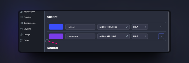
To add a new color, simply click the plus (+) icon under the last color in the group.
Adding a New Color
Removing a color is just as easy! Simply hover over the color that you would like to delete and click the mini menu (a series of 3 dots aligned vertically) to bring up the options. Here you'll see the option to delete at the bottom. You may need to click twice for confirmation.
{% hint style="danger" %}
Please keep in mind that deleted colors cannot be recovered.
{% endhint %}
Deleting a Color
## Changing Colors and Value Types
To change your color, simply click on the color itself or the value field to bring up the color picker. You can also choose between multiple color value types:
## Generating Extra Features
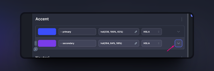
Bring up the color's extra options
By clicking on the down arrow in the color row, you will bring up extra options where you can:
1. [Generate utility classes](#id-1.-generate-utility-classes)
2. [Generate transparent variants](#id-2.-generate-transparent-variants)
3. [Generate shades](#id-3.-generate-shades)
4. [Generate tints](#id-4.-generate-tints)
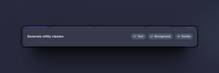
### 1. Generate Utility Classes
Generate Utility Classes Row
With each color, you will have the option to generate utility classes for text, background and borders. These will be automatically generated depending on which of the 3 items you have selected.
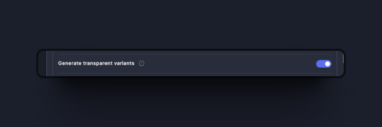
### 2. Generate Transparent Variants
Generate Transparent Variants Row
By checking this option, you can automatically generate 9 transparent variants of the selected color. If your color variable is --primary, then you can use `--primary--10` (meaning 10% transparency) through to `--primary-90`.
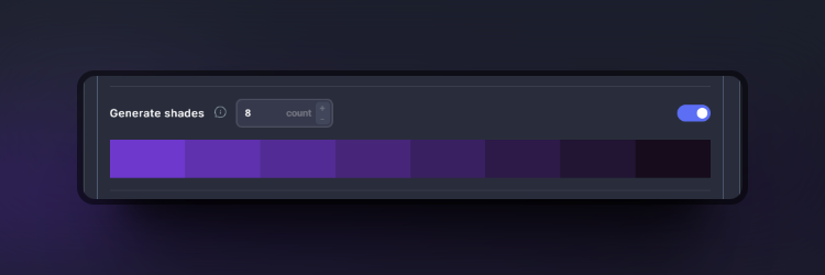
### 3. Generate Shades
Generate Shades Row
With this option enabled, you will see a dropdown showing you the shades generated from your color. You can select the amount in the count box ranging from 3 up to 10 shades.
### 4. Generate Tints
Generate Tints Row
Similarly to the shades above, you can also generate tints for your colors.
# Typography
Leverage our built-in calculators for efficient typography scaling, all automatically responsive! See the changes to your typography sizing on the fly.
## Video Overview
{% embed url="" %}
Our automatic fluid typography section is an extremely powerful tool where you can set your base settings and see all the varying sizes change on the fly. If you choose not to use the automatic sizing feature, you can even switch to the manual tab for full control 🔥
Our Automatic Fluid Typography Interface
## Base Settings
In this section, you can choose your base settings, such as the minimum base font size, maximum base font size, or even the base scale index (this is where you set which variable becomes your base, by default, this is `--text-m`). See the base highlighted in blue on the right.
Your base font size is highlighted in blue.
## Ratios
You can even choose the kind of ratio in which your text changes size, ranging from Minor Second, Major Third, Perfect Fourth, Golden Ratio, plus many more!
Select the kind of scaling ratio
{% hint style="info" %}
You can even click the edit button on the ratio section to toggle to manual mode for extra scaling control!
{% endhint %}
click the edit button on the ratio section to toggle to manual mode for extra scaling control.
## Manual Mode
We also give you complete freedom and power with our manual tab, where you can edit each variable, min-size and max-size.
These variables can even be generated into classes by clicking the tab:
Generate classes from all the typography variables!
### Info on Class Generation
{% hint style="info" %}
Note: The manual tab is disabled from the class generators.
{% endhint %}
Users have the flexibility to name variables according to their preferred naming conventions. As a result, the suffixes appended to variables may differ from the conventional designations (e.g., -s, -m, -l, -xl) utilized in our class generation logic. Consequently, we have decided to remove this feature from the manual tab.
Additionally, users are encouraged to create their own selector groups and manually assign variables to their properties.
# Spacing
Similarly to our typography section, you can use our calculators for efficient size generation, all of which are automatically responsive. See the visual representations update in real time.
## Video Overview
{% embed url="" %}
This section uses the same scaling techniques as the typography section ensuring that everything is uniform across your website.
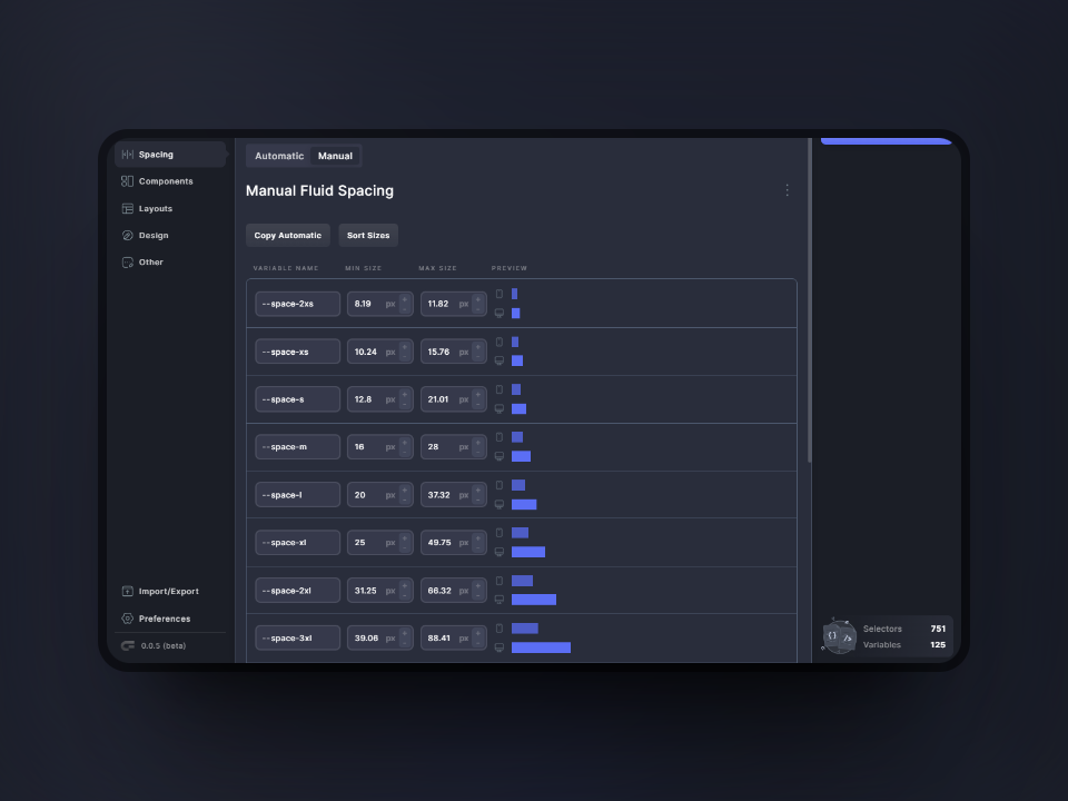
Spacing Section
## Base Settings
In this section, you can choose your base settings, such as the minimum base size, maximum base size, or even the base scale index (this is where you set which variable becomes your base, by default, this is `--space-m`). See the base highlighted in blue on the right.
## Ratios
Just like with the typography, you can choose which kind of ratio in which your sizes change, ranging from Minor Second, Major Third, Perfect Fourth, Golden Ratio, plus many more.
Select the kind of scaling ratio
{% hint style="info" %}
You can even click the edit button on the ratio section to toggle to manual mode for extra scaling control!
{% endhint %}
Click the edit button on the ratio section to toggle to manual mode for extra scaling control.
## Manual Mode
Manual Sizing Mode
Once again, you have full control should you choose to set your sizing manually. Here, you can change the name of your variables, and change their minimum and maximum sizes.
### Info on Class Generation
{% hint style="info" %}
Note: The manual tab is disabled from the class generators.
{% endhint %}
Users have the flexibility to name variables according to their preferred naming conventions. As a result, the suffixes appended to variables may differ from the conventional designations (e.g., -s, -m, -l, -xl) utilized in our class generation logic. Consequently, we have decided to remove this feature from the manual tab.
Additionally, users are encouraged to create their own selector groups and manually assign variables to their properties.
# Components
Core Framework is equipped with a component editor that allows for seamless management of reusable elements/components, providing a powerful live editor for real-time visualization.
## Video Overview
{% embed url="" %}
The components editor is where you can create reusable elements, such as buttons, link styles, cards, icons, avatars, and more. You can access each component and make edits or add modifier classes and pseudo-classes.
Here is an example of the components overview, where you can see all the components you've created in one place:
Components Editor Overview
## 1. Editing Components
To edit a component, simply click on the "Edit" button. If there are no components to edit, you can click on the plus icon to create a new one!
Creating a Component is this Easy!
When adding a new component, you can select the type from the list. Once you have added a component, it will be visible in your components section, and an edit button will become available for it. Clicking on the edit button will open up a new window where you can add modifiers and states/pseudos to the component.
### 1.1 Naming your Component Class
To customize the name of your new component, click on the base class field on the left under "default styles". You can then give it any name you like. As you type, all other instances of the name will change in real time.
Editing the class name
### 1.2 Adding Modifiers
To add a modifier to your component class, simply click on the "Add a modifier" button at the top. It will automatically be added under the "Modifiers" section:
Adding a modifier
Simply click in the field to add your modifier name to the base class.
{% hint style="info" %}
In this box, you can add a conjoining class without any spaces, such as `.btn-primary.is-large`. You can also add selectors like `.btn-primary svg`. Furthermore, you can add your own pseudo-classes, such as `.btn-primary:focus`, for unlimited flexibility!
{% endhint %}
### 1.3 Adding States
To add states or pseudo-classes, simply hover over your base class or modifier classes to see the "+State" option appear. Clicking on this option will display a list of states that you can add to your modifier classes. These states will then appear under the class.
Adding States
{% hint style="info" %}
If your components are difficult to see on our default background, then please use this button to toggle different background colors:
{% endhint %}
Clicking on this button will toggle different backgrounds
### 1.4 Deleting Modifiers and States
To delete modifiers and states, simply click on the mini menu (3 dots) and choose "Remove" from the menu:
Removing Modifiers and/or States
# Utility Classes & Vars
Core Framework allows you to create utility classes and variables in all cases. Variables are automatically generated in cases where you might reuse them, such as colors, text size and spacing!
With the flexibility of Core Framework, we offer options where you can create utility classes from variables.
In this example, the Spacing section allows you to generate 3 different sets of utility classes ranging from gap, margin, and padding:
Options to create utility classes
This will automatically create utility classes using all of the variables created from the section above it. In the CSS, you will see that many new classes have been generated.
For example, `.gap-m` will now have a value of `var(--space-m)` applied to it. Very powerful stuff! 🔥
## Creating new Groups
### Create a selector group
Creating a new group is very simple. At the bottom of the section you're in, simply click on the "Create a selector group" button. Enter a name for your group and then start adding your selectors along with the properties and values!
{% hint style="info" %}
You may notice that adding values will bring up a list of your existing variables! 🔥
{% endhint %}
Adding new selectors
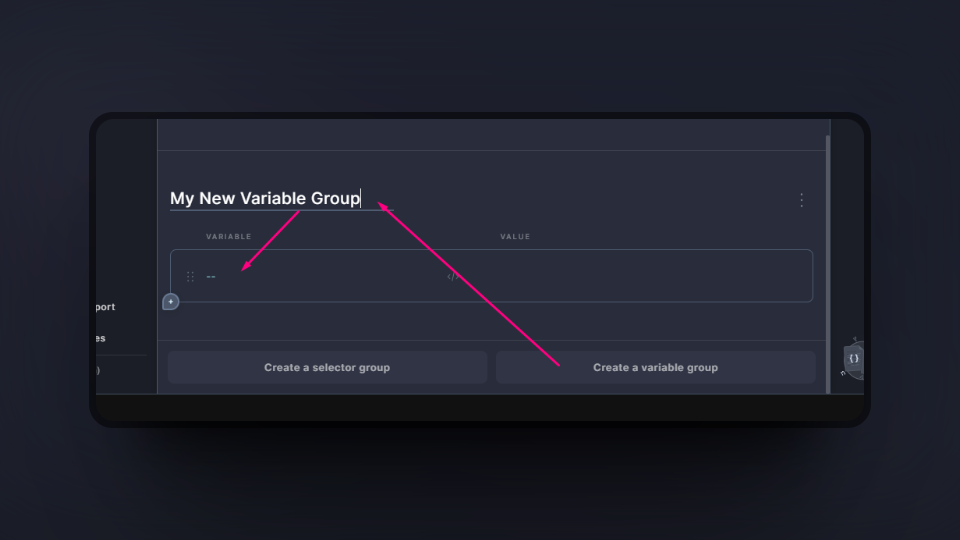
### Create a variable group
To create a new variable group, simply click on the "Create a variable group" button at the bottom right. Then, give the group a name and start adding your variables. You'll notice that your variables will always be prefixed with --.
# Breakpoints
Editing breakpoints could not be any more simple! We have made it super easy to add/edit classes and variables on literally any breakpoint, all within a few easy clicks!
## Video Overview
{% embed url="" %}
When you are editing on any breakpoint, the editing window will have a green border to indicate that you are indeed editing on a breakpoint and not editing on "All Breakpoints".
Editing on a breakpoint will turn the editing window green for easy
### Adding New Breakpoints
To add a new breakpoint of your choice, simply click on the "Add new media query" button. This will bring up a mini modal where you can select your min-width and max-width values:
Creating a New Media Query
### Adding Classes to Breakpoints
You will notice that each tab will be empty by default. Simply navigate through each tab to add classes/selectors along with their properties and values, and these will be applied to the break point you're currently on. Simple!
Then once again, go through the tabs to add your necessary classes along with their properties and values for your specific breakpoints.
# Manage project
The "Manage Project" view lets you quickly organize your framework, reorder, preview, export, import or remove every bit of the project from a single screen.
## Video Overview
{% embed url="" %}
Manage your entire CoreFramework project from a single screen
{% hint style="info" %}
Manage Project view was added in version 1.1.0
{% endhint %}
Manage project is a new view in Core Framework, that you can access from the main sidebar menu in Core Framework. This view lets you manage multiple tasks from the single view.
When you open the screen for the first time, you will see a list of groups from your project on the left half of the view.
Here you can drag and drop your groups, reorganize them easily, preview their CSS or remove them.
{% hint style="info" %}
Every change you make is auto-applied in the builder, but you still have to Save Changes, in order to make those changes live on your website
{% endhint %}
### How To Export Core Framework Projects
To export your framework, simply navigate to the "**Manage Project**" view on the left, and now you can click on the "**Export**" button in the top section. Alternatively, you can export from the "Preview CSS" view.
This will download a **.core** file which can then be used to import on other instances of Core Framework.
{% hint style="info" %}
It doesn't matter if it's the web version or the WordPress plugin version! All .core files will work regardless! 🎉
{% endhint %}
### How To Import Core Framework Projects, Groups and Components
On the right side of the "**Manage Project**" view, you can see two ways of import.
You can either import **.core** file from your computer, or use a remote import of a public project from the standalone [web app](https://coreframework.com/app).
Follow the link below to learn more about **Remote Import**:
{% content-ref url="/pages/NRjJUiVM7BFGgonS4rbu" %}
[Remote Import](/navigating-the-ui/remote-import)
{% endcontent-ref %}
Once you use your preferred way of import, you will see a list of importable groups on the right half of the view.
Import / Export
Now you can either Import the whole framework, by clicking "Overwrite All" button, or you can choose individual groups and import them by clicking a button on their left side.
Don't forget to **Save Changes** after you're done with importing, to reflect your changes in front end.
### How To Remove All Groups and Classes From The Framework
In the Manage Project view, you can now also empty out the default framework and start from scratch with your own utility classes. Use button "**Remove All**" to clear out all groups and colors from the project.
It will only keep our fluid calculators in their default settings.
# Remote Import
By utilizing our remote import feature, you can create a public URL and share your project with anyone. A recipient can preview the framework in read-only mode, or clone it to their projects.
## Video Overview
{% embed url="" %}
We go over the Remote Import in this video.
{% endembed %}
Project Management in the web app
{% hint style="info" %}
Remote import was added in version 1.1.0
{% endhint %}
Remote import is a fantastic feature, to create fileless import using a single link, which is always up to date with the original source. You can share the project with your teammates, to use it as a starter project in your team work flow. Any member of your team can now reuse the project and have an access to any changes made to the original.
If you're a seller of design kits, this feature will also come in handy as your customers can always access the latest version of the project without you having to mess with multiple files.
### How to create a shareable project for a remote import
In order to share your project using a public link,
1. Make sure you're logged in to your account and go to the [web app](https://coreframework.com/app)
2. You will see a list of your projects or you can create a new one
3. Click the icon in bottom left part of your project, to make it shareable
Click the share button, to make your project shareable
4. The modal will open, where you can set your project to be publicly shareable. Copy the link to clipboard.
Make a project shareable for a remote import
Now, your project is ready to be shared. Once you share it with someone, they can go directly to the URL and choose whether they want to preview your framework or clone it to their project.
You can also use the link the import the project into any instance of Core Framework, whether it is in your web account, or a WordPress plugin.
Insert the link of a shared project in order to import
# Preferences
On this page, you can set your important preferences such as adding your own class/variable prefixes, option to output REM units, set your min and max screen widths, root font size, plus more.
## Video Overview
{% embed url="" %}
## Project Settings
### Project Title
Give your project a title to easily identify it. This title will also be used as the file name when exporting your preset.
### Default Theme
Select the default theme for your project. Use .cf-theme-dark on the element for manual dark mode. Auto will use system preferences.
{% hint style="info" %}
If you are not seeing the selected theme being applied, please make sure to view the website from incognito, because sometimes a cookie is stored when logged in from when using the theme toggle.
{% endhint %}
## Font and Spacing
### Root Font Size
You can choose between 100% and 62.5% for the root font size. Values in fluid calculators (spacing and typography) will get automatically recalculated.
### Min Screen Width
Screen width for the minimum size in fluid calculators (spacing and typography).
### Max Screen Width
Screen width for the maximum size in fluid calculators (spacing and typography).
{% hint style="info" %}
If using a website builder, we recommend setting the max screen width the same as you have it set in your builder.
{% endhint %}
## CSS Processing
### Enable PostCSS
Use PostCSS to process the outputted CSS to automatically include vendor prefixes and fallbacks to ensure cross-browser compatibility.
{% hint style="success" %}
With PostCSS, you can write your CSS rules without vendor prefixes (in fact, forget about them entirely!)
{% endhint %}
For example, this CSS:
```css
::placeholder {
color: gray;
}
```
Automatically becomes:
```css
::-moz-placeholder {
color: gray;
}
::placeholder {
color: gray;
}
```
### Output REM Units
Pixel values in typography and spacing will get automatically recalculated and outputted in REM.
### Smooth Linear Gradients
Generates more iterations on the value to create smoother linear gradients for enhanced visual appeal.
## Prefixes and Customization
### Class Prefix
Add a custom prefix in front of all Core Framework classes, to avoid conflicts with existing classes with the same generic name.
{% hint style="danger" %}
If you decide to add class prefixes, we recommend setting this before building your website. If you have added classes to your elements and then decide to use class prefixes later, then you will need to re-add the classes to your elements!
{% endhint %}
### Variable Prefix
Add a custom prefix before every Core Framework variable (colors, spaces, and sizes), to avoid conflicts with existing variables with the same generic name.
{% hint style="danger" %}
If you decide to add variable prefixes, we recommend setting this before building your website. If you have added variables to your elements and then decide to use variable prefixes later, then you will need to re-add the variables to your elements and classes!
{% endhint %}
## Accessibility and Usability
### Disable Hover on Touch Devices
Disable hover styles on touch devices for improved user experience.
### Respect Reduced Motion
If enabled, all animations will be disabled when the user has enabled the 'Reduce motion' option in their OS settings.
### Enable Clickable Parent
Enable a clickable parent class to use on your links. This is useful for adding to card titles, which will expand the clickable area and improve accessibility. By default, this class name is `.expand-click`
{% hint style="info" %}
Please remember to set the parent wrapper to `position: relative;` so that the expansion does not go over the bounds of the wrapper.
{% endhint %}
### Disable Focusable Parent On Click
A focusable parent is added on click by default, toggle this option to turn it off.
## Readability
### Add Group Comments
Enable comments in the final stylesheet to identify and organize groups easily.
## Plugin Preferences
### Theme
Choose between a light, dark and gray theme for the Core Framework user interface.
{% hint style="info" %}
Please note that this is only for the appearance of Core Framework and not the website itself.
{% endhint %}
### Uninstall
Remove all data on uninstall, including core framework classes and colors from builders (can't be undone).
## White Labeling
### Plugin Name
Change all instances of the name of the plugin within the WordPress dashboard.
### Plugin Icon
Change the icon of the plugin, which must be an .svg file. You can reset this back to default by hovering over the icon and clicking on the red trash icon.
### Plugin Author
Change the author of the plugin located in the Plugins section.
### Plugin Description
Change the description of the plugin located in the Plugins section.
### Hide plugin
Here, you can hide the plugin completely from the WordPress menu.
{% hint style="success" %}
You can regain access by using the following path:
`yourdomainname/wp-admin/admin.php?page=core-framework`
{% endhint %}
## Reset
{% hint style="danger" %}
**Reset to default**
This option will reset the entire framework and preferences to the default settings. Please be advised that this option cannot be reversed!
{% endhint %}
# Dark Mode
Equip your sites with both light and dark color schemes in a few simple clicks. Site's color scheme can be toggled manually or automatically based on user's system preferences.
### How to set up your color palette for a dark mode
{% embed url="" %}
Making your site ready for the use of Dark Mode is straightforward and easy in Core Framework.
1. First of all, navigate to the **Colors** pane
2. Choose a color you want to alternate and expand the color settings
3. **Enable Dark Mode**
Now when your color has a dark mode enabled, you will see a second input right next to the base input for the color. That's where you choose the secondary color for a dark mode.
{% hint style="info" %}
Not every color requires to have a dark mode enabled. Colors that don't have the option enabled will display the same color in both modes.
{% endhint %}
### How to switch the color mode on the front end
After your color palette is set up, you can choose a method for switching the color mode.
Head over to the **Preferences** pane, and look for the **Dark Theme** option, where you can choose from:
1. Automatic
2. Light (Default option)
3. Dark
The automatic method will auto-choose light or dark scheme for the user, based on their system preferences.
If you choose a light or a dark option, the selected color palette will be displayed all the time, until you switch theme manually.
### How to switch the color mode manually
If you're using one of our add-ons for [Oxygen Builder](https://coreframework.com/marketplace/oxygen-builder-addon) and [Bricks Builder](https://coreframework.com/marketplace/bricks-builder-addon), we've included a custom toggle element that you can use and edit directly in the builder.
You can also manually switch the theme not only for the full site, but also specific sections or divs.
There are 2 classes that are handling themes:
* `.cf-theme-dark`
* `.theme-inverted`
If you want to switch your entire site to a dark mode, the `.cf-theme-dark` class needs to be added to the `HTML` root element. Remove it to switch back to the light theme.
If you want to switch just a single section, add a class `.theme-inverted` to it. Thanks to this flexible feature, you can alternate color palettes of your sections using a single class.
Furthermore, we understand that some specific elements and/or sections should never alternate between light and dark mode when toggling, so we have introduced to new classes in version 1.6:
* `.theme-always-light`
* `.theme-always-dark`
{% hint style="info" %}
If you apply one of these classes to a parent element, but you're still seeing child content change when toggling, then you will need to make sure those elements are also using correct variables/classes.
{% endhint %}
# Grid System
With Core Framework's default preset, we have set up a convenient way for you to use CSS grid on your websites. Take full control and manipulate it in many ways across different devices.
### The Basics
By default, on all breakpoints, we have added numerous classes which you can use to create your CSS grids. As for the amount of columns you can have, by default, we have added 8 which are as follows:
* `.column`
* `.columns-2`
* `.columns-3`
* `.columns-4`
* `.columns-5`
* `.columns-6`
* `.columns-7`
* `.columns-8`
Here is a basic example, a container `
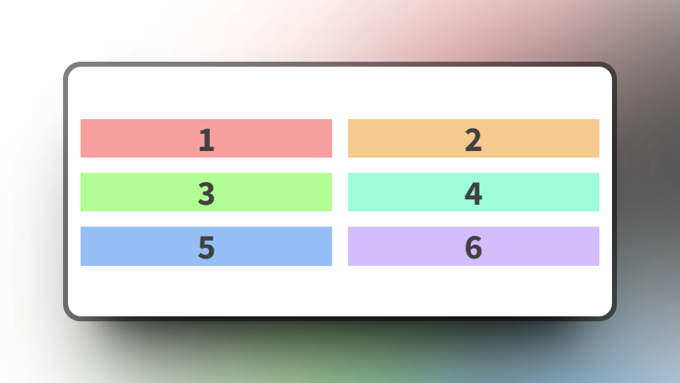
` with 6 elements inside of it. To display this as 3 columns, we can simply apply the `.columns-3` class. (The full class list to achieve the result as in the screenshot is as follows: `.columns-3, .gap-m, .full-width`).
Next, let's say we want this to collapse to two columns on the tablet device, and then to one column on smartphones. First, let's take a look at the breakpoints available to us:
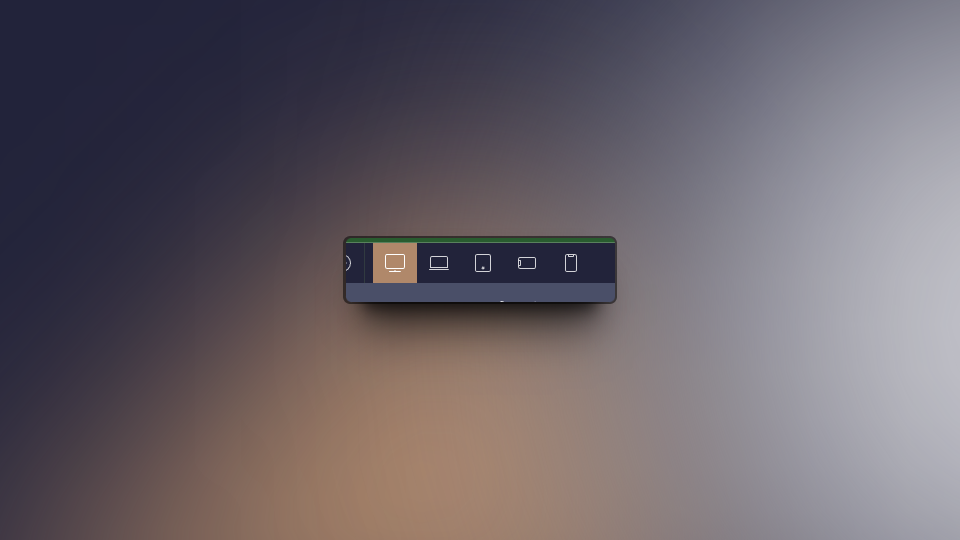
Icons showing the available breakpoints.
For quick reference, from right to left <- remember it like this: Small (s), Medium (m), Large (l), Extra Large (xl), All Breakpoints. This is important because it will help you remember which breakpoint is which when adding classes.
We have conveniently added suffixes to our classes for easy memorization. These are:
* `--on-s`
* `--on-m`
* `--on-l`
* `--on-xl`
So, to continue with the above scenario, we now know that we want the columns to break down to two on the tablet (Large) and then one column on smartphones (Small). So, let's add the following classes: `.columns-2--on-l, .column--on-s`
The columns have collapsed to two on the L breakpoint.
As you can see, we are simply adding new classes with their respective suffix so that we can manipulate the elements on different breakpoints.
{% hint style="warning" %}
Please note that when adding your breakpoints in Core Framework, it is important that the values of max-width match how they're set up in your builder as well.
{% endhint %}
Breakpoints setup in Core Framework
Breakpoints setup in Oxygen Builder
### Row Span
Next, let's say we want to span an element across two rows. This is as easy as adding a class to the element you would like to span.
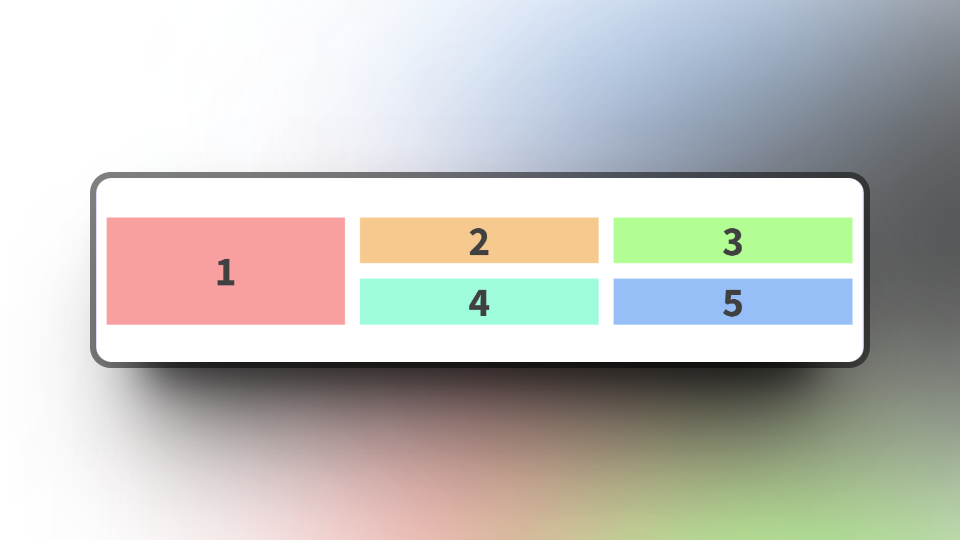
Taking the above example, let's span the first element across both rows:
First element spanning 2 rows.
To achieve this, simply add the `.row-span-2` class to the element you would like to span.
{% hint style="info" %}
You may need to add a height of 100% to the element so that it spans the whole height.
{% endhint %}
Remember, on the tablet devices (L breakpoint), we may need to fix this up a little since in our previous example we made it become 2 columns. Currently, here is how it looks:
How our example looks on the L breakpoint
Let's say we want to set it back to default (no spanning) on tablets and below. We can simply add a new class to our first column. In this case, let's add the `.row-span-1--on-l` class. We are once again using the suffixes here.
With the new class added, you can see the first column now spans only 1 row on the L breakpoint.
### Col Span
This works just like the row span. We can add classes to the elements that we wish to span on columns. Let's set a new base example using 4 columns on all breakpoints:
Here is an element with 4 columns and 2 rows.
Now, let's imagine we would like the element labelled "2" to span across 2 columns, then we can simply add the `.col-span-2` to the element:
The second element is now spanning across 2 columns
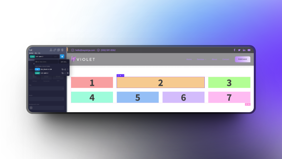
Now, let's go one step further and make the same element span across 2 rows as well. We can add the same class as in the previous section; `.row-span-2` to the same element:
The second element is now spanning 2 columns and 2 rows
On the L breakpoint, you will notice an issue. Since we are collapsing to 2 columns on the L breakpoint, this is how it looks:
An undesirable layout on the L breakpoint
To fix this, we can add some classes for the L breakpoint. In essence, we will simply reset that element for the large breakpoint.
Let's add the following classes to the element: `.col-span-1--on-l` and `.row-span-1--on-l`
We have fixed the layout with complete ease.
As you can see, we are making the element span only 1 on both column and row, and by using the `--on-l` suffix, this applies to the L breakpoint and lower.
# Filters
### Exclude pages - `core_framework_exclude_pages`
This filter enables you to prevent the loading of the Core Framework stylesheet on front-end pages. Here's how to use it:
add_filter('core_framework_exclude_pages', function($pages) {
    $pages[] = 3; // post id
    $pages[] = "privacy-policy"; // page slugs
    return $pages;
});
# Buying Products
The Marketplace provides a centralized platform for users to explore and purchase a variety of web design products such as website kits as well as our very own integration addons.
## **Introduction**
The Core Framework Marketplace serves as a hub for purchasing high-quality design products that are compatible with various web builders. This guide will walk you through the process of navigating the marketplace, selecting products, and completing your purchase securely.
## **Navigating the Marketplace**
1. **Accessing the Marketplace**: Start by logging into your Core Framework account and navigating to the [Marketplace](https://coreframework.com/marketplace).
2. **Browsing Products**: We offer addons & integrations for Oxygen Builder, Bricks Builder and Gutenberg, as well as UI Kits & Templates which you can use to quickly develop a baseline website for yourself or your clients.
## **Selecting Products**
1. **Product Details**: Click on any product to view detailed information, including full descriptions, compatibility details and pricing.
2. **Bundles**: We offer some bundle products on our UI Kits & Templates when using with multiple builders, which will be offered cheaper than buying them separately.
## **Purchasing Process**
1. **Buy Now**: Once you decide on a product, simply click on 'Buy Now' which will automatically take you to the checkout page.
2. **Checkout**: Review your product and enter a promotional code. Please note that we only offer promotional codes under special circumstances and these are not given out commonly.
{% hint style="info" %}
Please note that we only accept card payments at this time.
{% endhint %}
1. **Payment Method**: Enter your payment information in the right-hand column.
2. **Order Confirmation**: After payment, you will receive an order confirmation via email along with a download link (if applicable).
## **After Purchase**
1. **Downloading and Installation**: For downloadable products, follow the provided instructions from the email that you will receive to download and install them.
2. **Getting Support**: If you encounter any issues, each product comes with support options—either from the Core Framework team or directly from the product developers.
## **Tips for a Smooth Transaction**
* **Check Compatibility**: Ensure the product is compatible with your current website setup.
* **Stay Informed**: Subscribe to updates for any purchased products to receive notifications about updates or new features.
## **Conclusion**
The Marketplace in the Core Framework is designed to be user-friendly, providing all the tools needed to enhance your web development projects. By following these steps, you can effectively utilize the Marketplace to expand the capabilities of your websites and applications.
# Become an Author
The "Become an Author" section in the Core Framework Marketplace is dedicated to individuals looking to sell their own UI Kits, templates, and other design products.
{% hint style="info" %}
The platform for authors was just launched and is currently in BETA. This page will be soon updated with more details.
{% endhint %}
A screenshot of the Become an Author page.
This platform provides a unique opportunity for creators to reach a wide audience of web developers and designers, enhancing your visibility and monetization potential.
## **Introduction**
Joining the Core Framework Marketplace as an author allows you to contribute your own design creations, such as UI Kits and templates, and profit from your skills and creativity. This guide will help you understand the process of becoming an author, from application to selling.
{% hint style="info" %}
We highly recommend you to check out our [Author Guidelines](/marketplace/author-guidelines) article before applying to become an author as it contains important information.
{% endhint %}
## **Author Application Process**
Click on the 'Become an Author' link available on the dashboard page.
1. **Become an Author:** Becoming an author is as simple as clicking on the '[Become an Author](https://coreframework.com/dashboard/marketplace-submissions)' link from your Dashboard.
2. **Eligibility and Requirements**: [Review the criteria](/marketplace/author-guidelines) for becoming an author, which includes understanding of Core Framework, and the quality standards required for your submissions.
3. **Registration**: Complete the author registration form on the Marketplace and follow the instructions, providing details about yourself and other important information.
## **Preparing Your Products**
1. **Product Standards**: Ensure your products meet the high-quality standards set by Core Framework, including design, functionality, and compatibility.
2. **Documentation**: Create comprehensive documentation for each product, guiding users on how to install and use the templates effectively.
3. **Pricing Your Products**: Set competitive prices for your products considering the value, complexity, and potential market demand.
## **Submission and Approval**
1. **Product Submission**: Upload your products along with the necessary documentation and previews.
2. **Review Process**: Wait for the Core Framework review team to evaluate your submissions. This may include feedback and requests for modifications.
3. **Approval**: Once approved, your products will be listed as approved on your dashboard.
4. **Publish Product:** The final step will be to publish your approved product and then it will be displayed publicly on the marketplace.
{% hint style="info" %}
It may take a few minutes for the product to show up on the marketplace.
{% endhint %}
Remember to Publish your product after it's approved!
## Seller Dashboard
The seller dashboard will provide you with an overview of your earnings, your products, and a link to your payouts. You will need to connect your Stripe account so that you can initiate your payouts.
A screenshot of the Author dashboard overview.
## Edit Store Profile
1. You can edit your store profile at any time. Here, you can set your profile image, front-facing name (which will be shown to your customers), and description.
{% hint style="info" %}
Although you can change the name of you store the URL will remain the same. You can change the URL by contacting support.
{% endhint %}
Screenshot showing the Edit Store Profile page.
## **Benefits of Becoming an Author**
* **Revenue Sharing**: Understand the revenue model, including commission rates and payment schedules.
* **Community Engagement**: Engage with other designers and potential customers to receive feedback and foster a following.
* **Profile Building**: Enhance your professional profile by showcasing your work on a recognized platform.
## **Conclusion**
Becoming an author on the Core Framework Marketplace opens up new opportunities for professional growth and financial gains. By adhering to the guidelines and actively engaging with the community, you can successfully sell your designs and build a reputation in the web development industry.
# Author Guidelines
Happy to have you here! Before you submit your product to the marketplace, please read and comply with the following guidelines.
## General guidelines for authors
1. At the moment, we only accept sellers from the following countries: Austria, Belgium, Bulgaria, Croatia, Cyprus, Czech Republic, Denmark, Estonia, Finland, France, Germany, Gibraltar, Greece, Hungary, Ireland, Italy, Latvia, Liechtenstein, Lithuania, Luxembourg, Malta, Netherlands, Norway, Poland, Portugal, Romania, Slovakia, Slovenia, Spain, Sweden, Switzerland, United Kingdom.
2. The commission split is **70 / 30**, meaning Core Framework will keep 30% of the sale, and 70% is paid out to the author's bank account.
3. You can sign up for access to the **Author's Area** from your **Dashboard**. You will be asked for the name and the portfolio link. The marketplace is moderated and we reserve the right to approve or deny any application.
4. After your application is approved, you will be informed via your account email and you can go ahead to set up your store and a **connected Stripe** account for payout handling.
5. Once your store and a Stripe account are created and verified, you will get full access to the **Author's Area**, where you can create new products, manage existing ones, edit your store, and see basic reporting about your sales.
6. When creating a new product, it can be either saved as a draft or submitted for review. Once you submit the product for review, it can take up to 7 days for approval.
7. We can either approve the product, which would publish it to the marketplace right away, or deny it and ask you for a revision of either your product or the product description.
8. Seller accounts and payouts are handled through the Stripe Connect platform, which will process your payouts every day, after 14 days from the sale, and you can directly manage your payouts from the Stripe Connect Express dashboard.
9. If the purchase has to be canceled due to a refund or other external circumstances, the sale commission is not paid.
10. An author is expected to provide basic email support for 12 months from the sale.
11. If an author is unresponsive to the buyer's support requests and our warnings for more than 14 days, the account will be terminated.
### Product Guidelines
We don't have many guidelines for your product but cross-compatibility is a key. Make sure that your product will be compatible with other sites that already use Core Framework. An easy test is to load your design with a default Core Framework setup - it can't break.
Therefore we have a few rules in place to follow in your product submission:
1. Use a default framework naming convention
2. Don't use prefixes
3. We don't allow mobile-first builds, at the moment
4. Don't remove anything from your framework, rather style it to your design
5. If you use BEM classes, create them directly in the HTML / page builder and use Core Framework variables inside. Do not add BEM classes to the Core Framework project file.
# Blocks
Blocks is the official Core Framework wireframe kit featuring BEM, A11Y and Global Components - all set up for you! Perfect for rapid web design.
**✅ Features:**
* 300+ pre-built, design-ready layouts.
* Focus on accessibility, BEM classes, and clean HTML structure.
* Takes full advantage of the Core Framework utility classes, variables & components.
* Dark and Light theme-ready out of the box.
* Easily customizable and responsive by design.
* Works out of the box with default Core Framework settings (.core project optional).
* WooCommerce layouts (Coming Soon!)
* Will be continually updated with new layouts.
## Setup 🛠️
To use Blocks, you need to have Bricks Builder and Core Framework installed and activated. Follow the steps below to get started:
1. Install and activate the Bricks Builder theme.
2. Install and activate the Core Framework plugin with default mode (full experience).
3. Activate the Bricks Builder addon under **Core Framework** -> **Addons**.
4. Go to Bricks → Settings → Templates and enter the URL and Password in the Remote templates section.
5. Open a page or template in Bricks and check that you can access the Remote templates.
**Additional steps to make sure everything else works smoothly:**
* **SVG**: To make sure that sections with SVGs work correctly, please make sure to enable SVG uploads for **Administrator** in **Bricks** -> **Settings** -> **General**.
* **Code**: To make sure that sections with custom code work correctly, please enable **Code Execution** under **Bricks** -> **Custom Code**.
**Blocks is now set up and ready to go! ✅** 🎉
***
## Anatomy of Blocks 🫀
Blocks embraces a hybrid approach to web design with a thoughtful combination of utility classes, variables and BEM methodology in an effort to strike a perfect balance between consistency, customization, modularity, and maintainability, ultimately enhancing your design and development experience.
### Components
#### Core Framework Components
Blocks utilizes Core Framework’s native Components as much as possible so that you can tweak your styles from within the Core Framework dashboard. These include button, badge, card, icon, link, avatar, divider and input etc.
These components have default Core Framework styles out of the box that you can tweak inside Core Framework dashboard.
#### Custom Components
Blocks comes with a variety of reusable global components with custom BEM classes that can be reused across your designs. These include:
Accordion
**`.line-accordion`**
**`.box-accordion`**
**`.accordion__title`**
**`.accordion__icon`**
Author
**`.author-wrapper`**
**`.author__meta`**
**`.author__name`**
**`.author__title`**
**`.meta-wrapper`**
Background
**`.bg-wrapper`**
**`.bg-img`**
Button Wrapper
**`.btn-wrapper`**
Blur
**`--blur-horizontal`**
**`--blur-vertical`**
**`--blur-right`**
**`--blur-left`**
**`--blur-top`**
**`--blur-bottom`**
Divider
**`.divider-horizontal`**
**`.divider-dot`**
Card
**`.cards-wrapper`**
**`.card-wrapper`**
**`.card__heading`**
**`.card__info`**
**`.card__link-wrapper`**
Counter
**`.counters-wrapper`**
**`.counter-wrapper`**
**`.counter`**
**`.counter__info`**
**`.counter__description`**
Icon
**`.icon-wrapper`**
List
**`.icon-list`**
**`.info-list`**
Link
**`.link-wrapper`**
Logo
**`.logo`**
Map
**`.map-wrapper`**
**`.map`**
Form
**`.form`**
**`.form-terms`**
Sliders
**`.slider-wrapper`**
**`.slider`**
**`.slider__slide`**
**`.slider—overflow`**
**`.img-slider`**
**`.img-slider--round`**
**`.overlay-slider`**
**`.overlay-slide`**
**`.content-slider`**
**`.card-slider`**
**`.card-slide`**
**`.card-slide--bg`**
**`.sync-sliders`**
**`.main-slider`**
**`.thumb-slider`**
Tabs
**`.pill-tabs`**
**`.pill-tabs__menu`**
**`.pill-tabs__menu-item`**
**`.pill-tabs__content`**
**`.pill-tabs__pane`**
**`.box-tabs`**
**`.box-tabs__menu`**
**`.box-tabs__menu-item`**
**`.box-tabs__content`**
**`.box-tabs__pane`**
**`.bar-tabs`**
**`.bar-tabs__menu`**
**`.bar-tabs__menu-item`**
**`.bar-tabs__content`**
**`.bar-tabs__pane`**
**`.border-tabs`**
**`.border-tabs__menu`**
**`.border-tabs__menu-item`**
**`.border-tabs__content`**
**`.border-tabs__pane`**
Table
**`.table-wrapper`**
**`.table`**
**`.table__thead`**
**`.table__tbody`**
**`.table__tr`**
**`.table__th`**
**`.table__td`**
**`.table__heading`**
**`.table__text`**
**`.table__icon`**
**`.scroll-instruction-wrapper`**
**`.scroll-instruction__icon`**
**`.scroll-instruction__text`**
Tooltip
**`.tooltip`**
**`.tooltip__text`**
**`.tooltip__icon`**
Toggle
**`.toggle-switch`**
**`.toggle-btn`**
**`.toggle-btn__dot`**
**`.toggle-btn__dot--active`**
**`.toggle__text`**
**`.toggle__text--active`**
**`.toggle__content`**
**`.toggle__content--active`**
Profile
**`.profile`**
**`.profile__avatar`**
**`.profile__meta`**
**`.profile__name`**
**`.profile__title`**
**`.profile__icons`**
**`.profile__img`**
**`.profile__info`**
**`.profile-hover`**
**`.profile-hover__meta`**
Review
**`.review-wrapper`**
**`.review`**
**`.blockquote`**
Rating
**`.rating`**
**`.rating__star`**
Steps
**`.steps-wrapper`**
**`.step-card`**
**`.step__number`**
**`.step__info`**
Stack
**`.stack-cards`**
**`.stack-cards__item`**
### Utility Classes & Variables
#### Core Framework Utility Classes & Variables
Blocks utilizes Core Framework’s default utility classes and variables to take full advantage of our powerful live editor, allowing you to visually control every aspect of your project with Core Framework dashboard.
#### Custom BEM Classes
In combination with Core Framework's built-in utility classes and variables, Blocks is equipped with custom BEM classes, providing a more scalable, maintainable, and flexible approach for your web projects compared to relying solely on utility classes.
## WooCommerce
If you are using WooCommerce elements, then we highly recommend adding a specific setting inside of Bricks. Some of our **Add to Cart** buttons are styled in a way where this is the optimal setting to use.
Kindly navigate to **Bricks -> Settings -> WooCommerce** tab.
Then, at the bottom, toggle on the **AJAX Add to cart** option, **hide "View cart"** option, and **Show notice** option:
## Section-Specific Guides and Tips 💡
We have designed almost all of the sections in such a way that there’s little to no edits required on your part. However, there may be some exceptions where you need to tweak some things in order to make things work the way you need. We will discuss some of these instances below:
### Headers
#### Header 4
Header 4 features a centred logo with the nav menu split in two parts. The menu needs to have even number of items and behaves like a traditional menu on mobile.
**Limitations:**
1. The menu needs to have even number of items (2, 4, 6, 8, etc)
2. The menu behaves like a traditional menu on mobile.
**Here's the custom CSS that makes the magic happen:**
```css
/* Center Logo */
%root%.brxe-nav-menu, .bricks-nav-menu-wrapper, .bricks-nav-menu {
display: contents;
}
/* Target nav menu items on the left of logo */
%root% li:nth-of-type(-n + 2) {
order: 1;
}
/* Target nav menu items on the right of logo */
%root% li:nth-of-type(n + 3) {
order: 3;
}
```
This CSS is applied to the custom class **`.header__menu-split`**
**Explanation:**
With the logo set to order 2. Order 1 and 3 above defines the order of the nav items to the left (1) and right (3) of the logo.
The **`(-n + "number")`** targets nav menu items to the left of the logo and **`(n + "number")`** targets nav menu items to the right of the logo.
The CSS above works for menus with 4 links. If your menu has a total of 6 links, simply use **`(-n + 3)`** and **`(n + 4)` to make it work.**
#### Header 5
Header 5 features a dynamic nav menu with the last link that should look like a button. For that, the last menu item needs to have a **`.btn`** class.
**Step by Step Guide:**
* In your WordPress dashboard, go to **Appearance** -> **Menus**
* Click on **Screen Options** on the top right of your screen and check **CSS Classes** under **Show advanced menu properties**. This will enable the CSS Classes input field under menu item settings.
* Now add your desired Core Framework button class to the last menu item inside the CSS Classes (optional) input field without the dots, i.e. **`btn`**.
#### Header 7
This header is made specifically with WooCommerce in mind, and this includes a cart as well as a search bar. For this header, we use the free plugin **FiboSearch - AJAX Search for WooCommerce. This is an amazing plugin which lots of flexibility.** Not only does it looks great, and is highly responsive bringing you product search results in real time. Kindly [install this from the WordPress repository](https://wordpress.org/plugins/ajax-search-for-woocommerce/) and apply the following settings to get the same result as our Header 7 example:
Once installed, navigate to **WooCommerce -> FiboSearch.**
At the top, toggle on "**Show advanced settings**" and then click on the **Search bar** tab.
Kindly match your settings to the image below:
And that's it! We have included all necessary styles in the templates so there is nothing else to do! However, you are free to edit the options in the **Autocomplete** and **Search config** tabs to suit your store's needs!
### Stats
#### Stats 17
The Stats 17 section contains animated progress bars in both linear and radial fashion, and all of these stats are dynamic.
These stats are controlled on the "progress" element containing the class `.stats-17__progress` by editing the data attribute `data-value` applied to them.
### Stacking Elements
For sections with stacked cards (cards stack on each other on vertical scroll), we’ve added two extra sections on top and bottom named “HEIGHT FOR DEMO” in the structure panel for demo purposes since they need some space on top and bottom to work properly. Feel free to remove these sections after you import your layouts that have stacked cards.
### Sliders
To ensure optimal functionality of our slider elements, which utilize the Bricks slider component, Slider (Nestable), powered by Splide, please follow the detailed steps below. We have identified an issue with the speed control when using the autoscroll feature within Bricks’ options. The following instructions will guide you in configuring Bricks’ Slider for the desired performance.
#### Step-by-Step Guide to Configure Bricks' Slider with Splide Auto Control
1. **Include the Splide Extension Auto Scroll Script**
On the page containing your Slider element, insert a code block before the Slider element with the following code:
```html
```
{% hint style="danger" %}
Replace 'your-slider-id' with the actual ID of your Slider element. To find the ID, click on the Slider element in Bricks and check the ID, which will be in the format #brxe-c9f28f. In this case, we would use c9f28f as the ID in the code.
{% endhint %}
2. Configure Custom Options in Bricks
After adding the code block, we will now configure the Slider element in Bricks:
* Click on the Slider element.
* Navigate to **Options** and set the **Options type** to **Custom**.
* In the **Custom options** box, add the desired options for the Splide (Slider) element. Below is an example configuration used on our showcase website:
```json
{
"type": "loop",
"perPage": 3,
"height": "auto",
"gap": "var(--space-m)",
"pagination": false,
"arrows": false,
"autoScroll": {
"speed": 0.3
},
"breakpoints": {
"767":{
"perPage": 2
},
"476":{
"perPage": 1
}
}
}
```
For a full list of Splide options, [please visit this page](https://splidejs.com/guides/options/#options). By following these steps, you will ensure that the Bricks’ Slider component operates smoothly with the desired autoscroll speed control.
### Duplicate Sliders
Please note that if there are 2 sync sliders on the same page, one of them might not work as they have some shared BEM classes. In that case, you will need to edit and replace classes in the code and the relevant slider elements.
### Tables
Sections with tables have a custom scroll instruction element that is set to display on mobile landscape and below only since the table container is set to be **`overflow: auto`** in order to make the table mobile responsive.
### Maps
For sections that contain a map, we are using iframe embeds instead of the Google Maps API. You can avoid the API dependency by simply embedding the map by following these steps:
1. Find any location on Google Maps and click the share button.
2. Copy the iframe HTML code from Embed a map tab.
3. Paste the code into the code element with class **`.map`**
### Query Loops
Blog and Single Post sections are query loop compatible to be dynamic data ready out of the box. In order for them to be displayed properly on your site, you need the required WordPress content and may need to tweak the query loop settings according to your needs. Please refer to Bricks builder’s guides on [Dynamic Data](https://academy.bricksbuilder.io/article/dynamic-data/) and [Query Loop](https://academy.bricksbuilder.io/article/query-loop/) for more details.
### Custom Code Blocks
When you import any layout with custom code, you’ll be required to sign the code to execute it. This is a code security measure by Bricks which you can read more on [here](https://academy.bricksbuilder.io/article/code-signatures/).
# CoreKit
Reintroducing Core as CoreKit - The original OxyNinja's design set library is now powered by Core Framework.
Meet the ultimate **UI Kit** for Core Framework, featuring 170+ modern sections to rapidly build sleek and beautiful websites. It includes a comprehensive collection of visually stunning pre-designed layouts, sections, and components that are ready for use in production right out of the box.
**✅ Features:**
* 170+ pre-designed original layouts and sections across headers, footers, mega menus, heros, features, CTAs, blogs, and more.
* Takes full advantage of the Core Framework utility classes and utility variables.
* Beautiful yet minimal by default.
* Dark and light theme-ready out of the box.
* Easily customizable and responsive by design.
* Ready to import templates for blog archives and single posts
* Trusted by thousands of users since 2020.
## Installation Guide for Oxygen 🟪
{% hint style="danger" %}
If you are using CoreKit for Oxygen Builder, then you will need to have purchased the [Oxygen Integration addon](https://coreframework.com/marketplace/oxygen-builder-addon).
{% endhint %}
### 1. Oxygen Builder
Please make sure you have installed and activated Oxygen Builder. You will need to navigate to **Oxygen** → **Settings** → **Library** → set '**Enable 3rd Party Design Sets**' → **Add Design Set** → and paste in your CoreKit site key before clicking on 'Add Source Site'.
### 2. Core Framework
1. Please install and activate the Core Framework plugin. Be sure to choose the Full experience option during onboarding.
2. Next, kindly navigate to **Core Framework** → **Addons** and enter your license key for Oxygen Builder Core Framework add-on. Don't forget to hit '**Save Changes'**.
3. Then, navigate to **Core Framework** → **Manage Project**. Here, you can import the **CoreKit.core** project file. Click '**Overwrite**' and then '**Save Changes'**.
Import the .core file, click overwrite all, and don't forget to hit 'Save Changes'
### 3. Import Global Styles
In order to streamline your setup, please use our blueprint Global Styles file for Oxygen Builder so that the necessary styles are applied globally. You can do this by navigating to the Oxygen Export & Import section under Oxygen from the WordPress dashboard and copying the JSON from our blueprint.
{% hint style="info" %}
[Please find our blueprint JSON here and instructions on how to import.](https://docs.coreframework.com/builder-integrations/oxygen-builder#option-1-import-our-blueprint)
{% endhint %}
### 4. Blog Templates
When adding blog templates, you will need to make sure that you have the correct settings applied. There are two main blog types: **Blog Archive template**, which generally displays all of your blog posts on the page, and **Single Blog template**, which is the layout of a single blog post.
#### Blog Archive Template
To add a blog archive, add a new Oxygen Template by navigating to **Oxygen -> Templates -> Add New Template**. Give it an appropriate name, such as 'Blog Archive', and make sure to inherit your Main template. Then, under **Archive,** check **Post Types** and add **Posts:**
This is how your settings should look for the Blog Archive.
{% hint style="warning" %}
**Regarding Pagination:** a blog archive may sometimes have pagination. If you are using pagination, then it is important that your Repeater element is set to 'Default' for the query.
{% endhint %}
#### Single Blog Template
To add a Single Blog template, once again, let's add a new template by navigating to **Oxygen -> Templates -> Add New Template**. Give it an appropriate name, such as 'Single Blog', and make sure to inherit your Main template. Then, under **Singular,** check **Posts:**
This is how your settings should look for the Single Blog template.
#### Importing the Templates
Finally, you can choose the appropriate templates from CoreKit's Design Set to add to these templates, which will be located inside Oxygen Builder by navigating to **Add Element -> Library -> Design Sets -> CoreKit - CF -> Templates**.
## Installation Guide for Bricks 🟨
{% hint style="danger" %}
If you are using CoreKit for Bricks Builder, then you will need to have purchased the [Bricks Integration addon](https://coreframework.com/marketplace/bricks-builder-addon).
{% endhint %}
### 1. Bricks Builder
Please make sure you have installed and activated Bricks Builder. Then, navigate to **Bricks -> Settings -> Templates** -> Enter the **URL** and **Password** in the Remote templates section. We also recommend using '**CoreKit**' in the Name field. Be sure to click on **Save Settings**.
Another important step is to ensure you have **SVG Uploads** enabled in the Bricks Builder settings. Kindly navigate to **Bricks -> Settings -> General Tab**, and make sure **Administrator** is checked. This is important when it comes to importing templates containing .svg elements.
Ensure Administrator is checked on this section.
### 2. Core Framework
1. Please install and activate the Core Framework plugin. Be sure to choose the Full experience option during onboarding.
2. Next, kindly navigate to **Core Framework** → **Addons** and enter your license key for the Bricks Builder Integration add-on. Don't forget to hit '**Save Changes'**.
3. Then, navigate to **Core Framework** → **Manage Project**. Here, you can import the **CoreKit.core** project file. Click '**Overwrite**' and then '**Save Changes'**.
Import the .core file, click overwrite all, and don't forget to hit 'Save Changes'
### 3. Import Theme Styles
In order to streamline your setup, please use our blueprint Theme Styles file for Bricks Builder so that the necessary styles are applied globally. Please follow the instructions on the page linked below:
{% hint style="info" %}
[Please find our blueprint JSON here and instructions on how to import.](https://docs.coreframework.com/builder-integrations/bricks-builder#option-1-import-our-blueprint)
{% endhint %}
## Fluent Forms
The contact forms included in our sections make use of Fluent Forms. We therefore recommend having this plugin installed so that you can make use of the forms right away! Fluent Forms offer a free version of their plugin which will work just as well.
## CoreKit Counter Sections
CoreKit includes sections featuring counters that utilize JavaScript for animated counting from 0 to a specified target number.
To implement these counters, assign the class `.counter-display` to the counting element, as this is recognized by the JavaScript. Set your target number by adding a `data-value` attribute to the element and specifying the desired target number as its value.
In this example, we have set the target number to 500.
{% hint style="success" %}
The sections already come with the attributes attached, so you can simply change the values to anything you like.
{% endhint %}
## Custom Code for Excerpt Length
In our own blog archive and blog single templates, our excerpts are a little shorter than the default value of 55 words. In our examples, we are using a value of 20. To implement your own custom value, you can use the code snippet that we are using below. Simply paste this into a code editor, such as [Fluent Snippets](https://wordpress.org/plugins/easy-code-manager/) (free), to customize your excerpt length!
```php
add_filter( 'excerpt_length', 'custom_excerpt_length', 999 );
/**
* Change the length of excerpt.
*
* @param int $length The number of words. Default 55.
* @return int New excerpt length.
*/
function custom_excerpt_length( $length ) {
return 20; // number of words. Default is 55.
}
```
# Violet
Violet is a versatile design set for Core Framework, featuring 150+ unique sections. It offers both a dark and light theme out of the box and includes a number of advanced sections.
Meet the expansive **Violet UI Kit** for Core Framework, featuring multitude of modern sections to rapidly build sleek and beautiful websites. This kit boasts expandable navigation elements, JavaScript-based progress bars, and customizable tags using data attributes.
**✅ Features:**
* Expandable Navigations
* Animated Progress Bars
* Editable Tags using Data Attributes
* Mega Menus
## Video Installation Guide
{% embed url="" %}
Step by step instructions to set up and install Violet.
{% endembed %}
## Installation Guide for Oxygen 🟪
{% hint style="danger" %}
If you are using Violet for Oxygen Builder, then you will need to have purchased the [Oxygen Integration addon](https://coreframework.com/marketplace/oxygen-builder-addon).
{% endhint %}
### 1. Oxygen Builder
Please make sure you have installed and activated Oxygen Builder. You will need to navigate to **Oxygen** → **Settings** → **Library** → set '**Enable 3rd Party Design Sets**' → **Add Design Set** → and paste in your Violet site key before clicking on 'Add Source Site'.
### 2. Core Framework
1. Please install and activate the Core Framework plugin. Be sure to choose the Full experience option during onboarding.
2. Next, kindly navigate to **Core Framework** → **Addons** and enter your license key for the Oxygen Builder Integration add-on. Don't forget to hit '**Save Changes'**.
3. Then, navigate to **Core Framework** → **Manage Project**. Here, you can import the **Violet.core** project file. Click '**Overwrite**' and then '**Save Changes'**.
Import the .core file, click overwrite all, and don't forget to hit 'Save Changes'
### 3. Import Global Styles
In order to streamline your setup, please use our blueprint Global Styles file for Oxygen Builder so that the necessary styles are applied globally. You can do this by navigating to the Oxygen Export & Import section under Oxygen from the WordPress dashboard and copying the JSON from our blueprint.
{% hint style="info" %}
[Please find our blueprint JSON here and instructions on how to import.](https://docs.coreframework.com/builder-integrations/oxygen-builder#option-1-import-our-blueprint)
{% endhint %}
### 4. Create a Global Stylesheet
Please go ahead and create a Global Stylesheet either in the Oxygen Builder (Stylesheet -> Add Stylesheet) and name it something like Violet-Styles, or you can use a code editor such as WPCodeBox. Whatever you choose, please add the CSS below so that some imported sections can work as intended.
```css
.text-link--icon-right > .ct-fancy-icon {
transition: transform 0.4s;
}
.text-link--icon-right:hover > .ct-fancy-icon {
transform: translateX(3px);
}
.c-v-text-link--il > .ct-fancy-icon {
transition: transform 0.4s;
}
.c-v-text-link--il:hover > .ct-fancy-icon {
transform: translateX(-3px);
}
.text-gradient--primary{
-webkit-background-clip: text;
-webkit-text-fill-color: transparent;
display: inline;
background-image: linear-gradient(120deg, var(--primary), var(--primary-l-2));
}
.text-tag--primary:after{
padding: 4px 6px;
border-radius: var(--radius-s);
margin-left: var(--space-2xs);
font-size: .8rem;
letter-spacing: 0;
text-transform: uppercase;
background-color: var(--primary-10);
color: var(--text-body);
border: 1px solid var(--primary);
font-weight: 500;
content: attr(data-tag);
margin-top: auto;
margin-bottom: auto;
}
.text-tag--secondary:after {
padding: 4px 6px;
border-radius: var(--radius-s);
margin-left: var(--space-2xs);
font-size: .8rem;
letter-spacing: 0;
text-transform: uppercase;
background-color: var(--secondary-10);
color: var(--text-body);
border: 1px solid var(--secondary);
font-weight: 500;
content: attr(data-tag);
margin-top: auto;
margin-bottom: auto;
}
.pill-primary {
background-color: var(--primary-10);
padding: 5px 10px;
font-size: var(--text-s);
color: var(--text-body);
font-weight: 600;
display: flex;
flex-direction: row;
align-items: center;
justify-content: middle;
border: 1px solid var(--primary);
}
.pill-secondary {
background-color: var(--secondary-10);
padding: 5px 10px;
font-size: var(--text-s);
color: var(--text-body);
font-weight: 600;
display: flex;
flex-direction: row;
align-items: center;
justify-content: middle;
border: 1px solid var(--secondary);
}
```
### 5. Blog Templates
When adding blog templates, you will need to make sure that you have the correct settings applied. There are two main blog types: **Blog Archive template**, which generally displays all of your blog posts on the page, and **Single Blog template**, which is the layout of a single blog post.
#### Blog Archive Template
To add a blog archive, add a new Oxygen Template by navigating to **Oxygen -> Templates -> Add New Template**. Give it an appropriate name, such as 'Blog Archive', and make sure to inherit your Main template. Then, under **Archive,** check **Post Types** and add **Posts:**
This is how your settings should look for the Blog Archive.
{% hint style="warning" %}
**Regarding Pagination:** a blog archive may sometimes have pagination. If you are using pagination, then it is important that your Repeater element is set to 'Default' for the query.
{% endhint %}
#### Single Blog Template
To add a Single Blog template, once again, let's add a new template by navigating to **Oxygen -> Templates -> Add New Template**. Give it an appropriate name, such as 'Single Blog', and make sure to inherit your Main template. Then, under **Singular,** check **Posts:**
This is how your settings should look for the Single Blog template.
#### Importing the Templates
Finally, you can choose the appropriate templates from Violet's Design Set to add to these templates, which will be located inside Oxygen Builder by navigating to **Add Element -> Library -> Design Sets -> Violet - CF -> Templates**.
### 6. Fluent Forms (Optional)
Some sections use a pre-made shortcode from fluent forms, and it's important to set the widths of the columns within Fluent Forms itself to get the best look. Once you have installed the free version of Fluent Forms, navigate to Fluent Forms → All Forms → Subscription Form → Edit. Once the Editor is loaded, you should edit the main container and set the columns to a 70:30 ratio.
Please set the columns in Fluent Forms to replicate the above screenshot
## Installation Guide for Bricks 🟨
{% hint style="danger" %}
If you are using Violet for Bricks Builder, then you will need to have purchased the [Bricks Integration addon](https://coreframework.com/marketplace/bricks-builder-addon).
{% endhint %}
### 1. Bricks Builder
Please make sure you have installed and activated Bricks Builder. Then, navigate to **Bricks** → **Settings** → **Templates** → Enter the **URL** and **Password** in the Remote templates section. We also recommend using '**Violet**' in the Name field. Be sure to click on **Save Settings**.
### 2. Core Framework
1. Please install and activate the Core Framework plugin. Be sure to choose the Full experience option during onboarding.
2. Next, kindly navigate to **Core Framework** → **Addons** and enter your license key for the Bricks Builder Integration add-on. Don't forget to hit '**Save Changes'**.
3. Then, navigate to **Core Framework** → **Manage Project**. Here, you can import the **Violet.core** project file. Click '**Overwrite**' and then '**Save Changes'**.
Import the .core file, click overwrite all, and don't forget to hit 'Save Changes'
### 3. Import Theme Styles
In order to streamline your setup, please use our blueprint Theme Styles file for Bricks Builder so that the necessary styles are applied globally. Please follow the instructions on the page linked below:
{% hint style="info" %}
[Please find our blueprint JSON here and instructions on how to import.](https://docs.coreframework.com/builder-integrations/bricks-builder#option-1-import-our-blueprint)
{% endhint %}
### 4. Create a Global Stylesheet
Please [copy the global CSS from above](https://docs.coreframework.com/official-ui-kits/violet#id-4.-create-a-global-stylesheet) and paste it to your install. For Bricks, there are two options, from the WordPress dashboard:
1. Appearance -> Customize -> Additional CSS
2. Bricks -> Settings -> Custom Code (at the bottom, there is an option for Custom CSS)
## Author Page
Here is how the author page looks from the front-end
Violet comes with a fully-dynamic author page which brings in statistics for the author template. These statistics include:
* Avatar
* Full Name
* Total Posts
* Last Post
* Account Created
* Biography
* Latest Blog Posts (Repeater/Loop)
To edit the statistics, simply click on the relevant element to see the code blocks which make up the element. These code blocks contain the PHP which you are completely free to edit to your needs.
### Oxygen Template
To set the author page for Oxygen, you will need to add it as a template and set the rules below:
### Bricks Template
To set the author page for Bricks, you will need to set the template to 'Archive':
Next, in the Bricks editor, click on the gear icon > template settings > populate content. To preview the page in the builder, let's set the 'Content type' to 'Archive (author)' and then set the 'Author' to any user to see the preview:
## Additional Features of Violet
### Adding Tags
Adding Tags couldn't be simpler!
To add a tag to your links or elements, you will need to add a specific class. Two classes are available, both for the primary color and the secondary color:
* `.text-tag--primary`
* `.text-tag--secondary`
Once you have added one of the classes from above to the element, you can then go to the element's ID and add an attribute. The attribute required is `data-tag`
You can then use any value that you wish! The value will be the text displayed inside of the tag.
### Progress Bars
Our responsive and animated progress bars are easy to set up!
**Easy to Control**
Just like the tags, we can control the values of these progress bars from the Attributes tab. This means you can use dynamic data for the values which gives you great control!
1. Import one of the sections from Add → Library → Design Sets → Violet → Numbers/Counters (Numbers 4 or Numbers 5).
2. Once imported, click on one of the progress bars (the pink bar) - it will be labelled "Progress Bar" in the Structure Pane.
This example shows the Structure Pane of Oxygen Builder
3. On this element, you will need to change the values of the attributes to your liking:
### Side Menus
**Where to Place your Inner Content/Footer**
It may be a little confusing on where to place your elements when using our side menus, so below are some pointers. We have a total of 3 sections with side menus, each listed below. These examples will show the setup for Oxygen Builder.
#### Header 6:
You should place your Inner Content inside the Flex Row → Content Container elements, below the Header 6 element.
#### Header 7:
Just like Header 6, you should place your Inner Content inside the Flex Row → Content Container elements, below the Header 7 element.
**Header 8:**
Similarly, you should place your Inner Content inside the Flex Row → Content Container elements, below the Header element.
# WooCore
WooCore, the popular e-commerce design set initially developed for OxyNinja, is now compatible with your Core Framework projects.
It offers an array of impressive sections tailored specifically for **WooCommerce**.
AJAX-ready elements like mini cart counters and toast notifications enhance the user experience.
WooCore includes essential WooCommerce pages like Cart, Checkout, Account, and Shop pages. Additionally, it offers a wide selection of uniquely designed Product Archive and Single Product templates to meet your specific e-commerce requirements.
**✅ Features:**
* All WooCommerce pages are built with care
* Mini Cart Counter
* Mega Menu
* Responsive Product Filter
* Custom-made Toast Notifications
## Installation Guide for Oxygen 🟪
{% hint style="danger" %}
If you are using WooCore for Oxygen Builder, then you will need to have purchased the [Oxygen Integration addon](https://coreframework.com/marketplace/oxygen-builder-addon).
{% endhint %}
### 1. Oxygen Builder
Please make sure you have installed and activated Oxygen Builder. You will need to navigate to **Oxygen** → **Settings** → **Library** → set '**Enable 3rd Party Design Sets**' → **Add Design Set** → and paste in your WooCore site key before clicking on 'Add Source Site'.
### 2. Core Framework
1. Please install and activate the Core Framework plugin. Be sure to choose the Full experience option during onboarding.
2. Next, kindly navigate to **Core Framework** → **Addons** and enter your license key for the Oxygen Builder Integration add-on. Don't forget to hit '**Save Changes'**.
3. Then, navigate to **Core Framework** → **Manage Project**. Here, you can import the **WooCore.core** project file. Click '**Overwrite**' and then '**Save Changes'**.
Import the .core file, click overwrite all, and don't forget to hit 'Save Changes'
### 3. Oxygen Elements for WooCommerce
Install and activate **Oxygen Elements for WooCommerce**, which is a plugin from the team at Oxygen Builder. If purchased, you can find it in your dashboard when logging into the Oxygen website.
### 4. Install WooCommerce
Make sure that you install and activate WooCommerce and kindly go through the setup when prompted. WooCommerce needs to be activated in order to make use of the **Product Builder** elements from Oxygen.
### 5. Import Global Styles
Oxygen offers an import feature where you can import your global styles. Simply use our JSON provided below to quickly set up your global styles for Oxygen. Kindly navigate to Oxygen -> Export & Import -> and paste the JSON into the **Import Global Settings** box.
{% hint style="warning" %}
Please right click on the file below, and choose 'Save Link As' to download it.
{% endhint %}
{% file src="/files/KTL8VInHYk5SZMU5hLZZ" %}
This JSON will help you quickly set up your Oxygen Global Styles.
{% endfile %}
{% hint style="info" %}
You can leave the Import **Global Colors** toggle unchecked.
{% endhint %}
### 6. Create a Global Stylesheet
The CSS linked below is necessary for styling many elements. We did not include this CSS in Core Framework as it contains class fixes and does not relate to a framework *per se*.
[Use the CSS located here.](#oxygen-required-css)
### 7. Copy PHP to a Snippet Plugin:
The PHP linked below is necessary in order for the cart counter to work using WooCommerce's built-in AJAX. We recommend FluentSnippets as a snippet editor as it will work, and it is free!
[Use the PHP located here.](#oxygen-required-php)
### 8. Using Templates/Pages
WooCore comes with a dozen ready-to-use templates and pages that you can import using Oxygen's design set/library feature.
{% hint style="info" %}
WooCore does not contain any elements under the 'Sections & Elements' within the Design Sets section. WooCore is primarily made up of Pages and Templates only.
{% endhint %}
When you are in Oxygen Builder, you can locate WooCore templates/pages by clicking **+Add** → **Library** → **Design Sets** → **WooCore** → **Templates**
{% hint style="info" %}
In order for the templates to show up, you will need to be editing an Oxygen template. Pages will show up on both template pages, and normal pages.
{% endhint %}
#### Main Template
The first template to import is the **Main** template. The main template consists of the header, footer and inner content. It also includes some code blocks which are important for the functionality of WooCore. Example: automatically disappearing notice boxes after adding a product to cart, etc.
Create a New Template in Oxygen, and set it as "Catch All":
Edit the template with Oxygen and import the Main template from WooCore as explained above.
### 2. Core Framework
1. Please install and activate the Core Framework plugin. Be sure to choose the **Full experience** option during onboarding.
Be sure to select Full Experience during onboarding
1. Next, kindly navigate to **Core Framework** → **Addons** and enter your license key for the **Bricks Builder Integration add-on**. Don't forget to hit '**Save Changes**'.
2. Then, navigate to **Core Framework** → **Manage Project**. Here, you can import the **WooCore.core** project file. Click '**Overwrite**' and then '**Save Changes'**.
### 4. Install WooCommerce
Make sure that you install and activate **WooCommerce** and kindly go through the setup when prompted. WooCommerce needs to be activated in order to make use of the **WooCommerce** elements from Bricks.
### 5. Import Global Styles
Bricks allows you to add a theme style which we will do in this step.
Simply open any page or template in Bricks Builder, and then navigate to Settings (⚙️ Gear icon) -> Theme Styles -> Click the + icon -> click the Import icon -> Click on the 'Select Files to Import'.
Download the JSON located below, and use this file for the import. This will set up lots of global styles for use with WooCore.
{% hint style="warning" %}
Please right click on the file below, and choose 'Save Link As' to download it.
{% endhint %}
{% file src="/files/xksnVFV1yhDhg8UW4v1h" %}
### 6. Create a Global Stylesheet
The CSS linked below is necessary for styling many elements. We did not include this CSS in Core Framework as it contains class fixes and does not relate to a framework *per se*.
[Use the CSS located here.](#bricks-required-css)
### 7. Copy PHP to a Snippet Plugin:
The PHP linked below is necessary in order for the cart counter to work using WooCommerce's built-in AJAX. We recommend FluentSnippets as a snippet editor as it will work, and it is free!
[Use the PHP located here.](#bricks-required-php)
### 8. Using Templates/Pages
WooCore comes with a dozen ready-to-use templates and pages that you can import using Bricks' Template Import feature.
The available templates that Bricks Builder offers is plentiful, and we have provided example pages for all of them.
The Templates offered by Bricks
When adding pages/templates, you can find all of them available when importing our WooCore templates:
A Screenshot of the WooCore Templates
### 9. Additional Requirements & Plugins
1. We recommend adding the free version of Fluent Forms as this is what we use for the forms throughout the example templates.
2. Add Products to WooCommerce - in order to see the archive pages and single product pages in their true form, go ahead and add some products to WooCommerce.
3. Add Categories - Don't forget to add some categories as well as some category images under Products -> Categories. This will be necessary to see the Categories Element working properly on the home pages.
4. Add Attributes - Our archive pages make use of the filters, and for these to all work properly, you will need to set up attributes under Products -> Attributes. In our example, we use "Color" and "Size". Then, you can use these when setting up your variation products for WooCommerce.
## Bricks - Required CSS:
This CSS is necessary for styling many elements. We did not include this CSS in Core Framework as it contains class fixes and does not relate to a framework *per se*.:
```css
/* WooCommerce my-account Page Styling - Global CSS */
.brxe-wc-account .woocommerce a {
transition: all ease 0.2s;
}
/* Buttons */
.woocommerce-info .button {
background: var(--dark);
border: 1px solid var(--dark);
font-size: var(--text-xs);
letter-spacing: 1px;
text-transform: uppercase;
color: var(--light)!important;
line-height: 1.2;
text-align: center;
}
.woocommerce-info .button:hover {
background: var(--light);
border: 1px solid var(--light);
color: var(--dark)!important;
}
*/
/* WooCommerce 8.4.0 Fix */
/*** WooCommerce introduced new CSS to 8.4.0 which changes the
way the buttons look on the Account page.
**/
div.wc-block-components-notice-banner__content a.button{
display: block;
margin-top: var(--space-s)!important;
border: none;
width: auto;
}
div.wc-block-components-notice-banner__content a.button:hover{
border: none;
text-decoration-line: none;
text-underline-position: none;
}
.wc-block-components-notice-banner > .wc-block-components-notice-banner__content .wc-forward{
-webkit-appearance: unset!important;
-moz-appearance: unset!important;
appearance: unset!important;
font-size: var(--text-xs)!important;
background: var(--tertiary)!important;
border: none!important;
color: var(--light)!important;
float: unset!important;
opacity: unset!important;
padding: var(--space-xs) var(--space-s) !important;
text-decoration-line: none!important;
text-underline-position: none!important;
}
.wc-block-components-notice-banner > .wc-block-components-notice-banner__content .wc-forward:hover{
background: var(--tertiary-70)!important;
}
/*** End of Fix ***/
.woocommerce form.checkout_coupon, .woocommerce form.login, .woocommerce form.register {
border: 0;
padding: var(--space-s) 0;
margin: 0;
}
.oxy-woo-my-account .woocommerce form.login {
margin-top: 0;
padding-bottom: var(--space-s);
padding-top: var(--space-s);
}
.oxy-woo-order-tracking form, .woocommerce form.woocommerce-ResetPassword.lost_reset_password, .woocommerce .woocommerce-EditAccountForm, .woocommerce .woocommerce-address-fields, .woocommerce-cart .cart-collaterals .cart_totals table, .woocommerce .col2-set, .woocommerce-form-coupon, .woocommerce #reviews #comments ol.commentlist li .comment-text, ul.woocommerce-order-overview, .woocommerce form.login, .woocommerce form.checkout_coupon, .woocommerce table.shop_table {
border: none;
border-top: none;
padding: var(--space-s) 0;
}
#rememberme {
width: var(--space-s);
height: var(--space-s);
}
/* End of My Account Styling */
.woocommerce #respond input#submit.added::after,
.woocommerce a.button.added::after,
.woocommerce button.button.added::after,
.woocommerce input.button.added::after {
font-family: WooCommerce;
content: "\e017";
margin-left: .53em;
vertical-align: bottom;
}
.woocommerce a.button.loading:after {
font-family: WooCommerce;
content: " \e01c ";
margin-left: .53em;
vertical-align: bottom;
-webkit-font-smoothing: antialiased;
font-weight: 400;
-webkit-animation: spin 2s linear infinite;
-moz-animation: spin 2s linear infinite;
animation: spin 2s linear infinite;
}
.woocommerce-notices-wrapper .wc-block-components-notice-banner {
align-items: center;
}
.woocommerce-notices-wrapper .wc-block-components-notice-banner>.wc-block-components-notice-banner__content {
padding-right: 0;
display: flex;
flex-direction: row-reverse;
align-items: center;
gap: var(--space-s);
}
.woocommerce-notices-wrapper .wc-block-components-notice-banner>.wc-block-components-notice-banner__content .wc-forward {
-webkit-appearance: none;
-moz-appearance: none;
appearance: none;
display: flex !important;
align-items: center !important;
justify-content: center !important;
padding: var(--space-xs) var(--space-s) !important;
background: var(--secondary) !important;
border-color: var(--secondary-d-1) !important;
color: var(--light) !important;
float: unset;
margin: unset;
text-decoration: none;
}
.woocommerce-page .woocommerce-cart-form #coupon_code {
font-size: var(--text-s) !important;
}
@media only screen and (max-width:768px) {
.woocommerce-page .woocommerce-cart-form #coupon_code {
width: 50%;
margin-right: var(--space-xs);
}
}
.woocommerce-page .input-text {
font-size: var(--text-s) !important;
}
.woocommerce-page .select2-container .select2-search__field,
.woocommerce-page .select2-container .select2-selection {
font-size: var(--text-s) !important;
}
@keyframes slideUp {
0% {
transform: translateY(200%);
}
100% {
transform: translateY(0);
}
}
@keyframes slideDown {
0% {
transform: translateY(0);
}
100% {
transform: translateY(200%);
}
}
.animate-up {
animation: slideUp 0.5s ease forwards;
}
.animate-down {
animation: slideDown 0.5s ease forwards!important;
}
.added-to-cart--success svg {
color: var(--text-body);
background-color: #4ab866;
fill: #fff;
border-radius: 50%;
padding: 2px;
}
.price ins {
text-decoration: none;
}
.woocommerce label[for="payment_method_woocommerce_payments"],
.woocommerce label[for="payment_method_bacs"],
.woocommerce label[for="payment_method_cod"] {
display: unset;
}
.wc-img-cover,
.wc-img-cover img {
object-fit: cover;
object-position: center;
width: 100%;
height: 100%;
}
.wc-img-contain,
.wc-img-contain img {
object-fit: contain;
object-position: center;
width: 100%;
height: 100%;
}
.wc-image-grid-1 {
display: grid !important;
grid-template-columns: 1fr 1fr;
grid-gap: var(--space-2xs);
}
.wc-image-grid-1 * {
width: 100% !important;
border-radius: 2px;
margin: 0 !important;
}
.wc-image-grid-1 *:nth-child(1) {
grid-column: 1 / -1;
max-height: 800px;
object-fit: cover;
object-position: center;
}
.wc-grid-img {
width: 100% !important;
height: 100% !important;
object-fit: cover;
object-position: center;
}
#ct-builder .wc-archive-item-1,
#ct-builder .wc-archive-item-2,
#ct-builder .wc-archive-item-3,
#ct-builder .wc-archive-item-4 {
max-width: 350px;
}
.oxy-dynamic-list .oxy-product-wrapper-inner {
height: 100%;
}
div.c-divider,
div.wc-full-divider {
min-height: 1px !important;
}
.oxy-repeater-pages-wrap {
grid-column: 1 / -1;
}
.oxy-product-info h2 {
margin-bottom: var(--space-s) !important;
}
.widget_top_rated_products h2,
.woocommerce .widget_shopping_cart h2,
.woocommerce .widget_products h2,
.woocommerce .widget_product_categories h2,
.woocommerce .widget_layered_nav_filters h2,
.woocommerce .woocommerce-widget-layered-nav h2,
.woocommerce .widget_rating_filter h2,
.woocommerce .widget_price_filter h2,
.woocommerce div.widget_product_tag_cloud h2,
.woocommerce h1.page-title,
.woocommerce h1.product_title,
.woocommerce section.related.products h2,
.woocommerce section.upsells.products h2,
.woocommerce h2.woocommerce-Reviews-title,
.woocommerce span.comment-reply-title,
.woocommerce-Tabs-panel h2,
h2.woocommerce-order-downloads__title,
.woocommerce-orders article header h1,
.woocommerce-account article header h1,
.woocommerce-downloads article header h1,
.woocommerce-edit-address article header h1,
.woocommerce-account h2,
.woocommerce-Address-title h3,
.woocommerce-MyAccount-content h3,
.woocommerce-EditAccountForm legend,
h1.bricks-woo-archive-title,
h2.woocommerce-column__title,
h2.woocommerce-order-downloads__title,
h2.woocommerce-order-details__title,
.woocommerce-billing-fields h3,
.woocommerce-checkout h3,
.woocommerce .cart_totals h2,
.woocommerce .cross-sells h2 {
color: inherit;
font-weight: inherit;
line-height: inherit;
}
.woocommerce .price_label .from,
.woocommerce .price_label .to,
.woocommerce ul.products li.product .price,
.product-quantity,
.woocommerce .price ins,
.woocommerce-Price-amount,
.woocommerce-loop-category__title .count,
.woocommerce .price {
font-weight: 600;
}
.woocommerce a.added_to_cart {
display: none !important;
}
.wc-price-container .price {
display: flex;
flex-direction: row;
align-items: center;
}
.wc-price-container .price>del {
order: 2;
}
.wc-price-container .price>ins {
padding-right: 10px;
}
.wc-cat-list-1 .woocommerce .products ul::after,
.wc-cat-list-1 .woocommerce .products ul::before,
.wc-cat-list-1 .woocommerce ul.products::after,
.wc-cat-list-1 .woocommerce ul.products::before {
display: none;
}
.wc-cat-list-1 .columns-4 {
display: inline;
}
.wc-cat-list-1.bricks-woo-product-categories .woocommerce ul.products li.product-category a img {
margin-bottom: 0;
}
.wc-cat-list-1.bricks-woo-product-categories .woocommerce ul.products li.product a {
align-items: center;
display: grid;
grid-template-columns: var(--space-2xl) 1fr;
grid-gap: var(--space-s);
background: #fff;
border-radius: 0;
overflow: hidden;
padding: 0;
box-shadow: 0 var(--space-4xs) var(--space-2xs) #00000017;
transition: all 0.3s;
}
.wc-cat-list-1.bricks-woo-product-categories .woocommerce ul.products li.product a:hover {
transform: translatey(-3px);
box-shadow: 0 var(--space-2xs) var(--space-s) #00000017;
}
.wc-cat-list-1.bricks-woo-product-categories .woocommerce ul.products li.product,
.wc-cat-list-1.woocommerce-page ul.products li.product {
width: 100%;
padding: 0;
margin: 0;
}
.wc-cat-list-1.bricks-woo-product-categories .woocommerce ul.products {
display: grid;
width: 100%;
grid-template-columns: repeat(auto-fill, minmax(300px, 1fr));
grid-gap: vsr(--space-s);
margin: 0;
}
.tab-accordion {
border: 1px solid #e8e8e8;
background: none;
width: 100%;
justify-content: center;
margin-bottom: var(--space-s);
}
.wc-sale-badge,
.wc-new-badge {
display: block;
background: var(--light);
color: var(--dark);
text-transform: uppercase;
letter-spacing: 1px;
font-size: var(--text-xs);
font-weight: 700;
padding: var(--space-4xs) var(--space-3xs);
box-shadow: var(--shadow-s);
margin: var(--space-4xs);
opacity: .8;
}
.wc-sale-badge {
background: var(--dark);
color: var(--light);
}
.wc-archive-item-1 img {
width: 100%;
height: 100%;
object-fit: cover;
transition: all 0.6s !important;
}
@media only screen and (min-width:992px) {
.wc-archive-item-1-content {
opacity: 0;
}
.wc-archive-item-1-title {
transform: translateY(-25px);
}
.wc-archive-item-1-price {
transform: translateY(25px);
}
.wc-archive-item-1:hover img {
transform: scale(1.2);
opacity: .1;
}
.wc-archive-item-1:hover .wc-archive-item-1-content {
opacity: 1;
}
.wc-archive-item-1:hover .wc-archive-item-1-title,
.wc-archive-item-1:hover .wc-archive-item-1-price {
transform: translatey(0);
}
}
.wc-archive-item-2 .add_to_cart_inline {
margin: 0;
}
.wc-archive-item-2 .atc-code-block {
position: absolute;
bottom: 0;
left: 0;
z-index: 3;
transition: all 0.6s;
}
.wc-archive-item-2 .woocommerce a.button {
width: 100%;
padding: var(--space-2xs);
background-color: rgba(0, 0, 0, .4);
border: none;
border-radius: 0;
font-size: var(--text-xs);
font-weight: 500;
text-align: center;
text-transform: uppercase;
letter-spacing: 1px;
color: #fff;
margin: 0;
}
.wc-archive-item-2 .woocommerce a.button:hover {
background-color: rgba(0, 0, 0, .6);
}
@media only screen and (min-width:992px) {
.wc-archive-item-2 .atc-code-block {
transform: translatey(100%);
}
.wc-archive-item-2:hover .atc-code-block {
transform: translatey(0);
}
}
.wc-archive-item-2-img img {
width: 100%;
height: 100%;
object-fit: cover;
object-position: center;
}
/* ARCHIVE STYLE 3 */
.wc-archive-item-3 .woocommerce a.button {
max-width: 150px;
padding: 10px;
background-color: rgba(0,0,0,0.1);
border: none;
border-radius: 2px;;
font-size: 11px;
font-weight: 500;
text-align: center;
text-transform: uppercase;
letter-spacing: 1px;
color: grey;
transition: all 1s;
margin: 0;
}
.wc-archive-item-3 .add_to_cart_inline {
display:flex;
justify-content: center;
}
.wc-archive-item-3 .woocommerce a.button:hover {
background-color: rgba(0,0,0,0.5);
color: white;
}
.wc-archive-item-3-img img {
width: 100%;
height: 100%;
object-fit: cover;
object-position: center;
}
.wc-archive-item-4 .woocommerce a.button {
padding: var(--space-2xs);
background-color: rgba(0, 0, 0, .1);
border: none;
border-radius: var(--radius-xs);
font-size: var(--text-xs);
font-weight: 500;
text-transform: uppercase;
letter-spacing: 1px;
color: grey;
transition: all 1s;
margin: 0;
}
.wc-archive-item-4 .woocommerce a.button:hover {
background-color: rgba(0, 0, 0, .5);
color: #fff;
}
.wc-archive-item-4-img img {
width: 100%;
height: 100%;
object-fit: cover;
object-position: center;
}
.woocommerce-notices-wrapper {
position: fixed;
bottom: var(--space-s);
right: var(--space-s);
z-index: 100;
transition: all 0.6s;
animation: slide-up-fade-in ease 1s;
animation-iteration-count: 1;
transform-origin: 50% 50%;
animation-fill-mode: forwards;
opacity: 0;
width: auto;
}
.woocommerce-notices-wrapper .woocommerce-message{
background-color: var(--bg-surface);
}
.woocommerce-notices-wrapper .woocommerce-message a{
background-color: var(--dark);
color: var(--light);
}
.woocommerce-message,
.woocommerce-info,
.woocommerce-error {
display: flex;
align-items: center;
justify-content: flex-start;
border: none;
box-shadow: 0 var(--space-4xs) var(--space-xs) #00000017;
border-radius: 2px;
background: var(--bg-surface);
z-index: 100;
transition: all 0.6s;
width: auto;
}
.woocommerce-notices-wrapper .woocommerce-message{
justify-content: flex-start;
}
.woocommerce-message .button,
.woocommerce-info .button,
.woocommerce-error .button {
margin-left: var(--space-s) !important;
order: 5;
}
.woocommerce-error::before,
.woocommerce-info::before,
.woocommerce-message::before {
top: auto;
left: 1.5em;
}
.showcoupon {
padding: var(--space-4xs);
}
@keyframes slide-up-fade-in {
0% {
opacity: 0;
transform: translatey(200px);
}
100% {
opacity: 1;
transform: translatey(0);
}
}
@keyframes slide-down-fade-in {
0% {
opacity: 1;
transform: translatey(0);
}
100% {
opacity: 0;
transform: translatey(200px);
}
}
.hide-notification:not(.bricks-woo-checkout) {
animation: slide-down-fade-in ease 1s;
animation-iteration-count: 1;
transform-origin: 50% 50%;
animation-fill-mode: forwards;
}
.woocommerce div.product p.price {
font-weight: 400;
font-size: var(--text-l);;
color: #303030;
}
ul.variable-items-wrapper {
display: flex;
flex-direction: row;
flex-wrap: wrap;
padding: 0;
margin: 0 0 var(--space-2xs) 0;
}
ul.variable-items-wrapper li {
list-style-type: none;
padding: var(--spce-4xs) var(--space-xs);
border: 1px solid #e8e8e8;
background: #fff;
border-radius: 2px;
margin-right: var(--space-2xs);
margin-bottom: var(--space-xs);
font-size: var(--text-xs);
font-weight: 500;
}
ul.variable-items-wrapper li.color-variable-item {
padding: 2px;
}
ul.variable-items-wrapper .variable-item-span-color {
width: var(--space-s);
height: var(--space-s);
border-radius: 2px;
display: block;
}
ul.variable-items-wrapper li:hover,
ul.variable-items-wrapper li.selected {
border: 1px solid grey;
}
ul.variable-items-wrapper li:focus {
outline: none;
}
ul.variable-items-wrapper li.disabled {
transition: al 0.6s;
opacity: .3;
cursor: not-allowed;
}
ul.variable-items-wrapper li.disabled:hover {
border: 1px solid #e8e8e8;
}
.woocommerce textarea,
.woocommerce input,
.woocommerce select {
max-width: 100%;
}
.woocommerce #reviews #comments h2 {
margin-bottom: var(--space-m);
}
#reviews.cr-reviews-ajax-reviews .comment-reply-title {
font-size: 1em;
}
#reviews.cr-reviews-ajax-reviews div.cr-ajax-reviews-cus-images-div2 {
overflow-x: auto;
}
.woocommerce #reviews #comments ol.commentlist li .comment-text {
border: none;
border-top: none;
border-radius: 0;
background: none;
padding: 0;
}
.woocommerce #reviews #comments .comment_container,
div.cr-ajax-reviews-sort-div,
.cr-ajax-reviews-cus-images-div {
padding-bottom: var(--space-s);
margin-bottom: var(--space-s);
border-bottom: 1px solid #e8e8e8;
}
.woocommerce #reviews #comments ol.commentlist li img.avatar {
padding: 0;
width: vr(--space-m);
height: var(--space-m);
background: none;
border: none;
border-radius: 100%;
}
span.ivole-voting-cont {
font-size: var(--text-xs);
margin: var(--space-2xs) 0;
color: #3d3d3d;
}
.ivole-meter {
background: #dddddd !important;
height: var(--space-3xs);
border-radius: 2px;
box-shadow: none;
}
.ivole-meter .ivole-meter-bar {
border-radius: 2px;
box-shadow: none;
background: #a1a1a1 !important;
}
.ivole-meter .ivole-meter-bar:before {
display: none;
}
button.cr-ajax-reviews-add-review,
#cr-ajax-reviews-sort {
cursor: pointer;
border-radius: 2px;
border: 1px solid;
padding: var(--space-xs);
background: #ddd0 !important;
color: #434343;
font-size: var(--text-s);
font-weight: 400;
font-family: inherit;
transition: all 0.4s;
}
#cr-ajax-reviews-sort {
border: none;
padding: 0;
}
#cr-ajax-reviews-sort:focus {
box-shadow: none;
}
#cr-ajax-reviews-sort,
button.cr-ajax-reviews-add-review:hover {
color: #000;
}
.woocommerce .woocommerce-mini-cart__total strong,
.woocommerce .woocommerce-mini-cart span.quantity,
.woocommerce-Price-amount,
.woocommerce-mini-cart-item a,
.woocommerce ul.cart_list li dl,
.woocommerce ul.product_list_widget li dl {
line-height: 1.5;
}
.widget.woocommerce.widget_shopping_cart {
padding: 0;
border-bottom: none;
}
.woocommerce ul.cart_list li,
.woocommerce ul.product_list_widget li {
padding: var(--space-2xs) 0 var(--space-2xs) 0 !important;
}
.woocommerce .widget_shopping_cart .total,
.woocommerce.widget_shopping_cart .total {
border-top: none;
}
.woocommerce-mini-cart-item {
position: relative;
}
.woocommerce ul.product_list_widget li img {
border: 1px solid #e8e8e8;
border-radius: 2px;
width: var(--spce-l);
height: var(--space-l);
object-fit: cover;
object-position: center;
float: left;
margin-bottom: var(--space-2xs);
margin-right: var(--space-2xs);
margin-left: 0;
margin-top: 0;
}
.woocommerce ul.product_list_widget li a {
display: flex;
flex-direction: row;
}
.woocommerce ul.cart_list li dl,
.woocommerce ul.product_list_widget li dl {
margin: 0 0 var(--space-4xs) 0;
padding-left: 0;
border-left: 0;
display: flex;
flex-direction: row;
width: 100%;
}
.woocommerce .widget_shopping_cart .cart_list li a.remove,
.woocommerce.widget_shopping_cart .cart_list li a.remove {
color: #000 !important;
}
.woocommerce ul.cart_list li dl dt,
.woocommerce ul.product_list_widget li dl dt {
padding: 0;
margin: 0;
}
.woocommerce ul.cart_list li dl dd,
.woocommerce ul.product_list_widget li dl dd {
padding: 0;
margin: 0;
}
.woocommerce ul.cart_list li dl dd p:last-child,
.woocommerce ul.product_list_widget li dl dd p:last-child {
margin-bottom: 0;
margin: 0;
}
.wc-menu-open {
position: relative;
}
.wc-menu-open .wc-dropdown-cart {
opacity: 0;
position: absolute;
top: 100%;
right: 0;
background: #fff;
padding: var(--space-s);
transition: all 0.2s;
}
.wc-menu-open:hover .wc-dropdown-cart {
opacity: 1;
visibility: visible;
}
.wc-secondary-image {
position: absolute;
width: 100%;
height: 100%;
left: 0;
top: 0;
right: 0;
bottom: 0;
opacity: 0;
z-index: 1;
transition: all 0.4s !important;
}
.wc-flip-images:hover .wc-secondary-image {
opacity: 1;
}
.woocommerce .widget_price_filter .ui-slider .ui-slider-handle,
.woocommerce-page .widget_price_filter .ui-slider .ui-slider-handle {
background: #f5f5f5;
border: 1px solid;
border-radius: 100%;
-webkit-border-radius: 100%;
-khtml-border-radius: 100%;
-moz-border-radius: 100%;
height: var(--space-2xs);
outline: 0 none;
position: absolute;
top: calc(0% - var(--spce-4xs));
width: 10px;
margin-left: calc(0% - var(--spce-4xs));
z-index: 2;
}
.woocommerce .widget_price_filter .ui-slider .ui-slider-handle:last-child,
.woocommerce-page .widget_price_filter .ui-slider .ui-slider-handle:last-child {
margin-left: calc(0% - var(--spce-4xs));
}
.woocommerce .widget_price_filter .ui-slider-horizontal,
.woocommerce-page .widget_price_filter .ui-slider-horizontal {
height: 2px;
}
.woocommerce .woocommerce-ordering {
margin: 0;
}
.widget.woocommerce {
padding: var(--space-m) 0;
border-bottom: 1px solid #e8e8e8;
}
span.count {
opacity: .6;
}
.wc-filters .widgettitle {
width: 100%;
position: relative;
display: flex;
align-items: center;
cursor: pointer;
transition: all 0.4s;
}
.wc-filters .widgettitle:hover {
opacity: .6;
}
.wc-filters .widgettitle:after {
content: "-";
width: var(--space-s);
height: var(--space-s);
position: absolute;
top: 0;
right: 0;
}
.wc-filters .widgettitle.visible:after {
content: "+";
}
.wc-filters .widgettitle.visible {
margin: 0;
}
.wc-filters .widgettitle+* {
max-height: 1000px;
}
.wc-filters .widgettitle.visible+* {
max-height: 0;
overflow: hidden;
}
@media only screen and (max-width:991px) {
.wc-filters.active {
transform: translatey(0);
}
}
ul.splide__list {
width: 100%;
}
#primary-slider {
margin-bottom: 10px;
}
.splide__slide img {
width: 100%;
height: 100%;
object-fit: cover;
object-position: center;
}
.splide--nav>.splide__track>.splide__list>.splide__slide {
border: none !important;
opacity: .5;
transition: opacity 0.6s;
}
.splide--nav>.splide__track>.splide__list>.splide__slide:hover {
opacity: 1;
}
.splide--nav>.splide__track>.splide__list>.splide__slide.is-active {
opacity: 1;
}
.splide .splide__arrow,
.oxy-oxyninja-slider .splide__arrow {
border-radius: 0;
opacity: 0;
background: #fff;
box-shadow: 0 1px 5px #0000001c;
transition: all 0.4s;
}
.splide:hover .splide__arrow,
.oxy-oxyninja-slider:hover .splide__arrow {
opacity: .8;
}
.splide .splide__arrow:hover,
.oxy-oxyninja-slider .splide__arrow:hover {
opacity: 1;
background: #fff;
box-shadow: 0 1px var(--space-2xs) #0000001c;
}
.splide .splide__arrows button:disabled,
.oxy-oxyninja-slider .splide__arrows button:disabled {
display: none;
}
.splide .splide__arrow--prev,
.oxy-oxyninja-slider .splide__arrow--prev {
left: -1em;
}
.splide .splide__arrow--next,
.oxy-oxyninja-slider .splide__arrow--next {
right: -1em;
}
.splide:hover .splide__arrow--prev,
.oxy-oxyninja-slider:hover .splide__arrow--prev {
left: 1em;
}
.splide:hover .splide__arrow--next,
.oxy-oxyninja-slider:hover .splide__arrow--next {
right: 1em;
}
@media only screen and (max-width:991px) {
.splide .splide__arrow,
.oxy-oxyninja-slider .splide__arrow {
opacity: 1;
}
.splide .splide__arrow--prev,
.oxy-oxyninja-slider .splide__arrow--prev {
left: 1em;
}
.splide .splide__arrow--next,
.oxy-oxyninja-slider .splide__arrow--next {
right: 1em;
}
}
.splide .splide__pagination,
.oxy-oxyninja-slider .splide__pagination {
bottom: -1em;
}
.splide .splide__pagination__page,
.oxy-oxyninja-slider .splide__pagination__page {
width: var(--space-l);
height: 1px;
background: #323232;
border-radius: 0;
opacity: .2;
}
.splide .splide__pagination__page.is-active,
.oxy-oxyninja-slider .splide__pagination__page.is-active {
background: #323232;
transform: scale(1);
opacity: .7;
}
.wc-product-gallery-1 .splide .splide__pagination,
.wc-product-gallery-2 .splide .splide__pagination,
.wc-product-gallery-1 .oxy-oxyninja-slider .splide__pagination,
.wc-product-gallery-2 .oxy-oxyninja-slider .splide__pagination {
display: none;
}
/* Error Notices Styling */
ul.woocommerce-error{
display: flex;
flex-direction: column;
align-items: flex-start;
}
/* Style WooCommerce Quantity Box */
.quantity .qty, .quantity .action {
border: 1px solid var(--dark-20);
}
form.cart .quantity .plus:hover svg, form.cart .quantity .minus:hover svg {
stroke: var(--text-title);
}
/****** WOOCORE REVIEWS ******/
/* Styles for Review Plugin */
.cr-ajax-reviews-review-form .cr-review-form-wrap .cr-review-form-nav {
border-top: 1px solid var(--dark-10) !important;
border-bottom: 1px solid var(--dark-10) !important;
}
.cr-ajax-reviews-review-form .cr-review-form-wrap .cr-review-form-nav .cr-nav-left svg,
.cr-ajax-reviews-review-form .cr-review-form-wrap .cr-review-form-nav .cr-nav-left span {
fill: var(--text-body) !important;
color: var(--text-body) !important;
font-size: var(--text-m) !important;
}
.cr-ajax-reviews-review-form .cr-review-form-item span {
font-size: var(--text-l) !important;
color: var(--text-body) !important;
}
.cr-ajax-reviews-review-form .cr-review-form-comment .cr-review-form-lbl,
.cr-ajax-reviews-review-form .cr-review-form-name .cr-review-form-lbl,
.cr-ajax-reviews-review-form .cr-review-form-email .cr-review-form-lbl {
background-color: var(--bg-surface) !important;
color: var(--text-body) !important;
font-size: var(--text-s) !important;
}
.cr-ajax-reviews-review-form .cr-review-form-comment .cr-review-form-comment-txt,
.cr-ajax-reviews-review-form .cr-review-form-ne .cr-review-form-name input,
.cr-ajax-reviews-review-form .cr-review-form-ne .cr-review-form-email input {
border: 1px solid var(--dark-10) !important;
background-color: var(--bg-surface) !important;
color: var(--text-body) !important;
}
.cr-ajax-reviews-review-form .cr-review-form-buttons .cr-review-form-submit {
background-color: var(--dark) !important;
color: var(--light) !important;
font-size: var(--text-s) !important;
border: 1px solid var(--dark-10) !important;
transition-duration: 0.3s !important;
font-weight: 300 !important;
text-transform: uppercase !important;
}
.cr-ajax-reviews-review-form .cr-review-form-buttons .cr-review-form-submit:hover {
background-color: var(--primary) !important;
color: var(--light) !important;
border: 1px solid var(--light-10) !important;
}
/* SUMMARY BAR */
.ivole-meter {
background: var(--dark-10) !important;
height: 7px;
border-radius: 2px;
box-shadow: none;
}
.ivole-meter .ivole-meter-bar {
border-radius: 2px;
box-shadow: none;
background: var(--primary) !important;
}
.ivole-meter .ivole-meter-bar:before {
display: none;
}
/* BUTTONS */
button.cr-ajax-reviews-add-review, #cr-ajax-reviews-sort {
cursor: pointer;
border-radius: 2px;
border: 1px solid;
padding: 12px;
background: #ddd0 !important;
color: #434343;
font-size: 14px;
font-weight: 400;
font-family: inherit;
transition: all 0.4s;
}
#cr-ajax-reviews-sort {
border: none;
padding: 0;
}
#cr-ajax-reviews-sort:focus {
box-shadow: none;
}
#cr-ajax-reviews-sort,
button.cr-ajax-reviews-add-review:hover {
color: black;
}
/****** WOOCORE REVIEWS (with review) ******/
.woocommerce textarea,
.woocommerce input,
.woocommerce select {
max-width: 100%;
}
#reviews .cr-summaryBox-wrap {
background-color: transparent;
color: var(--text-body) !important;
}
#reviews .cr-summaryBox-wrap .cr-average-rating,
#reviews .cr-summaryBox-wrap .cr-total-rating-count,
#reviews .cr-count-row,
.cr-reviews-ajax-reviews .cr-ajax-reviews-sort-div .cr-ajax-reviews-sort,
#reviews #comments .cr-ajax-reviews-list .meta .woocommerce-review__verified {
color: var(--text-body) !important;
}
#reviews #comments .meta .woocommerce-review__author {
color: var(--text-title) !important;
}
#reviews .cr-ajax-reviews-add-review {
color: var(--light)!important;
background-color: var(--dark) !important;
border-radius: 0;
text-transform: uppercase;
}
#reviews .cr-input-text,
.cr-all-reviews-shortcode .cr-ajax-search .cr-input-text,
.cr-ajax-search input[type="text"] {
background-color: var(--bg-surface)!important;
border: 1px solid var(--dark-10)!important;
}
.cr-all-reviews-shortcode .cr-count-row,
#reviews .cr-count-row {
background-color: var(--bg-surface)!important;
}
.cr-histogramTable tr.ivole-histogramRow .ivole-histogram-a {
color: var(--text-title)!important;
}
.woocommerce #reviews #comments h2 {
margin-bottom: 24px;
}
#reviews.cr-reviews-ajax-reviews #comments.cr-reviews-ajax-comments .cr-ajax-reviews-list .review .comment-text{
border-bottom: unset!important;
}
#reviews .comment-reply-title {
font-size: 1em;
}
#reviews .cr-ajax-reviews-cus-images-div2 {
overflow-x: auto;
}
.woocommerce #reviews #comments ol.commentlist li .comment-text {
border: none;
background: none;
padding: 0;
}
.woocommerce #reviews #comments .comment_container,
div.cr-ajax-reviews-sort-div,
.cr-ajax-reviews-cus-images-div {
padding-bottom: 20px;
margin-bottom: 20px;
border-bottom: 1px solid var(--dark-10)!important;
}
.woocommerce #reviews #comments ol.commentlist li img.avatar {
padding: 0;
width: 30px;
height: 30px;
background: none;
border: none;
border-radius: 100%;
}
span.ivole-voting-cont {
font-size: 12px;
margin: 10px 0;
color: #3d3d3d;
}
```
## Bricks - Required PHP:
Similarly to the above CSS, the following PHP is necessary for the functionality of WooCore - specifically the cart counters:
```php
/**
* WooCore Cart Count
*
* @since 3.4.1
*/
// Check if WooCommerce is active
if (function_exists('WC')) {
// Define the function
function woocore_cart_count($fragments)
{
global $woocommerce;
if ($woocommerce->cart->get_cart_contents_count() > 0) {
ob_start();
echo '';
echo WC()->cart->get_cart_contents_count();
echo '';
$fragments['.wc-cart-count'] = ob_get_clean();
} else {
ob_start();
echo '';
echo WC()->cart->get_cart_contents_count();
echo '';
$fragments['.wc-cart-count'] = ob_get_clean();
}
return $fragments;
}
// Add the function to the WooCommerce filter
add_filter('woocommerce_add_to_cart_fragments', 'woocore_cart_count');
}
/**
* WooCore MiniCart Ajax - Add
*
* @since 3.5.0
*/
// Check if WooCommerce is active
if (class_exists('WooCommerce')) {
function coreframework_minicart_ajax_add()
{
// Optional: Check for nonce for security
// check_ajax_referer('your_nonce', 'security');
if (!isset($_POST['product_id'])) {
wp_send_json_error('Invalid request');
wp_die();
}
$product_id = apply_filters('woocommerce_add_to_cart_product_id', absint($_POST['product_id']));
$quantity = empty($_POST['quantity']) ? 1 : wc_stock_amount($_POST['quantity']);
$variation_id = isset($_POST['variation_id']) ? absint($_POST['variation_id']) : 0;
$passed_validation = apply_filters('woocommerce_add_to_cart_validation', true, $product_id, $quantity, $variation_id);
$product_status = get_post_status($product_id);
if ($passed_validation && WC()->cart->add_to_cart($product_id, $quantity, $variation_id) && 'publish' === $product_status) {
do_action('woocommerce_ajax_added_to_cart', $product_id);
if ('yes' === get_option('woocommerce_cart_redirect_after_add')) {
wc_add_to_cart_message([$product_id => $quantity], true);
}
ob_start();
// Product List Start
$has_items = !WC()->cart->is_empty();
if ($has_items) {
foreach (WC()->cart->get_cart() as $cart_item_key => $cart_item) {
$_product = apply_filters(
'woocommerce_cart_item_product',
$cart_item['data'],
$cart_item,
$cart_item_key
);
$product_id = apply_filters(
'woocommerce_cart_item_product_id',
$cart_item['product_id'],
$cart_item,
$cart_item_key
);
if (
$_product &&
$_product->exists() &&
$cart_item['quantity'] > 0 &&
apply_filters('woocommerce_widget_cart_item_visible', true, $cart_item, $cart_item_key)
) {
$product_name = apply_filters(
'woocommerce_cart_item_name',
$_product->get_name(),
$cart_item,
$cart_item_key
);
$thumbnail = apply_filters(
'woocommerce_cart_item_thumbnail',
$_product->get_image('woocommerce_gallery_thumbnail'),
$cart_item,
$cart_item_key
);
$product_price = apply_filters(
'woocommerce_cart_item_price',
WC()->cart->get_product_price($_product),
$cart_item,
$cart_item_key
);
$product_permalink = apply_filters(
'woocommerce_cart_item_permalink',
$_product->is_visible() ? $_product->get_permalink($cart_item) : '',
$cart_item,
$cart_item_key
);
echo '';
echo '';
echo '';
echo esc_html($product_name);
echo '';
do_action('oxy-ninja_woocommerce_minicart_after_product_name', $_product);
echo function_exists('wc_get_formatted_cart_item_data')
? wc_get_formatted_cart_item_data($cart_item)
: WC()->cart->get_item_data($cart_item);
echo apply_filters(
'woocommerce_widget_cart_item_quantity',
'' .
sprintf('%s × %s', $cart_item['quantity'], $product_price) .
'',
$cart_item,
$cart_item_key
);
echo apply_filters(
'woocommerce_cart_item_remove_link',
sprintf(
'×',
esc_url(
function_exists('wc_get_cart_remove_url')
? wc_get_cart_remove_url($cart_item_key)
: WC()->cart->get_remove_url($cart_item_key)
),
esc_attr__('Remove this item', 'woocommerce'),
esc_attr($product_id),
esc_attr($cart_item_key),
esc_attr($_product->get_sku())
),
$cart_item_key
);
echo ''; // End of .woocore-mini-cart-product-details
echo '';
if (!$_product->is_visible()) {
echo str_replace(['http:', 'https:'], '', $thumbnail);
} else {
echo '';
echo str_replace(['http:', 'https:'], '', $thumbnail);
echo '';
}
echo ''; // End of .woocore-mini-cart-product-image
echo ''; // End of cart item
}
}
} else {
echo '';
esc_html_e('No products in the cart.', 'woocommerce');
echo '';
}
$mini_cart = ob_get_clean();
$items = sizeof(WC()->cart->get_cart());
$items_span = '' . sprintf(esc_html(_n('%d item', '%d items', $items, 'woocommerce')), $items) . '';
// Fragments and mini cart are returned
$data = [
'fragments' => apply_filters('woocommerce_add_to_cart_fragments', [
'ul.woocore-cart_list' =>
'' . $mini_cart . '',
]),
'cart_hash' => apply_filters(
'woocommerce_add_to_cart_hash',
WC()->cart->get_cart_for_session() ? md5(json_encode(WC()->cart->get_cart_for_session())) : '',
WC()->cart->get_cart_for_session()
),
'subtotal' => WC()->cart->get_cart_total(),
'items' => $items_span,
];
wp_send_json($data);
} else {
$data = [
'error' => true,
'product_url' => apply_filters(
'woocommerce_cart_redirect_after_error',
get_permalink($product_id),
$product_id
),
];
wp_send_json($data);
}
wp_die();
}
// Register AJAX actions for logged-in and logged-out users
add_action('wp_ajax_coreframework_minicart_add', 'coreframework_minicart_ajax_add');
add_action('wp_ajax_nopriv_coreframework_minicart_add', 'coreframework_minicart_ajax_add');
}
/**
* WooCore MiniCart Ajax - Remove
*
* @since 3.5.0
*/
function coreframework_quick_view()
{
if (!isset($_POST['product_id'])) {
wp_send_json_error('Invalid request');
wp_die();
}
$product_id = absint($_POST['product_id']);
if (!$product_id) {
wp_send_json_error('Invalid product ID');
wp_die();
}
$product = wc_get_product($product_id);
if (!$product) {
wp_send_json_error('Product not found');
wp_die();
}
$data = [
'name' => $product->get_name(),
'price' => $product->get_regular_price(),
'price_html' => wc_price($product->get_regular_price()),
'sale' => wc_price($product->get_sale_price()),
'sale_html' => $product->get_sale_price(),
'type' => $product->get_type(),
'short_description' => $product->get_short_description(),
'stock' => $product->get_stock_status(),
'attributes' => $product->get_attributes(),
'image_id' => $product->get_image_id(),
'image' => $product->get_image(),
'image_gallery' => $product->get_gallery_image_ids(),
];
wp_send_json($data);
wp_die();
}
// Register AJAX actions for logged-in and logged-out users
add_action('wp_ajax_coreframework_quick_view', 'coreframework_quick_view');
add_action('wp_ajax_nopriv_coreframework_quick_view', 'coreframework_quick_view');
```
## Additional Plugins
### Customer Reviews for WooCommerce
[**Customer Reviews for WooCommerce**](https://wordpress.org/plugins/customer-reviews-woocommerce/) is a great plugin that extends the default functionality of WooCommerce reviews and works great with WooCore. To set it after it's installed, go to its settings and click "Shortcodes" tab on top of the page, then tick "**Enable shortcodes and Gutenberg blocks**".
### Variation Swatches for WooCommerce
If you want to use Variations in your store, we highly recommend [**Variation Swatches for the Woocommerce**](https://wordpress.org/plugins/woo-variation-swatches/) plugin. The styling is included. All you need to do after you install the plugin is, go to its settings and on the first tab:
1. Untick "Enable default stylesheet"
2. Tick "Convert default dropdowns to button type"
# Style Guide
The Dynamic Style Guide is an essential tool within Core Framework, designed to help you maintain design consistency across your projects.
## Overview
This guide dynamically adapts to your chosen brand colors, tints, and shades, giving you a clear visual representation of your design elements in real time. Whether you’re at the design or development stage, the Dynamic Style Guide ensures you have a reliable reference to keep your brand unified.
It also includes a mock-up website design that highlights the default `--primary`, `--secondary`, and `--tertiary` color variables set within Core Framework. This gives you an instant preview of how your brand’s colors interact across a sample website layout.
{% hint style="success" %}
We recommend using at least `--primary`, `--secondary` and `--tertiary` variables to make the most of the Style Guide.
{% endhint %}
Additionally, we’ve created sections featuring Core Framework elements and an overview of typography, showcasing different font weights and text sizes, all linked directly to Core Framework’s variables and classes.
A standout feature is the Accessibility Matrix Table, which dynamically pulls all of your Core Framework colors to display every possible combination of text on background colors. This matrix helps you assess accessibility compliance by showing whether color combinations pass or fail accessibility standards, and it automatically updates when toggling between light and dark modes 🔥.
**✅ Features:**
* **Real-Time Synchronization:** As you update your color settings in Core Framework, the Dynamic Style Guide adjusts automatically, ensuring your design reflects the latest changes.
* **Preview Your Brand:** The guide provides a mockup layout that lets you visualize an example website design before moving into full development, helping you refine your color schemes and overall aesthetic.
* **Accessibility Insights:** Included in the guide is a dynamic accessibility table, which assesses how well different text colors work against various background shades, helping you meet accessibility standards from the start.
**Benefits also for Clients!**
The Dynamic Style Guide isn’t just a tool for developers and designers; it’s also a useful resource for clients. It provides a clear, visual representation of brand colors and styles, allowing clients to easily approve or request changes before full-scale development. This minimizes revisions later on, saving time and ensuring client satisfaction. With an included website mock-up section, you can simply import this to a page and show it to a client, giving them a clear understanding of how the brand colors will work together 🔥
## Using the Style Guide
{% hint style="info" %}
It is important to note that most of the dynamic sections make use of our [Helper class](/development/coreframework-helper), meaning most of the content is made up of PHP in the form of code blocks. We recommend having a good knowledge of PHP if you would like to make edits to the dynamic sections.
{% endhint %}
The style guide contains the following sections for both Bricks Builder and Oxygen Builder:
### Style Guide Header
This screenshot shows the Style Guide Header section
The **Style Guide Header** provides a simple yet effective introduction to your brand’s typography and color scheme. It dynamically pulls custom colors from Core Framework, offering an immediate visual overview of your chosen design elements.
Additionally, this section includes the essential code block for **TippyJS**, enabling tooltips to display correctly on hover for the sections that follow. This ensures that your style guide remains interactive and informative right from the start.
### Color Modules
We offer three distinct Color Module sections, each with a unique design but serving the same core purpose: to showcase your custom colors along with their respective shades and tints. Hovering over any shade or tint reveals a tooltip displaying the variable name, providing easy identification and reference.
Below are examples of the three different color modules available, offering flexibility in how you present your color palette.
Color Module 1, showing light and dark mode variations of your colors, as well as their variable names and values.
The layout and style of the Color Module 2 section.
Color Module 3 even displays the names of colors, and instantly changes when toggling to dark mode! 🔥
### Typography Section
A screenshot showing the Typography Section, giving a general overview of all text-related elements.
The **Typography Section** provides a comprehensive overview of all text-related elements. You'll find the various text sizes generated by Core Framework's typography sizing calculators, as well as the fonts being used across your project. This section also showcases different font weights and demonstrates how your links will appear when styled with the `.link` utility class, ensuring a consistent and visually appealing presentation of your brand's typography.
### Elements Section
The elements section shows an overview of many reusable elements.
In the **Elements Section**, you’ll discover a wide range of components that inherit the `--primary`, `--secondary`, and `--tertiary` colors. These components include commonly used website elements like buttons, icons, and avatars. Additionally, the section provides a clear overview of the spacing and padding utility classes, offering insight into how these elements are styled and structured across your project.
### Website Mock-Up
The **Website Mock-up section** offers an excellent way to gain a comprehensive understanding of how your brand colors, typography, and elements work cohesively. It utilizes the default `--primary`, `--secondary`, and `--tertiary` colors, providing a clear visual representation of your design in action. This section is also a powerful tool for showcasing your brand identity to clients in a fast and effective manner.
Below is an example of the website mock-up section with the dark theme enabled:
The website mock-up section being showcased with dark mode enabled.
### Accessibility Matrix Table
The impressive Accessibility Matrix Table
The Accessibility Matrix Table is an invaluable tool designed to enhance the accessibility of your designs. This dynamic feature automatically pulls in all the colors from Core Framework, allowing you to visualize how each color interacts with various background colors.
Key Features:
* **Dynamic Color Evaluation:** The table showcases every variation of your color palette, displaying text colors against multiple background colors. This real-time analysis helps you identify potential accessibility issues.
* **Accessibility Testing:** Each color combination is evaluated against established accessibility standards, indicating whether they pass or fail accessibility tests. This ensures that your design is inclusive and usable for all users, including those with visual impairments.
* **Responsive Adjustments:** The table automatically updates to reflect changes in your color variables and scores when toggling between light and dark modes. This responsiveness allows you to see the implications of your design choices instantly.
By integrating the Accessibility Matrix Table into your workflow, you can ensure that your designs are not only visually appealing but also accessible to a wider audience, thereby enhancing user experience and satisfaction.
## Installation Guide for Oxygen 🟪
### Add Design Set Key
Please make sure you have installed and activated Oxygen Builder. You will need to navigate to **Oxygen** → **Settings** → **Library** → set '**Enable 3rd Party Design Sets**' → **Add Design Set** → and paste in your site key for the Style Guide before clicking on 'Add Source Site'.
### Start Adding Sections!
That's all there is to it! You can now open a page in Oxygen Builder and browse from the sections within the Style Guide.
## Installation Guide for Bricks 🟨
### Add Remote Template
Please make sure you have installed and activated Bricks Builder. Then, navigate to **Bricks** → **Settings** → **Templates** → Enter the **URL** and **Password** in the Remote templates section. These are found in your dashboard at - simply "View" the item to access the details. We also recommend using '**Style Guide**' in the **Name** field. Be sure to click on **Save Settings**.
### Start Adding Sections!
You can now begin to add sections from the Style Guide library. When importing sections, you may be asked to import theme styles. We recommend importing them, as we have set up some important variables to make developing your websites more smooth and efficient.
## Using the Style Guide with Figma 🎨
Along with the Style Guide, we’ve provided a Figma file that comes with local variables directly synced from the Core Framework plugin inside Figma. Whether or not you choose to integrate the Core Framework plugin into your workflow, this Figma file remains incredibly valuable. It offers you the flexibility to work with predefined variables, ensuring consistency in your designs, all while maintaining full control over the design elements in Figma.
### Using the Core Framework Plugin inside Figma
{% hint style="info" %}
For instructions on how to get started with Core Framework inside Figma, we recommend following our article: [Getting Started with Figma](/figma/getting-started-with-figma).
{% endhint %}
If you are using the Core Framework plugin inside Figma, then you can follow these easy steps to get started:
1. Ensure that you’ve downloaded the `.core` file for the Style Guide.
2. In the Core Framework plugin within Figma, navigate to **Manage Project**. Scroll to the bottom and click **Browse Files**. Select the `.core` file from your saved location.
Navigate to Manage Project -> Browse files.
3. After selecting the `.core` file, click on **Overwrite All**, then hit **Save**.
Don't forget to click on Overwrite All -> Save
4. That's it! Once saved, all of the variables will be synced to Figma's local variables, ready for use.
{% hint style="info" %}
**Important Note:** Any changes to variables must be made through the Core Framework plugin, not directly within Figma's UI. Saving changes within Core Framework will automatically overwrite all variables stored in Figma.
{% endhint %}
Now, you can easily view all the variables within Figma's variable modal. To access it, simply deselect everything by pressing the **Escape** key (or clicking on a blank space in the canvas). Then, navigate to **Local Variables**. For example, selecting the **Colors** tab will display all the variables synced from Core Framework.
Here we can see all of the Local variables (Figma) pulled from Core Framework after clicking Save.
### Not using the Core Framework Plugin inside Figma
For users who choose not to use the Core Framework plugin inside Figma, no worries! The Figma file was created with Core Framework, meaning all local variables are still embedded in the file itself. This is highly beneficial, as you can easily access and utilize these local variables through Figma’s Local Variables modal. Any changes made to a variable will automatically update all instances across your design.
{% hint style="warning" %}
The drawback of not utilizing the Core Framework plugin is that you will have to manually adjust all colors, generated tints, shades, transparencies, and other variables which are usually automatically generated in Core Framework. This can be time-consuming and may lead to inconsistencies across your design. [Click here if you're ready to purchase](https://coreframework.com/marketplace/figma-integration)!
{% endhint %}
# OxyNinja Icons
Due to popular demand, we have decided to offer the classic icons which were shipped with both the original Core and WooCore kits (originally available through OxyNinja) to our documentation.
## SVG Set
{% hint style="info" %}
Please note, since these icons were originally available for OxyNinja, the icons here as a library can be imported to Oxygen Builder. We have included the separate SVGs below.
{% endhint %}
### Core Icons (SVG Set)
{% file src="/files/YcF5zlgifn6op2mrGkI5" %}
### WooCore Icons (SVG Set)
{% file src="/files/RqOdpmSYBSaxnh2qWDQB" %}
### Importing SVG Set to Oxygen
1. Unzip the files on your machine.
2. In WordPress, navigate to **Oxygen > Settings**
3. Next, navigate to the SVG Sets tab, enter an appropriate name for your SVG set (Core or WooCore), click browse to find the respective symbol-defs.svg file, and click on Import SVG Set.
4. Now, when choosing an icon from the Oxygen Builder, you should see that the SVG libraries are now available.
## SVG (Individual Files)
We are also providing the SVGs as individual files, enabling Bricks users to utilize the icons efficiently. This approach conserves resources, as you can include these files directly as code blocks. Simply copy the markup from each SVG file in the .zip archive and insert them as code blocks in Bricks or Oxygen.
### Core Icons (Individual)
{% file src="/files/37MIYgZMq6xpnbsraeOK" %}
### WooCore Icons (Individual)
{% file src="/files/EirgPlVzjHMBN8mtGhYa" %}
# Agency
Introducing the Agency Template – A sleek, modern one-page website designed to empower agencies, freelancers, and businesses with a polished web presence.
The Agency Template is here!
The Agency Template combines stunning design and seamless functionality, making it the perfect foundation for crafting professional-grade websites in record time. Available for Bricks Builder, Oxygen Builder, raw HTML, and even Figma, this versatile template adapts to your workflow and creative needs.
Built with clean, minimal styling, the Agency Template utilizes the full potential of Core Framework’s variables added to BEM classes, providing effortless customizability and responsive design right out of the box. With dark and light theme support, it’s ready to impress across all industries and audiences.
Check out our walkthrough - a guide from start to finish to help you get started using the Agency template in both Bricks Builder and Oxygen Builder.
{% embed url="" %}
Quickly get set up using our Agency template
{% endembed %}
## Core Framework
{% hint style="info" %}
If you are using Agency for Bricks Builder and/or Oxygen Builder, then please follow the instructions below to get started with Agency.
{% endhint %}
1. Please install Core Framework on your WordPress install. You can download this from the plugin repository. Simply go to **Plugins** -> **Add New Plugin** -> Search for '**Core Framework**'. Be sure to click on '**Install Now**' and then '**Activate**':
2. During the onboarding, you can choose the **Variables only** setup as Agency uses BEM classes with our variables applied:
3. At the next step, you can skip the addons for now as we can always add them later, depending on the builder you will use.
4. Once you have completed the onboarding, inside Core Framework, navigate to Manage Project and then click on the 'Browse files' button under 'Import'.
5. Locate your Agency Core file (.core) which you can download from your [Core Framework dashboard](https://coreframework.com/dashboard). Use this file to import into the Core Framework plugin.
6. Be sure to click on '**Overwrite All**' -> '**Save Changes**'.
Please see below for more specific instructions for each builder.
## Bricks Builder
{% hint style="info" %}
If you are using the Agency template for Bricks Builder, then you will also require the [Bricks Builder Integration Addon](https://coreframework.com/marketplace/bricks-builder-addon) for Core Framework.
{% endhint %}
To get started with the Agency template for Bricks, you will need to do the following:
1. Before anything, be sure to have Bricks Builder installed and activated as a theme.
2. Navigate to Core Framework -> Addons -> and enter your Bricks Integration Addon license key in the Bricks field, and click 'Activate'.
Enter the license key for Bricks Integration Addon.
3. In WordPress, navigate to **Bricks** -> **Settings** -> **Templates** -> in the '**Remote Templates**' section, please add a name such as '**Agency**', and then use the **URL and Password** located in your dashboard.
4. Finally, you can begin to import the sections when editing a page in Bricks. If you would like to import the example images, then make sure that you toggle on this option when importing the sections:
Be sure to toggle on 'import images' if you would like to import our example images.
## Oxygen Builder
{% hint style="info" %}
If you are using the Agency template for Oxygen Builder, then you will also require the [Oxygen Builder Integration Addon](https://coreframework.com/marketplace/oxygen-builder-addon) for Core Framework.
{% endhint %}
To get started with the Agency template for Oxygen, you will need to do the following:
1. First, make sure you have installed the Oxygen plugin.
2. Navigate to Core Framework -> Addons -> and enter your Oxygen Integration Addon license key in the Bricks field, and click 'Activate'.
Enter the license key for Oxygen Integration Addon.
3. In WordPress, navigate to **Oxygen** -> **Settings** -> **Library** -> make sure to check '**Enable 3rd Party Design Sets**' -> **Save Changes**.
4. Click on '**Add Design Set'** and enter your **Design Set Key** located in your dashboard of Core Framework's website.
5. Finally, you can begin to import the sections when editing a page in Oxygen Builder.
## HTML
{% hint style="warning" %}
**Please note:** the HTML version of the Agency Template is not yet available on our website, but will be available very soon!
{% endhint %}
The Agency template is also available as a static HTML file! We have added all of the necessary files and structured everything in folders for you, so you can navigate everything easily.
We have manually implemented the following to the HTML template, to take a huge weight off of your shoulders:
* Splide JS (for testimonials)
* CSS logo scrolling
* Media Queries for responsiveness
* Custom-made dark toggle with local storage using JavaScript
* Core Framework's exported CSS
Once you have purchased the HTML version of Agency, you will have access to a download file from your dashboard.
Simply download the .zip file, and extract it on your device in a convenient location.
Use an editor of your choice, such as VSCode, and open the folder. From within VSCode, you can now edit the files and navigate the folders as you please.
## Figma
Agency is also available as a Figma file! Once you have completed the purchase for Agency for Figma, you will have access to the Figma file right from your dashboard.
It implements Core Framework's variables, so that your designs remain consistent across Figma and your sites, whether you're building in Bricks, Oxygen or raw HTML!
# Real Estate
Introducing the Real Estate Template – A sophisticated, sleek website solution designed to help get you started showcasing properties and connect with potential buyers and sellers.
The Real Estate Template
The Real Estate Template combines elegant design and robust functionality, making it the perfect foundation for creating high-converting property websites in record time. Available for both Bricks Builder and Oxygen Builder, this versatile template adapts to your preferred platform and creative vision.
Built with clean, professional styling, the Real Estate Template utilizes the full potential of Core Framework's variables added to BEM classes, providing effortless customizability and responsive design right out of the box. With dark and light theme support, it's ready to showcase properties and engage potential clients across all devices.
Check out our walkthrough - a guide from start to finish to help you get started using the Real Estate template in both Bricks Builder and Oxygen Builder.
{% hint style="info" %}
The video walkthrough is coming very soon!
{% endhint %}
## Core Framework
1. Please install Core Framework on your WordPress install. You can download this from the plugin repository. Simply go to **Plugins** -> **Add New Plugin** -> Search for '**Core Framework**'. Be sure to click on '**Install Now**' and then '**Activate**':
2. During the onboarding, you can choose the **Variables only** setup as the Real Estate Template uses BEM classes with our variables applied:
3. At the next step, you can skip the addons for now as we can always add them later, depending on the builder you will use.
4. Once you have completed the onboarding, inside Core Framework, navigate to Manage Project and then click on the '**Browse files**' button under '**Import**'.
5. Locate your Real Estate Core file (.core) which you can download from your [Core Framework dashboard](https://coreframework.com/dashboard). Use this file to import into the Core Framework plugin.
6. Be sure to click on '**Overwrite All**' -> '**Save Changes**'.
Please see below for more specific instructions for each builder.
## Bricks Builder
{% hint style="info" %}
If you are using the Real Estate template for Bricks Builder, then you will also require the [Bricks Builder Integration Addon](https://coreframework.com/marketplace/bricks-builder-addon) for Core Framework.
{% endhint %}
To get started with the Real Estate template for Bricks, you will need to do the following:
1. Before anything, be sure to have Bricks Builder installed and activated as a theme.
2. Navigate to Core Framework -> Addons -> and enter your Bricks Integration Addon license key in the Bricks field, and click 'Activate'.
Enter the license key for Bricks Integration Addon.
3. In WordPress, navigate to **Bricks** -> **Settings** -> **Templates** -> in the '**Remote Templates**' section, please add a name such as '**Real Estate**', and then use the **URL and Password** located in your dashboard.
4. Finally, you can begin to import the sections when editing a page in Bricks. If you would like to import the example images, then make sure that you toggle on this option when importing the sections:
Be sure to toggle on 'import images' if you would like to import our example images.
## Oxygen Builder
{% hint style="info" %}
If you are using the Real Estate template for Oxygen Builder, then you will also require the [Oxygen Builder Integration Addon](https://coreframework.com/marketplace/oxygen-builder-addon) for Core Framework.
{% endhint %}
To get started with the Real Estate template for Oxygen, you will need to do the following:
1. First, make sure you have installed the Oxygen plugin.
2. Navigate to Core Framework -> Addons -> and enter your Oxygen Integration Addon license key in the Bricks field, and click 'Activate'.
Enter the license key for Oxygen Integration Addon.
3. In WordPress, navigate to **Oxygen** -> **Settings** -> **Library** -> make sure to check '**Enable 3rd Party Design Sets**' -> **Save Changes**.
4. Click on '**Add Design Set'** and enter your **Design Set Key** located in your dashboard of Core Framework's website.
### Global Styles
Open Oxygen Builder and set the following in the the Global Styles:
Please add the following in Oxygen's Global Styles
#### Sections & Columns
Please remove the default values from this section. The sections imported from the Real Estate Template all already contain variables for the section's padding.
Be sure to remove the default values in this area
#### Fonts
If you would like the use the same fonts that we used on the Oxygen version of the template, then you can change your fonts to the following:
In our example Template, we are using Roboto and Poppins
#### Width & Breakpoints
Unfortunately, Oxygen does not allow you to add a variable in this section so we must do this manually. Please ensure your page width is set to the same one you have set in Core Framework (located in Core Framework -> Preferences -> Font and Spacing Section -> Max Screen Width)
Set this option to the same value you're using in Core Framework
Here is the Core Framework value, which must be the same in Oxygen's Global Settings
### Fluent Forms
For the Subscribe field located in the footer, we opted to use Fluent Forms for this element. It is completely free and can be downloaded right from the plugin repository.
Please locate to Plugins -> Add New Plugin, and search for 'Fluent Forms'.
Download the Fluent Forms plugin
Once you have installed the plugin, make sure to click on 'Activate'.
After that, there is nothing left to do. Our template makes use of the default Subscription form which comes with the plugin by default. All of the styles for this form are included in the imported section (footer) as CSS 🔥
# Common Problems
Here we will try to address some common problems that our users have faced with Core Framework.
{% hint style="warning" %}
If you've recently migrated the site and have permalinks set to "Post Name", we recommend re-saving the settings and then checking to see if the issue remains.
{% endhint %}
### Unsuccessful update
If the plugin update fails, please deactivate the Core Framework plugin and activate it again, then proceed with the update. If the error persists, please contact support.
### Failed to get preset from database.
Failed to get preset from database error message
In the WordPress plugin version, you may get the above error message. In this case, please navigate to your WordPress dashboard, and go to Settings -> Permalinks. In here, please try changing your permalink structure to anything other than "Plain".
### Gutenberg "No results found".
In the Gutenberg editor, we have had some reports of users not being able to make use of the Core Framework widget. Classes are not being recognised and the search feature shows "no results found".
Please make sure the Gutenberg addon is enabled in the Core Framework plugin (in the Addons tab) and then refresh the Gutenberg editor.
# FAQ
Here are some of the most frequently asked questions about Core Framework, which we hopefully can answer here. This list will be updated periodically.
## Licensing
### How do I download?
The only download available is for the WordPress plugin version of Core Framework. Simply login to your account if you have not already, and navigate to [your dashboard](https://coreframework.com/dashboard). There, you will see an option to download the plugin:
The Dashboard Area on the Core Framework Website
### How do I get a license?
The Core Framework web app and WordPress plugin actually requires no license to use. They are free to use and readily available. The only licenses available are for the addons to Core Framework. To get an addon, you can navigate to the [marketplace](https://coreframework.com/marketplace) and choose the addons you'd like to purchase.
### What about OxyNinja users?
We made a promise to users of our previous plugin (OxyNinja) that you would receive the Oxygen Integration addon, WooCore, and CoreKit for free. We made a dedicated page for this that you can view here:
# Changelog
Core Framework is under constant development and we're gradually adding, improving, and fixing features. Below you can find release notes of all past updates.
{% hint style="info" %}
**Do you have a feature idea?**
Make sure to visit our [Feature Requests](https://feedback.coreframework.com) board, where you can vote and suggest features.
{% endhint %}
### 2.0.1
August 18th, 2026
**FIXED**\
• Remote project import from a shareable link or project ID missing from project settings\
• Shared projects are now fetched by your site rather than the browser
**Bricks**
• Auto BEM class generator icon missing from the structure pane after updating to 2.0.0\
• Class synchronization failing for empty class sets\
• Failed class pushes now reported instead of passing silently
**Figma**
• Plugin host message handling\
• WordPress URLs in the Figma sandbox\
• Connection key rejected by the REST preflight, which blocked synchronization
### 2.0.0
August 13th, 2026
Core Framework is open source!
### 1.10.2
March 24th, 2026
**FIXED**
* Figma API key sync issue
**Bricks**
* Shades and tints not appearing in Bricks color picker after Bricks 2.3
### 1.10.1
March 20th, 2026
**Oxygen Classic**
* Fixed conflict with custom font
* Fixed swapped min and max values in manual mode
* Variable UI missing styles
### 1.10.0
March 18th, 2026
**FIXED**
* Proper state tracking on "save changes" button
* Interface performance improvements
* Memory leaks in web app
* Minor bugs
**Oxygen addon**
* New native integration for Oxygen v6.x.x
* Auto-sync classes, variables and colors without the need of builder reload
* Live preview on hover for classes and variables
**Bricks addon**
* Fixed Variable UI not appearing properly after Bricks 2.2
* Fixed BEM generator in Bricks components
* Auto-sync classes, variables and colors without the need of builder reload
### 1.9.3
January 19th, 2026
**FIXED**
* Gutenberg CSS intended for is\_admin() no longer outputs to front-end
* SVG label added to Core Framework fonts in Oxygen Builder
* Some Google Font URLs echoing "undefined" in web app
* Figma addon's refresh/sync button not working
* Figma addon not pushing newly-created variables
**ADDED**
* Ability to disable Fonts feature added to Preferences
### 1.9.2
October 16th, 2025
**FIXED**
* Issue with the remote import feature.
### 1.9.1
October 14th, 2025
**FIXED**
* Fatal error when used in conjunction with Tutor LMS
* Responsive fixes
* Full-screen mode now works better
* Other minor bugs and visual fixes
### 1.9.0
September 2nd, 2025
**ADDED**
* Custom stylesheets; users now have the ability to add as many custom stylesheets as they please. Instant error-checking and synchronization with CF variables for convenient auto-suggesting.
{% embed url="" %}
### 1.8.3
August 28th, 2025
**IMPROVED**
* Added transparency variables to CF's autosuggestion value fields
* BEM tooltip is now a 'title' and has better placement
**FIXED**
* Color module improvements
* FSE saving in Gutenberg no longer has artificial save states
* Colors removed from our modal if they don't exist
### 1.8.2
June 30th, 2025
**IMPROVED**
* Color module logic changed to work more smoothly
* Fonts now support more file types
* Added 'No Classes Found' in Gutenberg widget if there are no classes available from Core Framework
* Added ability to select Core Framework-added fonts to Bricks 2.0 Beta
* Added missing theme toggle in the Bricks 2.0 Beta user interface
**FIXED**
* Core Framework defaulting to onboarding after updating
* BEM generator icon now shows even if "Copy/Duplicate" icons are disabled in Bricks' settings
* ThemeToggle method button\_place()
* Color swatches in Manage Your Project no longer overlap boundaries
* Fixed the wp\_add\_inline\_style() error
* Issue with removing the last class applied to elements in Gutenberg
* An issue saving when adding a custom prefix
* Inability to add colors to elements in Bricks from our custom popup in Bricks when using Bricks' List Type
* An issue adding a custom variable to fonts
### 1.8.1
May 22nd, 2025
**FIXED**
* An issue where Gutenberg was asking to save despite no changes being made
* An issue where Gutenberg template previews were flickering
* An issue in Gutenberg using deprecated toolbar controls resulting in a console warning
* BEM Generator modal now uses hard-coded colors as to not clash with custom variables
* An issue in some cases updating from 1.7.1 resulting in an infinite spinner
* Web App issue regarding uploading old .core files to the latest version
* Fonts now correctly update the desired font-display value
* Font display value is no longer incorrectly wrapped in quotation marks
* An issue with some custom fonts not being uploaded properly
### 1.8.0 Production
May 9th, 2025
**ADDED**
Everything included in 1.8.0 Beta
**FIXED**
Everything included in 1.8.0 Beta plus:
* An issue where custom fonts were not working on websites with a sub-directory
### 1.8.0 Beta
April 21st, 2025
**ADDED**
* Added a BEM generator in the Bricks interface
* Added the ability to upload custom fonts and import Google fonts (hosted locally).
* Added ability to disable groups from **Manage Project** section
* Added logical properties to auto-suggestions
* Added variables for columns to base framework
* Added `.sr-only` class for screen readers
* Added a new toggle for Gutenberg widget to be open/closed by default
**FIXED**
* Slight modification to tooltip located in **Manage Project** area
* Added space in Menu name
* Fixed an issue where local variables were not being removed in Figma
* Changed values of `.column-` classes to use variables
* Changed the value of the `.max-screen-width` class to use variable
* Gutenberg: fixed classes not updating in the widget
* Gutenberg: fixed inline color issue
* Fixed an overflow issue with long selectors in the **Components** area
* Extra unnecessary icon added to CF widget in Gutenberg removed
* White labeling in Gutenberg now works as expected
### 1.7.1
February 20th, 2025
**FIXED**
* Issue with color module slow to update between color selection and clicking 'Save changes'
* Added a z-index to `.expand-click` so content does not sit on top
* Color swatches now show in the Manage Project section for colors referencing other colors using variables
* Issue using old .core files with Core Framework version 1.7.0 and later
### 1.7.0 Production
January 22nd, 2025
**ADDED**
* White Labeling (found in Preferences)
**FIXED**
* Issues with **on\_update\_completed** action
* Z-index class issue in Bricks' Global Class manager
* `.expand-click` class CSS rules now work with all elements made into links
* Fixed text overlapping issue in the Components section
* Issues with colors not showing in WPGridBuilder's styles
* Issue not seeing **manual** variable styles from Typography and Spacing in the components area
### 1.7.0 Beta
October 29th, 2024
**ADDED**
* Improved responsiveness and stability of the color system
* Search functionality (classes and variables)
* Full view (Maximize) functionality
* Clickable parent functionality with option to rename class
* Purchase links added on Addons page
* SVG field right-click now opens CF interface (Bricks)
**FIXED**
* Changes sometimes not reflecting on the front-end
* Fixed a z-index issue on our plus icon in the CF interface
* Pasting groups now works on local (even if no SSL is detected)
* Small overflow issue fixed for our navigation items
* Disabled color groups are no longer being pulled in by our PHP Helper class
* Disabled color groups are no longer being added to Bricks/Oxygen color palettes
* Class generation has now been disabled in the Manual tab (for both Typography and Spacing)
### 1.6.4
October 16th, 2024
**FIXED**
* Issue with the empty preset not saving
* Issue with Core Framework UI not showing when right-clicking SVG color picker value in Bricks
* Issue with disable color groups still showing in the PHP [Helper Class](/development/coreframework-helper)
### 1.6.3
October 8th, 2024
**ADDED**
* Early-access [Figma Integration addon](https://coreframework.com/marketplace/figma-integration) released - [Getting Started](/figma/getting-started-with-figma) 📖
* Figma added to the Addons area in Core Framework
* Addons area is now separated by **free** and **premium** addons
### 1.6.2
October 1st, 2024
**FIXED**
* Issue where max fluid size could be less than the min (and vice versa)
* Issue with typography and spacing classes when updating to 1.6.1
* Typo in the description for transparency colors
**ADDED**
* A link to the documentation in the bottom right of the UI
### 1.6.1
September 19th, 2024
**FIXED**
* Issue with being unable to onboard using the empty preset
* Icon overlapping right click menu
### 1.6.0 - Production
September 16th, 2024
**FIXED**
* Issue with changes from manual tab (Typography & Spacing) not reflecting on front-end
### 1.6.0 - Beta
September 3, 2024
**ADDED**
* Ability to choose from a typography/spacing scale for utility classes
* Ability to name your own utility classes for typography and spacing
* Ability to copy and paste groups between different breakpoints
* Option to disable color groups
* Classes added for *always dark* and *always light* (**`.theme-always-dark`** & **`.theme-always-light`**)
* A default variable for max-screen-width can now be used - **`var(--max-screen-width)`**
**FIXED**
* The issue with the app crashing in an empty preset
* Utility classes for font sizes were still generated when turned off
* Part of the buttons for adding and removing sizes from calculators was not clickable
* Issues with syncing variables
* Slight FOUC on the front-end of light mode when dark mode is enabled
* Long group titles are no longer hidden by the max width
### 1.5.2
July 24, 2024
**FIXED**
* The issue with the app crashing in an empty preset
* Utility classes for font sizes were still generated when turned off
* Part of the buttons for adding and removing sizes from calculators was not clickable
### 1.5.1.1
July 9, 2024
**FIXED**
* Issue with generation of transparent variants
### 1.5.1
July 9, 2024
**FIXED**
* General issues with saving
* Incorrectly generated shades / tints
* Incorrect tint value in the default preset
### 1.5.0
July 5, 2024
**ADDED**
* Add multiple scale calculators in both typography and spacing
* Right-click on the tab name allows you to rename, duplicate, reset, and remove the tab
* New RAW option for color type - Allows for CSS variables (with autocomplete of framework colors) and browser-supported color names ([LIST](https://www.w3schools.com/colors/colors_names.asp))
**IMPROVED**
* The color picker can be opened by clicking color swatch only
**FIXED**
* Saving of edited shades / tints after changing the color format
* Creating new colors when the format was specified as HSLA but the color was HSL
* Color reset after focusing on the input
### 1.4.2
June 13, 2024
**FIXED**
* Colors disappearing in some cases
* Color picker jumping issues in Safari
* Custom tints / shades got reset after toggling a dark mode
* Toggle for gap classes was linked to contextual variables
* Incorrectly generated code in Bricks inline styles
* Variables with a double-dash in the name didn't work (eg. --bg--blue)
* Edge case of fatal error
### 1.4.1
June 7, 2024
**FIXED**
* Color conversion from (hsl -> hex) on load (black screen on some installs).
* Color conversion from (hsl -> hex) when clicking in color value field (black screen).
* Color values showing up dark on the color picker with Edge browser.
* Placement of color picker element when editing shades/tints.
### 1.4.0
June 3, 2024
**ADDED**
* Onboarding Wizard - A multi-step wizard that leads you through the initial setup, and allows you to load the full framework, variables only, or an empty interface to create your own.
* Onboarding Wizard attempts to auto-set the correct root font size based on your current setup
* New Contextual Variables for spacing and typography.
* Edit single shades and tints.
* Generate fill classes for colors.
* Copy and paste component variants.
* Bricks: Sync variables to the native variable manager
**IMPROVED**
* Improved color picker
* Bricks: Removed our variable autocomplete in favor of the Bricks native solution, which is upgraded with our live preview on hover.
* The preferences screen is organized and labels are improved.
* Various UI/UX fixes.
**FIXED**
* Resolve the issue with disappearing colors when using a beta version of Advanced Themer.
* Various minor bug fixes
### 1.3.10
March 27, 2024
**FIXED**
* Resolve issue with server side caching when using LiteSpeed Cache.
* Resolve issue with persistent update notification when using Redis Object Cache plugin.
* Resolve issue with incorrect text sizes on resize.
### 1.3.9
February 19, 2024
**ADDED**
* Grid templates in Variable UI (Bricks Builder).
* Select colors from the Variable UI by right-clicking on the colour picker pop-up trigger in the Bricks Builder.
* Wrap CSS declarations containing the `:hover` pseudo-selector with `@media (hover: hover)`. This setting prevents hover styles from appearing on touch devices. This feature is disabled by default.
**IMPROVED**
* Prevent minimum font sizes being larger than maximum.
* After selecting the colour using Variable UI colour previews on hover are temporally disabled (Bricks Builder).
* Increase allowed manual font and spacing size to 2000px.
### 1.3.8
February 6, 2024
**ADDED**
* Generate auto margin classes, eg. .margin-top-auto, .margin-left-auto, etc.
**IMPROVED**
* Tweak paste component tooltip.
* Improved sanitisation.
* Optimize database calls.
**FIXED**
* Allow underscores in variable names.
* Ensure latest variables are loaded into Variable UI and variable dropdown.
### 1.3.7
January 31, 2024
**FIXED**
* Don't open Variable UI in certain fields in Oxygen Builder.
* Fix overflow in components preview.
* Zip archive incompatibility with WordPress 6.4.3.
### 1.3.6
January 22, 2024
**FIXED**
* Incompatibility of custom theme toggle icon in Bricks Builder (reported with Feather Icons).
* Custom variables created in the colors category will appear in the Colour tab of the Variable UI (Bricks and Oxygen).
* Fixes miscalculations introduced in version 1.3.5
### 1.3.5
January 17, 2024
**ADDED**
* Add option to include comments in the stylesheet. [\[#75\]](https://feedback.coreframework.com/75)
* Add option to disable applying variable preview and auto changing unit on hover in Oxygen builder.
**FIXED**
* Calculations for fluid input were not updated with latest configuration on save. [\[#84\]](https://feedback.coreframework.com/84)
* Disable Autosuggestion of variables in icon size component in Oxygen Builder.
* Resolved an issue in certain WordPress multi-site configurations where saving changes were not updating stylesheet.
* Hide admin notices on Core Framework page.
* Certain variable configurations were not prefixed in the root declarations.
**IMPROVED**
* Quicker save time.
Various other fixed and improvements.
### 1.3.4
December 13, 2023
**FIXED**
* Variable UI couldn't be opened in certain project configurations.
* Incorrect dark mode color schema property in generated CSS.
### 1.3.3
December 7, 2023
**ADDED**
* Implement easing gradients to create create smooth linear-gradients. This option is disabled by default and can be toggled on in preferences.
```css
.gradient {
/* Before */
background: linear-gradient(to bottom, black, cubic-bezier(0.48, 0.3, 0.64, 1), transparent);
/* After */
background: linear-gradient(
to bottom,
hsl(0, 0%, 0%),
hsla(0, 0%, 0%, 0.94505) 7.9%,
hsla(0, 0%, 0%, 0.88294) 15.3%,
hsla(0, 0%, 0%, 0.81522) 22.2%,
hsla(0, 0%, 0%, 0.7426) 28.7%,
hsla(0, 0%, 0%, 0.66692) 34.8%,
hsla(0, 0%, 0%, 0.58891) 40.6%,
hsla(0, 0%, 0%, 0.50925) 46.2%,
hsla(0, 0%, 0%, 0.42866) 51.7%,
hsla(0, 0%, 0%, 0.34817) 57.2%,
hsla(0, 0%, 0%, 0.2693) 62.8%,
hsla(0, 0%, 0%, 0.19309) 68.7%,
hsla(0, 0%, 0%, 0.12126) 75.2%,
hsla(0, 0%, 0%, 0.05882) 82.6%,
hsla(0, 0%, 0%, 0.01457) 91.2%,
hsla(0, 0%, 0%, 0)
);
}
```
* Add [`core_framework_exclude_pages`](/how-to-use/filters#exclude-pages-core_framework_exclude_pages) filter that allows excluding pages from loading framework. Example usage:
add_filter('core_framework_exclude_pages', function($pages) {
    $pages[] = 3; // add post id
    $pages[] = "privacy-policy"; // or page slug
    return $pages;
});
* Added getStylesheetUrl, getStylesheetPath, and getStylesheetVersion functions in the Helper class. [Read more.](/development/coreframework-helper#method-usdhelper-greater-than-getstylesheeturl)
**IMPROVED**
* Auto change unit to none in Oxygen Builder on dropdown hover and when selecting variable using arrow keys.
* Duplicating component modifier also duplicates all pseudo states.
* Auto open the design tab when opening Variable UI from the border radius input in the Bricks Builder.
**FIXED**
* Groups in variable UI that have the same name won't be visually merged.
* Exclude shortcode inputs from variable dropdown and Variable UI.
* Variable UI could show incorrect labels for fluid spacing and typography variables with certain configurations of naming convention and variable prefix.
* In rare cases users could experience black screen when accessing the plugin.
### 1.3.2
November 15, 2023
**FIXED**
* Variable UI couldn't be opened in some cases.
* Tabbed navigation could result in duplicate autocomplete dropdowns.
### 1.3.1
November 14, 2023
**ADDED**
* Added option to open Variable UI using right click both in Oxygen and bricks builder.
**IMPROVED**
* Variable suggestions are now sorted based on relevancy, for example autosuggestions in font size inputs will show fluid font size variables first. Applies to both Oxygen and Bricks add-on.
* Navigate back in the CSS rows using `tab + shift`.
**FIXED**
* Autocomplete dropdown compatibility issues with Advanced Themer plugin.
* Adding state to the component could result in editing multiple states at the same time.
### 1.3.0
November 13, 2023
**ADDED**
* Visual Variable UI modal in Oxygen and Bricks builder addon.
* Open by holding down ⌘/Alt and clicking on an input.
* Preview class on hover in Oxygen builder.
* Variable dropdown with autocomplete and preview on hover in Oxygen Builder.
* Added settings pages for each add-on:
* Enable and disable features: apply a class on hover, toggle preview dark mode, variable dropdown, variable UI.
* Added `focus-visible` component state.
* Added option to duplicate group.
**IMPROVED**
* Scroll to the selected variable in the variable dropdown in Bricks Builder.
* Increase the maximum number of generated spacing and typography variables.
* The dropdown suggests color variables in raw color input in Bricks.
* Improved dropdown position in Bricks.
* Persistent previewed theme in Components.
**FIXED**
* Incorrect generated variable with double `--` chars in helper's `getVariables()` method.
### 1.2.9
October 30, 2023
**FIXED**
* Add a missing variable prefix to custom variables in the Bricks Builder autosuggestion dropdown.
### 1.2.8
October 25, 2023
**ADDED**
* Added the ability to use a custom icon in the theme toggle Bricks element.
**IMPROVED**
* Framework stylesheet loaded in the Gutenberg preview has a higher priority. This fixes compatibility issues with Greenshift components (e.g. "Advanced Core Button Block").
* Categorise settings in the Theme Toggle element for Bricks.
**FIXED**
* Component modifier classes (e.g. `.btn.small`) were not visible in Gutenberg integration.
### 1.2.7
October 16, 2023
**ADDED**
* Added Wordpress Multisite support.
* Added [CoreFramework\Helper](/development/coreframework-helper) which can be used by plugin developers to access the list of variables and classes.
**IMPROVED**
* Previewed theme is now persistent on reload and is shared between frontend and builder preview. This change affects theme preview button in Gutenberg, Oxygen and Bricks builders.
* Allow more digits in custom scale ratio in spacing and typography calculators.
**FIXED**
* Added missing `aria-label` to the Theme Toggle elements (Bricks builder, Oxygen builder, Gutenberg).
* Under certain conditions both `cf-theme-dark` and `cf-theme-light` class was added to the html element inside of Bricks builder preview iframe.
### 1.2.6
September 25, 2023
**FIXED**
* Reduced API requests within the Gutenberg add-on.
* Fixed an incorrect property in the `bold` class. This class will be automatically corrected on save.
* Increase the maximum value of the 'Max Screen Width' preference to 4000px.
* Shades and tints for dark mode were not generated under certain conditions.
* Set stage for UI kit preset import.
* Reorder Gutenberg add-on ui - move applied classes section to the top.
### 1.2.5
September 10, 2023
**FIXED**
* Fixed an issue with overlapping text in tabs in the Gutenberg add-on when the "Show button text labels" Wordpress preference is enabled.
* Fixed an error that could occur when trying to update the plugin on a site that has moved between domains.
* The framework stylesheet had the wrong order in the Bricks builder iframe, resulting in style differences between the Bricks builder preview and the frontend.
### 1.2.4
September 4, 2023
**ADDED**
* **Add Theme toggle block** (Gutenberg add-on)**.**
* Control size, colour and icon type.
* Add preview dark mode button to the page and site editor.
* **Add variables autocomplete with a dropdown to Bricks builder integration** (resave required after the update)**.** Supports every input that accepts variables. Hover over a variable to preview it.
**IMPROVED**
* Use `ctrl + S` or `⌘ + S` to save changes and `ctrl + J` or `⌘ + J` to preview generated CSS.
* Create new row on `Enter` or `Tab` when value input of the last declaration is focused. Remove rows with `Backspace` or move focus to property input (if value is empty).
* Allow multiple selectors in the component selector. Split selector with a `,`.
* Display alert on leave during save.
* Improved colour transition with theme toggles (affects Bricks, Oxygen and Gutenberg elements).
* Allow more sizes in spacing and typography calculators (`9xs` -`9xl`).
* Display shorter version of CSS variables in autosuggestion.
* Improved autocomplete filtering - typing `var(--` is not needed.
* Custom title when in plugin interface.
**FIXED**
* Incorrect CSS property autosuggestion for `transform` and `transform-origin`.
* Syncing classes to page builder required to save twice in some cases
* Previewed dark/light values could be flipped in native colour palette (Oxygen add-on).
* Display empty state of Group/Component row in Project Manager view.
* Theme toggle element for Oxygen not displaying correctly SVG on mobile Safari.
* Incorrect value of `columns-2--on-s` and `column-2--on-m` class.
### 1.2.3
August 23, 2023
**FIXED**
* Incorrect variable value in color classes when using '--' characters in color name.
* Incorrect behaviour of 'theme-invert' class in light mode.
### 1.2.2
August 21, 2023
**FIXED**
* Text size classes not regenerating clamp value on save when using a manual typography and root font size 100%.
**IMPROVED**
* Cleaned up the CSS output to always display variables instead of clamps, plus a last resort REM fallback.
* Size of the stylesheet is now showing a minified and gzipped size.
### 1.2.1
August 18, 2023
**FIXED**
* Incorrect value of of `.width-auto` class.
* In some cases, importing a project file created with older versions may result in manual typography sizes being reset.
### 1.2.0
August 17, 2023
**ADDED**
{% hint style="info" %}
[Learn how to use the new Dark Mode feature](/how-to-use/dark-mode)
{% endhint %}
* **Dark Mode**
* Create a dark mode variant of any color. Including shades, tints and transparent variants.
* Quickly add a theme toggle with dedicated Bricks and Oxygen elements.
* Toggle any specific section by adding a class `.theme-inverted`
* Choose a preferred default theme or set it automatically based on system settings.
* Preview dark mode in Oxygen and Bricks builder with button in the builder UI.
* Preview components in dark mode.
* **Colors** for backgrounds, text, border and shadow for both Light / Dark mode
* **Visual preview of classes on hover in Bricks Builder Addon**
* **Z-Index** utility classes eg. `.z-index-10` , `.z-index-100` , etc.
* **Position** classes `.sticky` , `.fixed`
* **Utilities** `.display-none` , `.visible` , `.hidden`
* **Relative width** clases, eg. `.width-50` , `.width-60`, etc.
* **Screen classes**, `.screen-width` (100vw), `.screen-height` (100vh)
* **Components** `.divider` , `.checkbox` , `.radio`
{% hint style="warning" %}
In order to see new classes, you may need to reset the framework to default (from the Preferences pane).
The update itself will not attempt to write to your saved framework.
{% endhint %}
***
**IMPROVED**
* Components default styles and output
* Dark / Light mode toggle in component previews
* Remove prefix from generated colour classes selector. For example colour variable named `--bg-primary` would generate background class `.bg-primary` instead of `.bg-bg-primary`
* Refined PostCSS config - expose variables in all declarations, make clamp fallback shorter.
* Improve components preview to ensure previewed css matches generated file.
* Display three inputs for checkbox and radio input in Components.
* Add missing states in component editor, `:checked` and `:valid`
* Hide Wordpress notices when in Core Framework interface
***
**FIXED**
* Fixed issue with previewing `:before` and `:after` in component editor.
* Fixed overflow issues with Menus in component editor.
* Performance improvements in Wordpress admin dashboard.
* Fixed issue with styles being applied to Gutenberg Editor UI.
* Fixed issue when *Column Span* or *Row Span* classes were used together with *Column Start* or *Row Start*
***
### 1.1.0
July 28, 2023
{% hint style="info" %}
[Learn more about the new Manage Project screen here.](/navigating-the-ui/manage-project)
{% endhint %}
* New **"Manage Project"** view, replacing the previous Import / Export view:
* Import parts of the project with a side by side view.
* Reorder sections between categories. Import the project remotely from the web app with a link.
* Add functionality to import and export individual colours, colour groups, fluid spacing configuration, fluid typography configuration, individual components, classes and variable groups.
* Resolved an issue related to saving the project on specific database configurations.
* Fixed a bug that was causing media queries to be improperly generated when using new variables in media query mode.
* Repositioned Core Framework in the menu bar.
* Resolved a problem where theme colours were disappearing in Gutenberg when the child theme was activated.
* Fix the issue with breakpoints not being removed correctly.
***
### 1.0.4
July 11, 2023
* Fixed an issue of duplicate colours in Gutenberg (noticed in Kadence and GeneratePress themes).
* Fixed an issue of overwriting theme colours (noticed in GeneratePress).
***
### 1.0.3
July 7, 2023
* Load prefixed stylesheet in Gutenberg editor, resulting in improved specificity of classes.
* Fixed an issue with a missing prefix in the variable name of the main colour in Oxygen and Bricks Integrations.
* Fixed an issue with incorrect colour ID in Oxygen causing incorrect colour assignment.
* Oxygen colour sync now uses variables instead of hex values.
* Improved drag'n'drop feature in the component editor by adding a drag handle.
* Fixed autocomplete filtering when using shorthand for variables - '--'.
* Fixed the issue of unnecessary loading of CSS in the Gutenberg integration.
* Fixed an issue with inserting space into the component variant selector.
* Added a tooltip, advising to push changes after enabling an add-on.
* Fixed an issue of selector specificity in the Oxygen builder iframe - affecting element selectors.
* Fixed an issue with FOUC when hovering over a class in Gutenberg widget.
* Fixed an issue with class sync when multiple integrations are enabled.
* Fixed an issue with the visibility of group icons in Gutenberg.
***
### 1.0.2[^1]
July 4, 2023
* We have fixed an issue with the search function in the Gutenberg component.
***
### 1.0.1
July 4, 2023
* Fixed an issue where Oxygen Builder was not detected in certain cases.
* Resolved an error that occurred when deleting a variant of a component with associated states.
***
### 1.0.0
July 3, 2023
* Initial release
[^1]:
# CoreFramework\Helper
### Introduction
The Helper class provided in the plugin is a powerful tool designed to facilitate easy access to a list of variables and classes within the Core Framework. This class allows developers to retrieve variables and classes, making it convenient to implement Core Framework into various Wordpress plugins.
### Usage
{% code fullWidth="false" %}
```php
use CoreFramework\Helper;
if (is_plugin_active('core-framework/core-framework.php')) {
if (class_exists('CoreFramework\Helper')) {
$helper = new Helper();
$class_names = $helper->getClassNames(); // [ 'colorStyles' => ['bg-primary', 'text-primary', 'border-primary'], 'typographyStyles' => [...], 'spacingStyles' => [...], 'layoutsStyles' => [...], 'designStyles' => [...], 'componentsStyles' => [...], 'otherStyles' => [...] ];
$class_names = $helper->getClassNames([
'group_by_category' => false,
]); // ['bg-primary', 'text-primary', 'border-primary', ...]
$variables = $helper->getVariables(); // [ 'colorStyles' => ['primary', 'secondary'], 'typographyStyles' => [...], 'spacingStyles' => [...], 'layoutsStyles' => [...], 'designStyles' => [...], 'componentsStyles' => [...], 'otherStyles' => [...] ];
$variables = $helper->getVariables([
'group_by_category' => false,
]); // ['primary', 'secondary', ...]
}
}
```
{% endcode %}
### Method: `$helper->`getStylesheetUrl`()`
**Since**: 1.3.3
Retrieves the full URL of the core framework stylesheet.
### Method: `$helper->`getStylesheetPath`()`
**Since**: 1.3.3
Obtains the server path to the core framework stylesheet.
### Method: `$helper->`**`getStylesheetVersion`**`()`
**Since**: 1.3.3
Fetches the version of the core framework stylesheet.
### Method: `$helper->getClassNames([options])`
**Parameters:**
* `options` (optional, array): An array of options to customise the output. The options array may contain the following keys
Option
Type
Default
Description
group_by_category
boolean
true
Determines whether the returned data should be grouped by category.
excluded_keys
string[]
[]
An array of keys that should be excluded from the returned data. For example, to exclude all class names or variables related to colors, pass ['colorStyles'] as an element of the excluded_keys array. The keys can be any of the following predefined strings: 'colorStyles', 'typographyStyles', 'spacingStyles', 'layoutsStyles', 'designStyles', 'componentsStyles', 'otherStyles'.
### Method: `$helper->getVariables([options])`
**Parameters:**
* `options` (optional, array): An array of options to customise the output. The options array may contain the following keys
Option
Type
Default
Description
group_by_category
boolean
true
Determines whether the returned data should be grouped by category.
excluded_keys
string[]
[]
An array of keys that should be excluded from the returned data. For example, to exclude all class names or variables related to colors, pass ['colorStyles'] as an element of the excluded_keys array. The keys can be any of the following predefined strings: 'colorStyles', 'typographyStyles', 'spacingStyles', 'layoutsStyles', 'designStyles', 'componentsStyles', 'otherStyles'.
Helper class has been introduced in version 1.2.7.